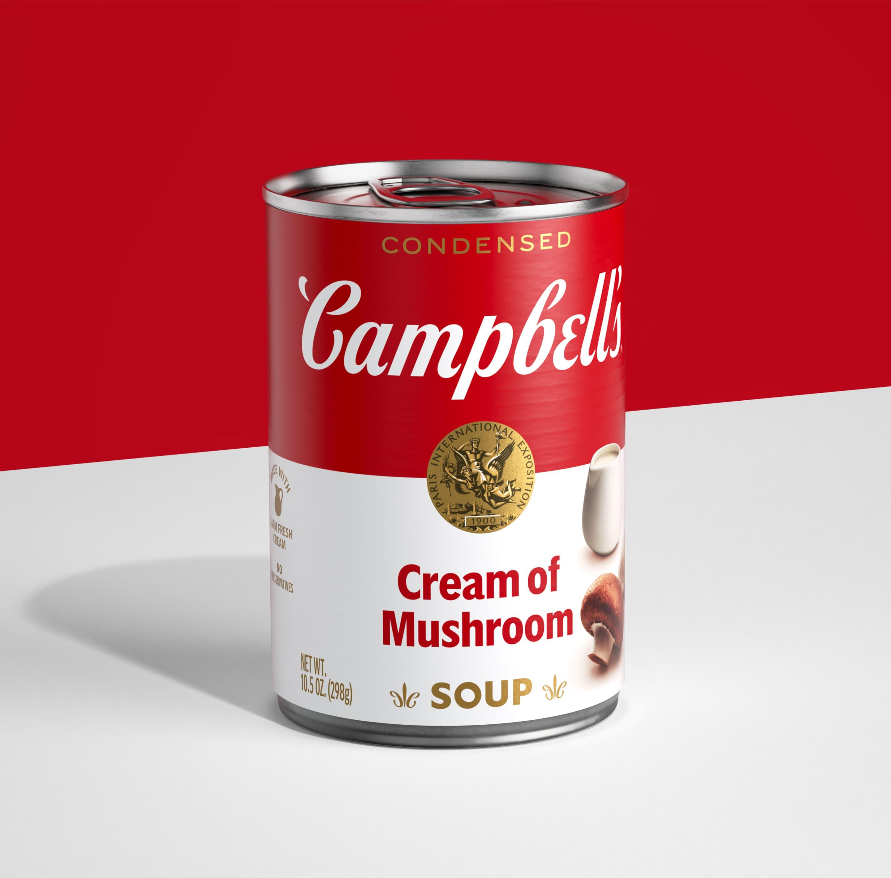
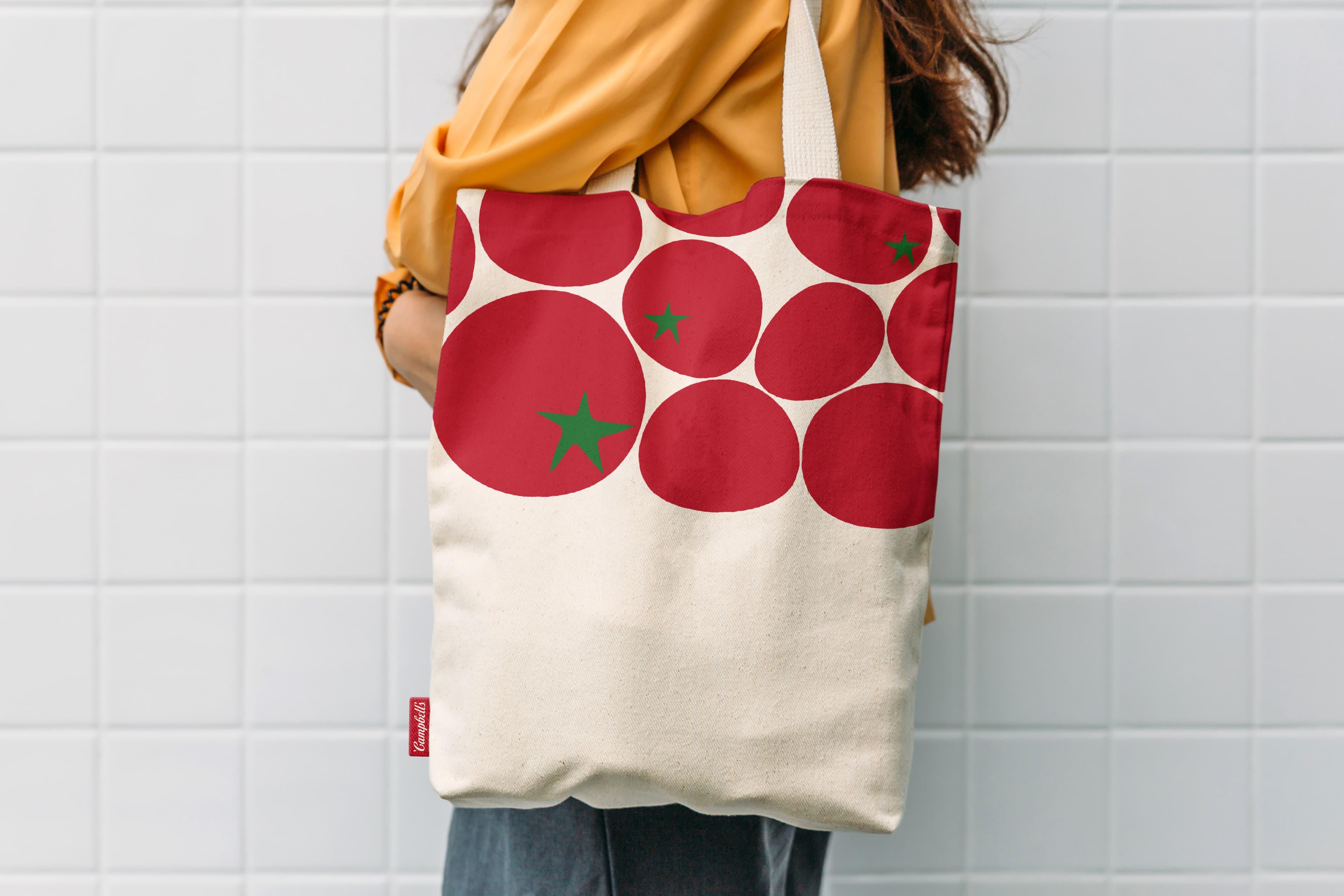
Campbell’s has always had some of the most recognisable packaging in the world. But over the years (all 125 of them), some of the generic trappings of the category had crept in. We set about reasserting Campbell’s iconic status by giving its condensed soup its first redesign in 50 years.
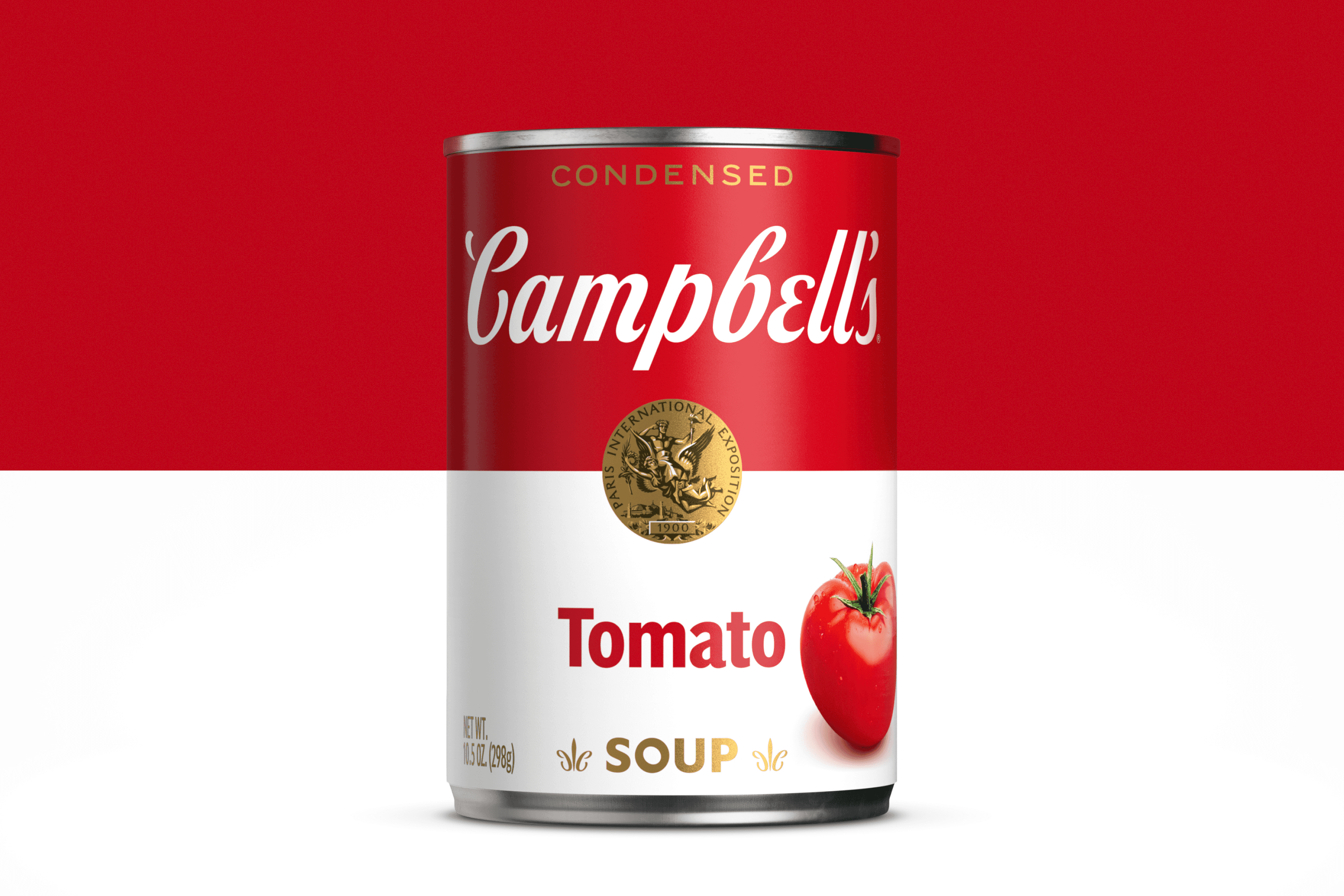
All the things that made Campbell’s iconic were already there. They were just fighting to make themselves heard. We let these key elements shout loud and clear by stripping out the category generics and refining the visual architecture from top to bottom. It brought some swagger and simplicity back to one of the world’s great brands.
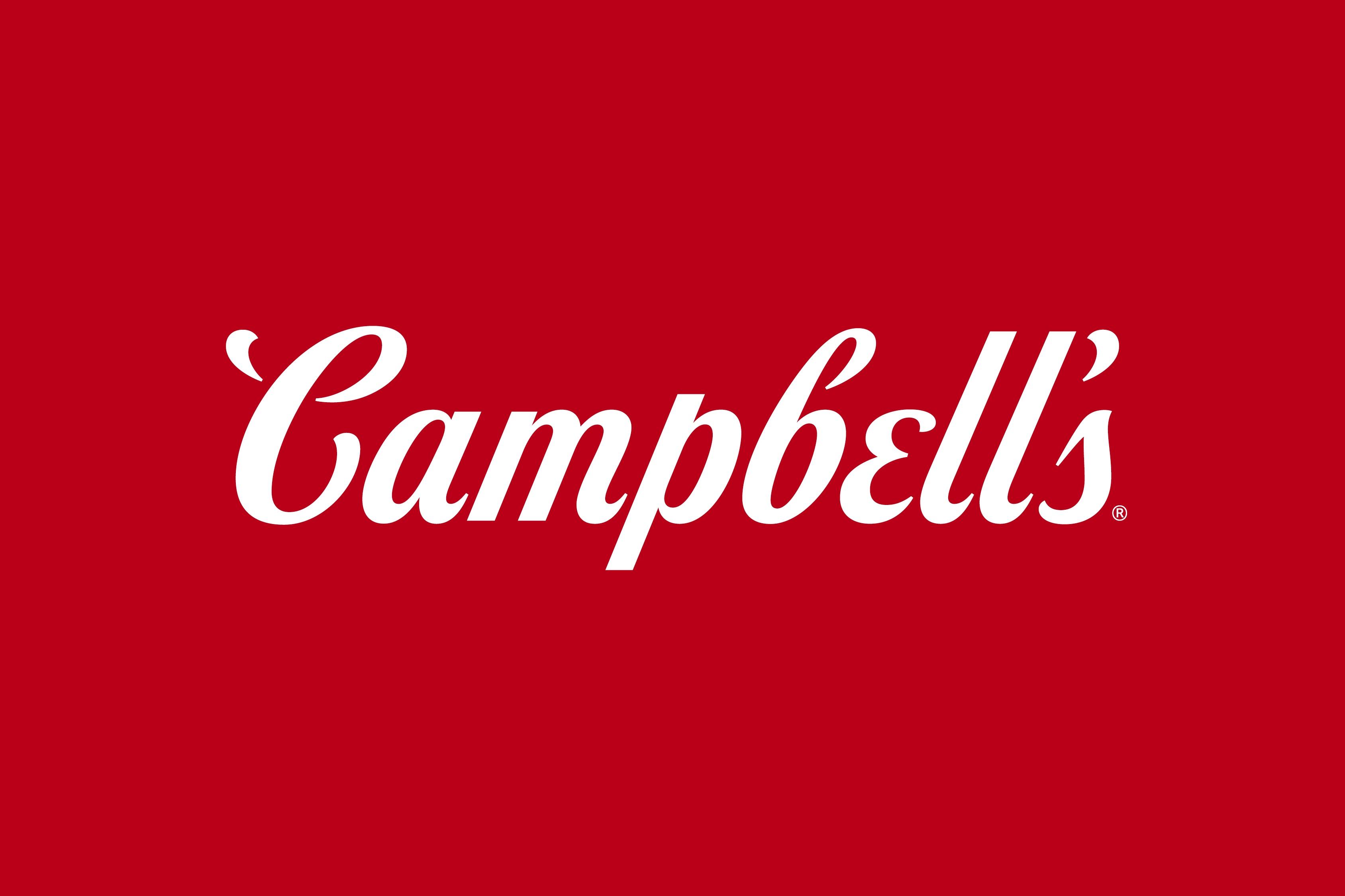
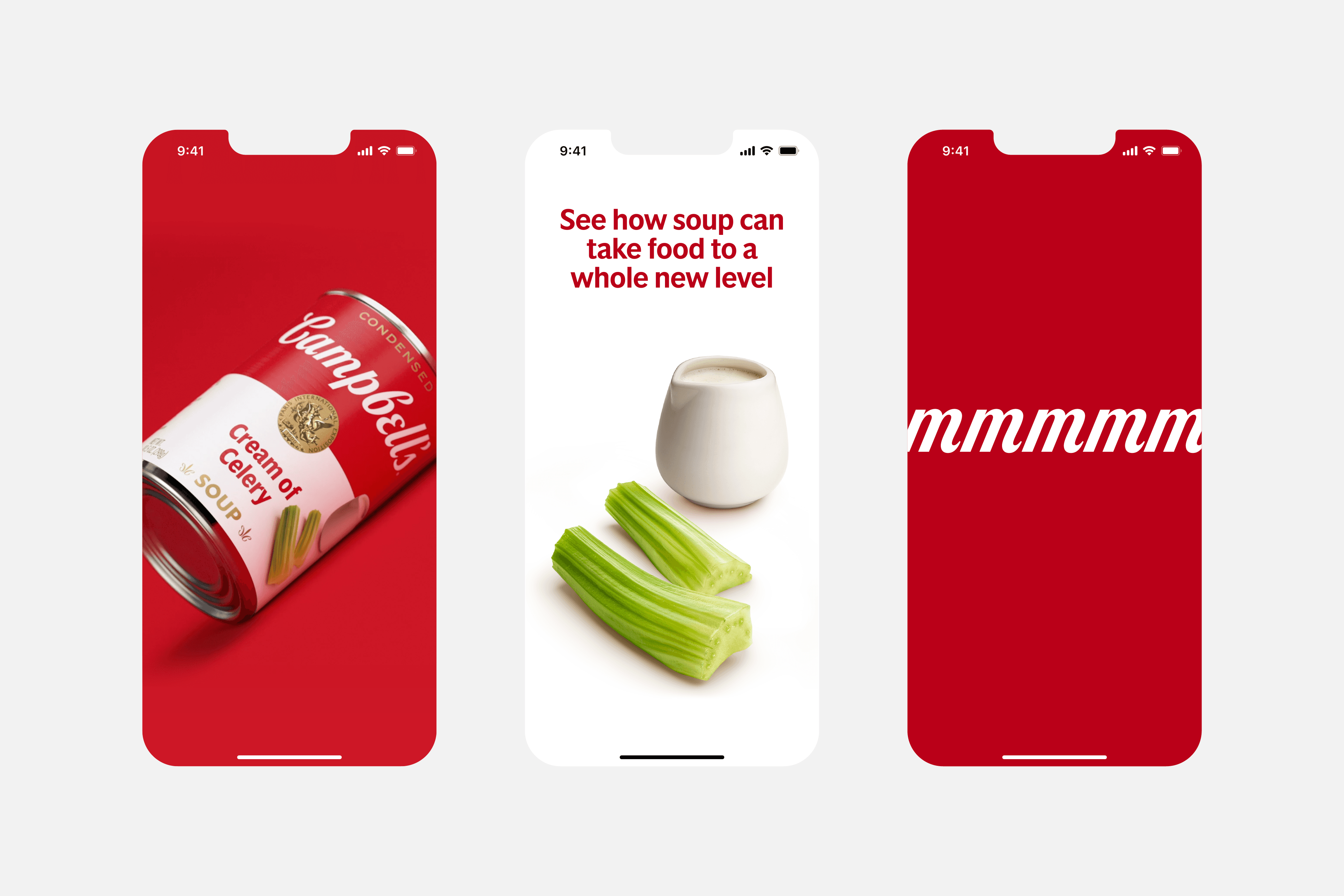
The new wordmark was based on founder Joseph Campbell’s signature. We opened up all sorts of new dynamic options by separating the characters. This allowed us to condense and expand the type, which is particularly useful in digital environments.
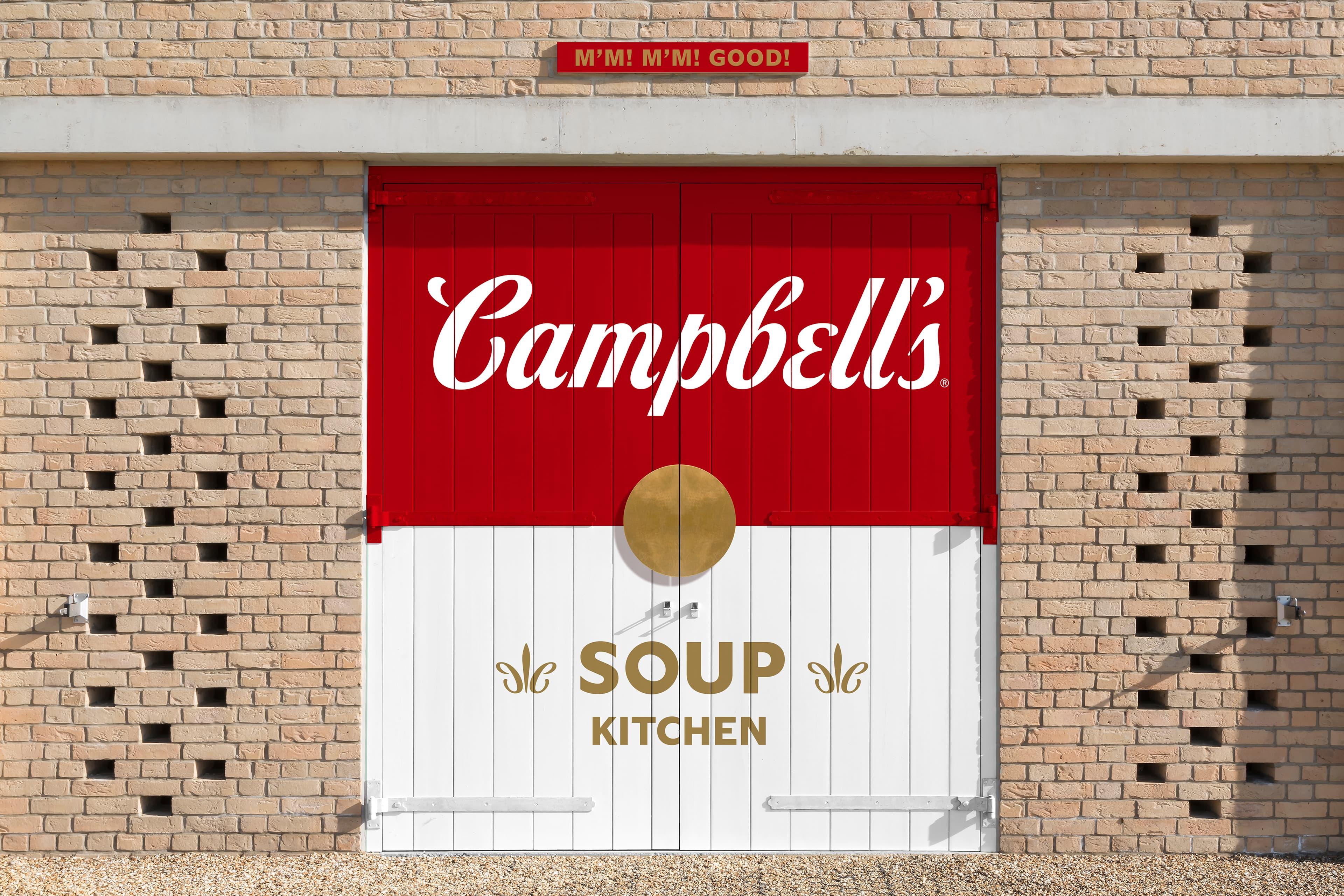
We added more craft and detail to the bronze medallion and introduced a new fleur-de-lis. Two C’s from the Campbell’s wordmark sit back-to-back, reinforcing the brand’s heritage in every detail.
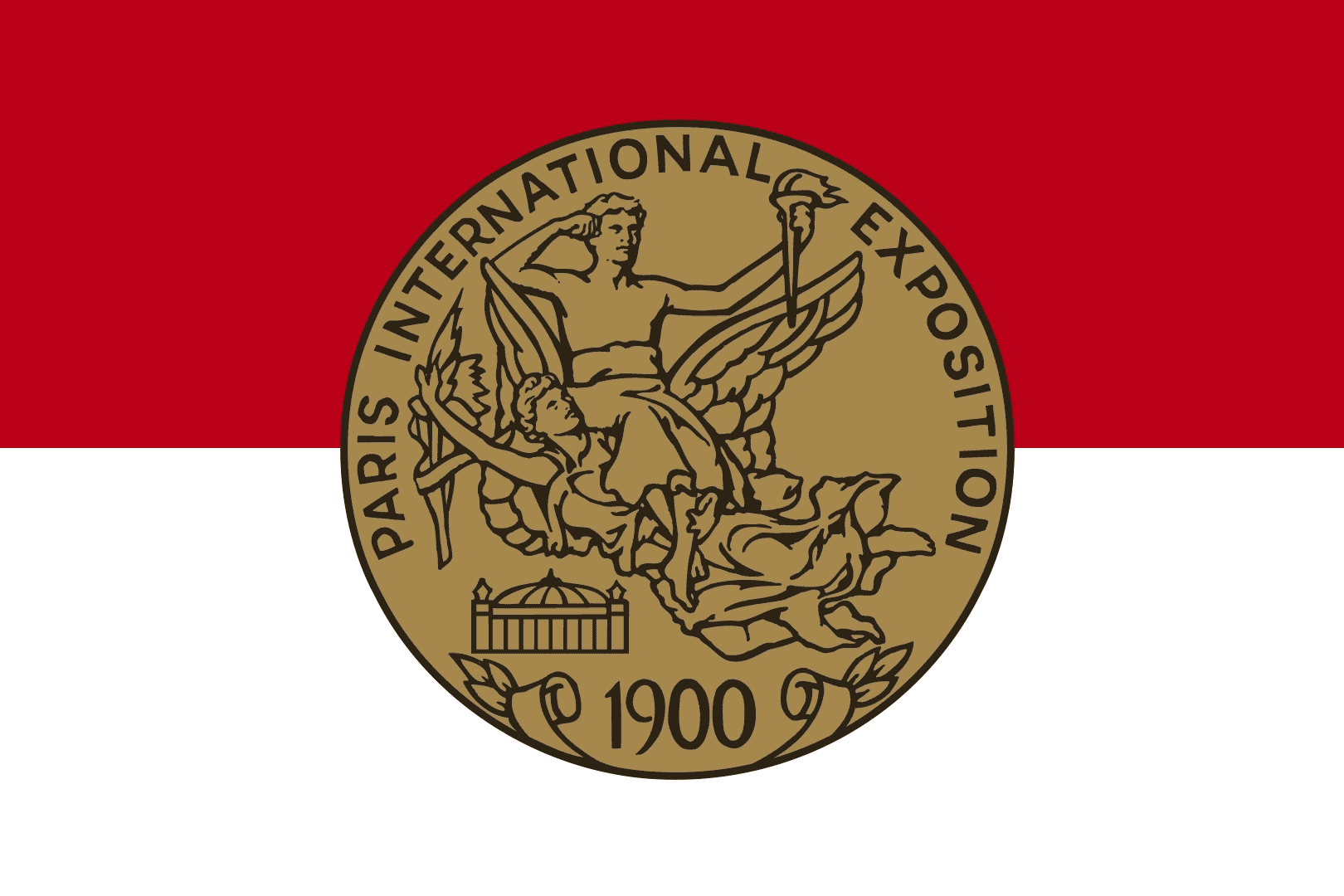
The restored medallion.
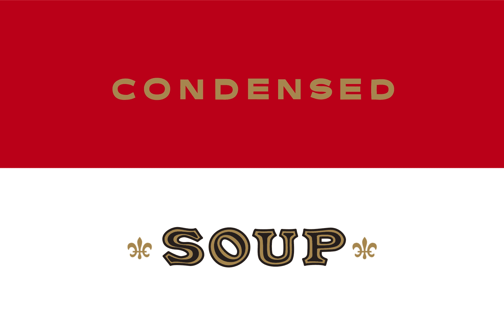
Refined type and fleur-de-lis.
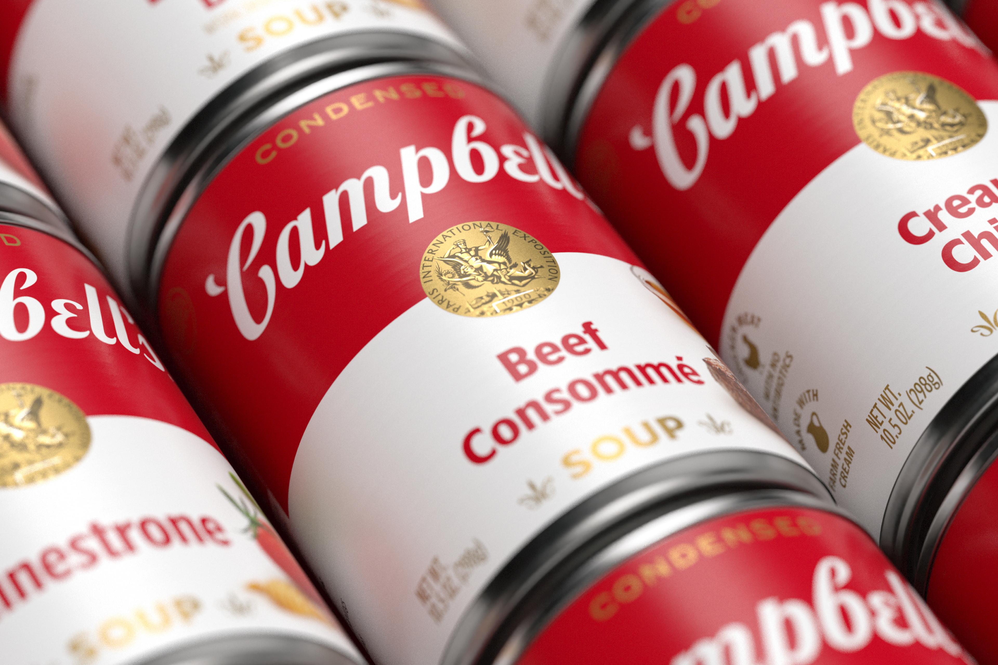
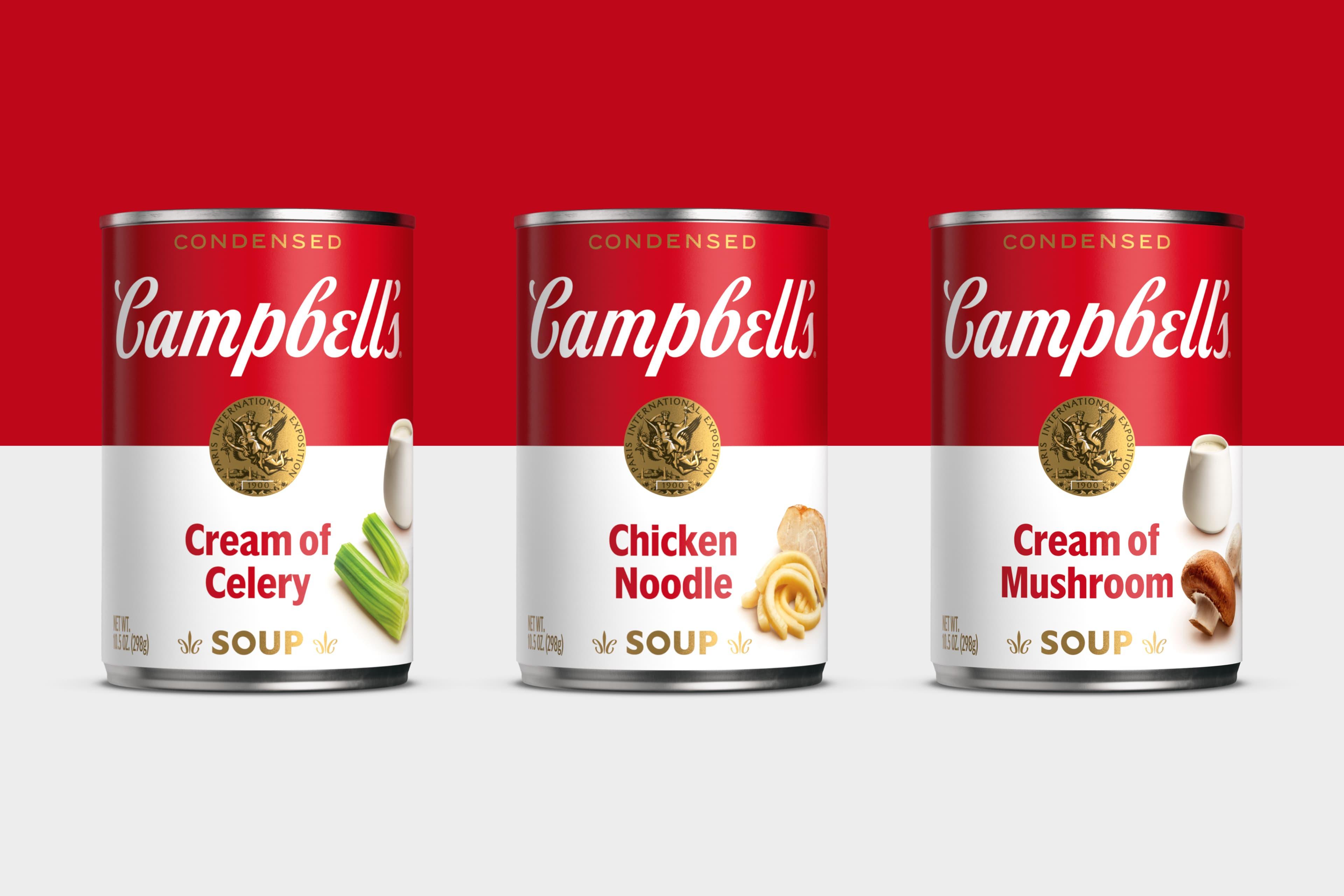
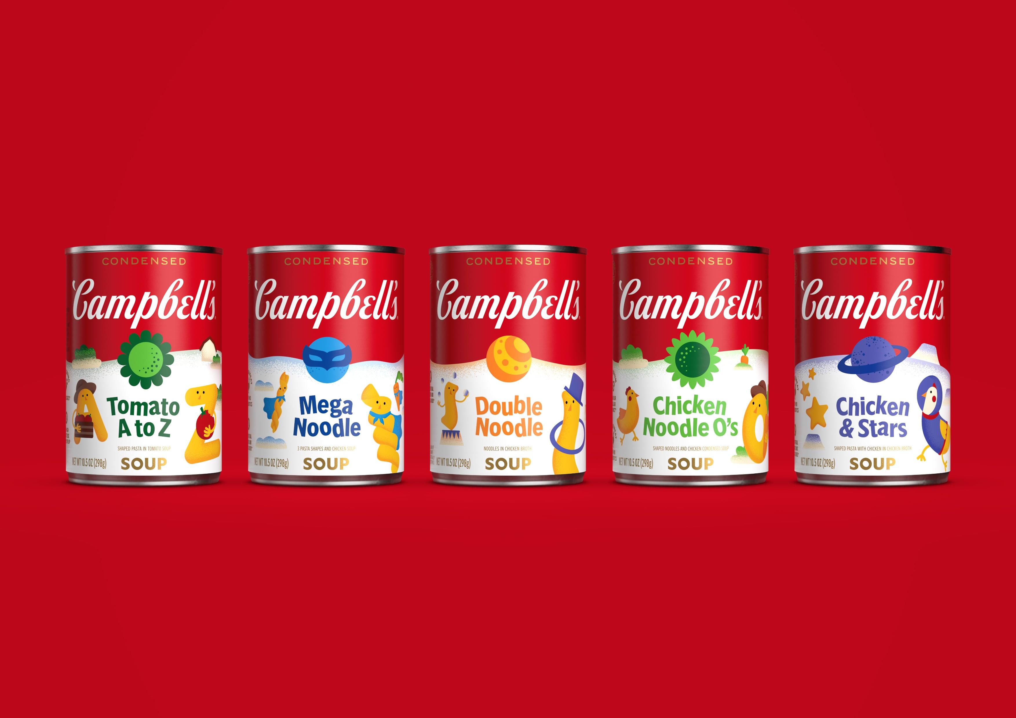
The refined visual identity system ensured that 100+ product SKUs remained distinct and easy to navigate. We ditched generic bowls of soup on-pack and replaced them with carefully captured ingredients. They gave the brand the quality cues it deserved and hinted that a spoon isn’t the only way to enjoy the product.

— Linda Lee — Chief Marketing Officer, Meals & Beverages, Campbell’s"Turner Duckworth’s ability to understand our underlying goals, bring bold ideas that challenge our thinking and work seamlessly together to execute through complexity led to success."
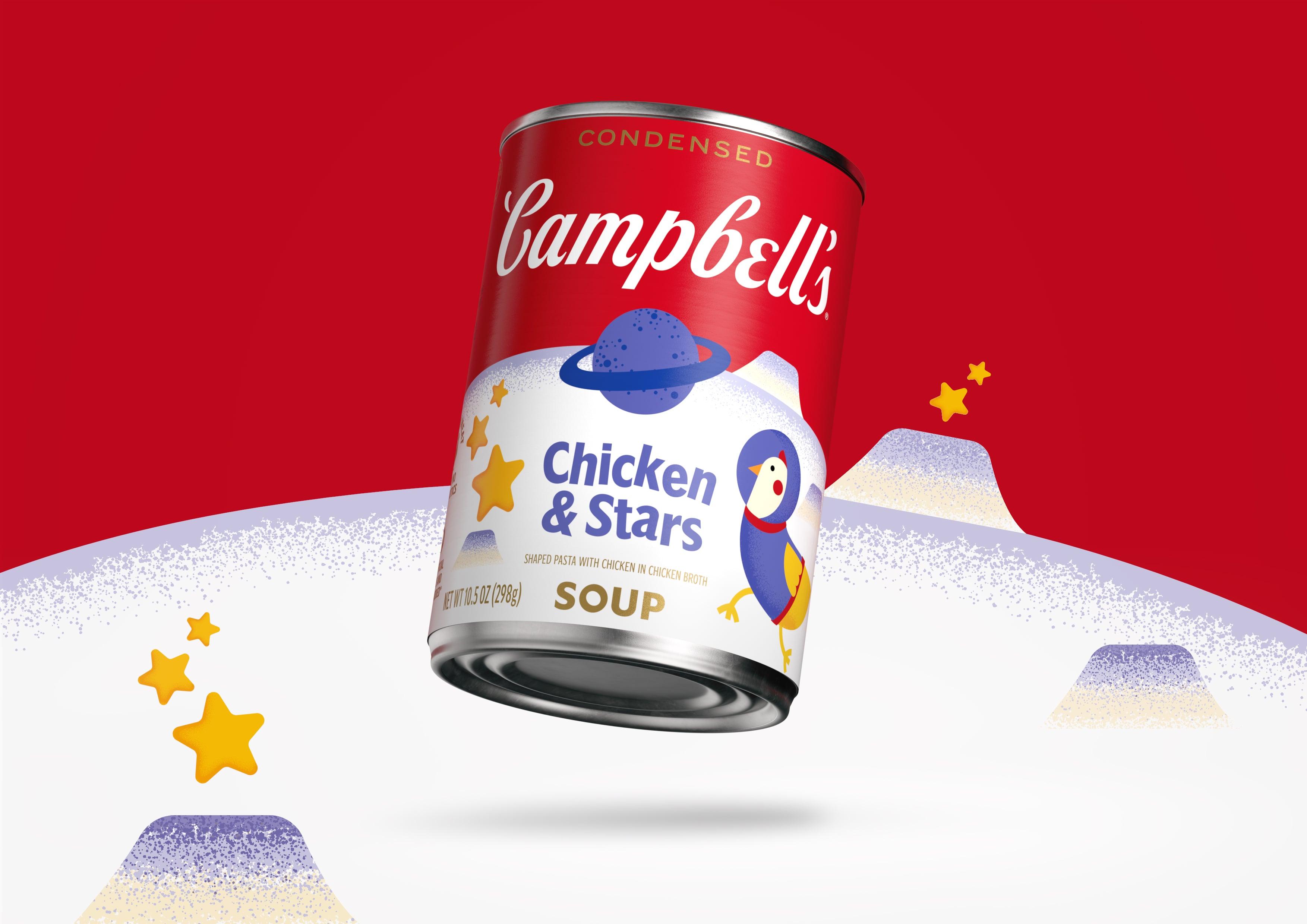
Campbell’s Kids effortlessly flexed into the new system. It maintained the iconic red and white split, typography and wordmark, and introduced a world of play, swapping out the bronze medallion on each flavour for a fun, illustrated icon.