Crumbl's journey began with two crazy cousins, one store, and the pursuit of the perfect cookie. Since then, it has grown into an international fan favorite, attracting millions of likes and loyal customers.
We combined the classic ingredients of the old wordmark, sprinkled in some tasty details, and served up a logo that's as sweet and distinctive as Crumbl's scrumptious cookies.
Embracing the famous Crumbl box, we confidently incorporated its unique shape into the new identity, ensuring the icon lived on with an even more distinctive presence.
Grounded in Crumbl's mission to bring friends and family together over a box of the best cookies, we developed the Crumblverse, an imaginatively delightful illustrated world that brings the brand's stories, community, and bakers to life.
Central to the new identity is Crumbl Sans, a customized variable typeface that effortlessly shifts from delightful to delectable. The new type spans the entire Crumbl experience, from pixel-perfect utility to bold sensory sensations.
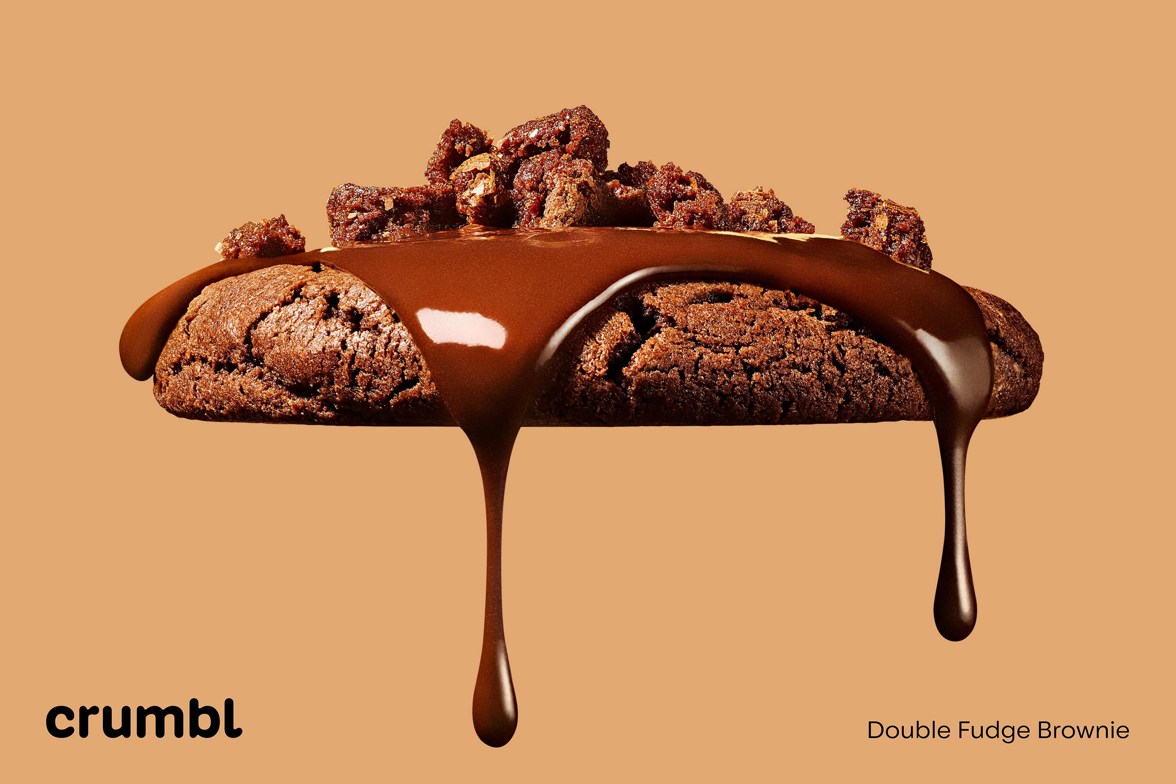
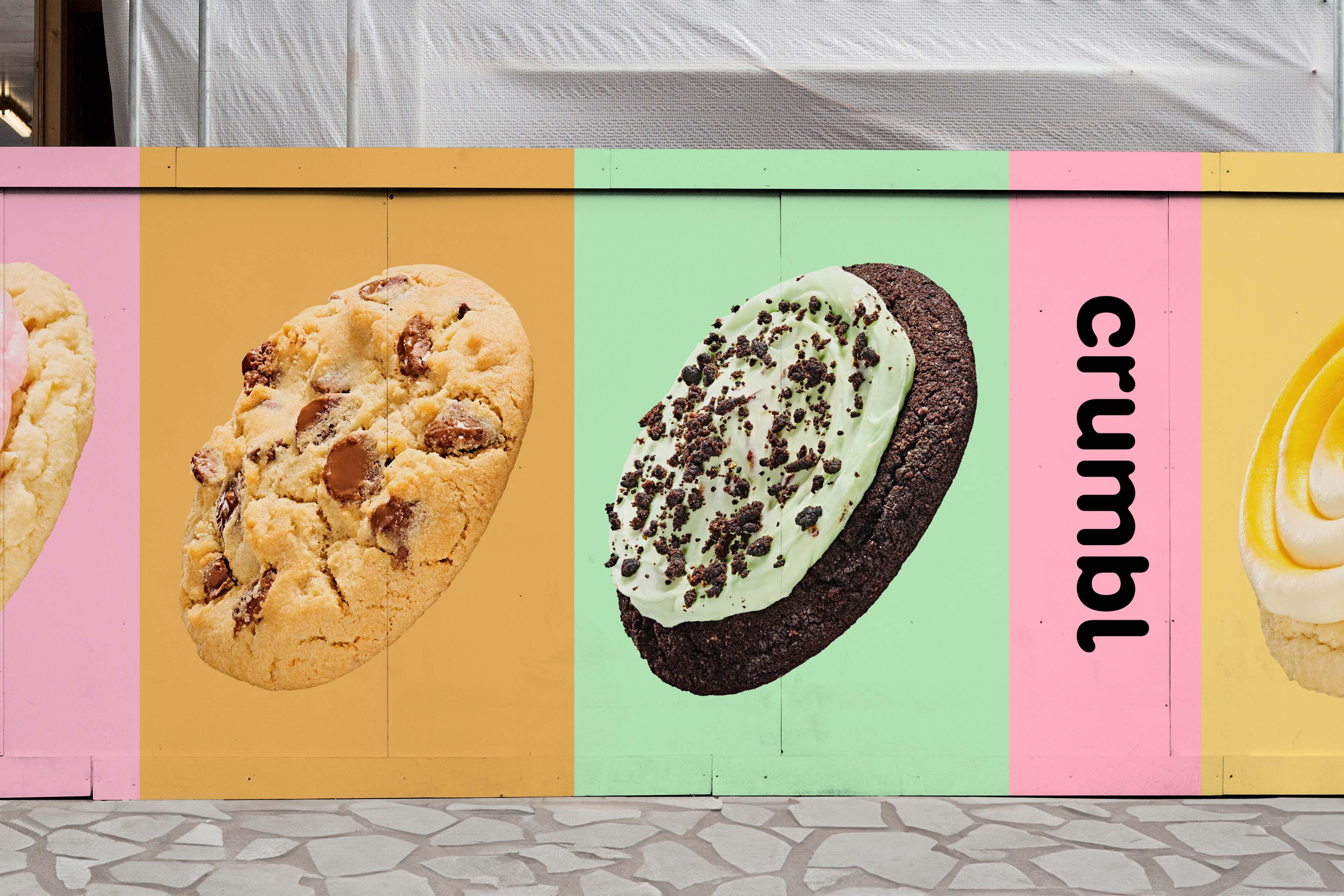
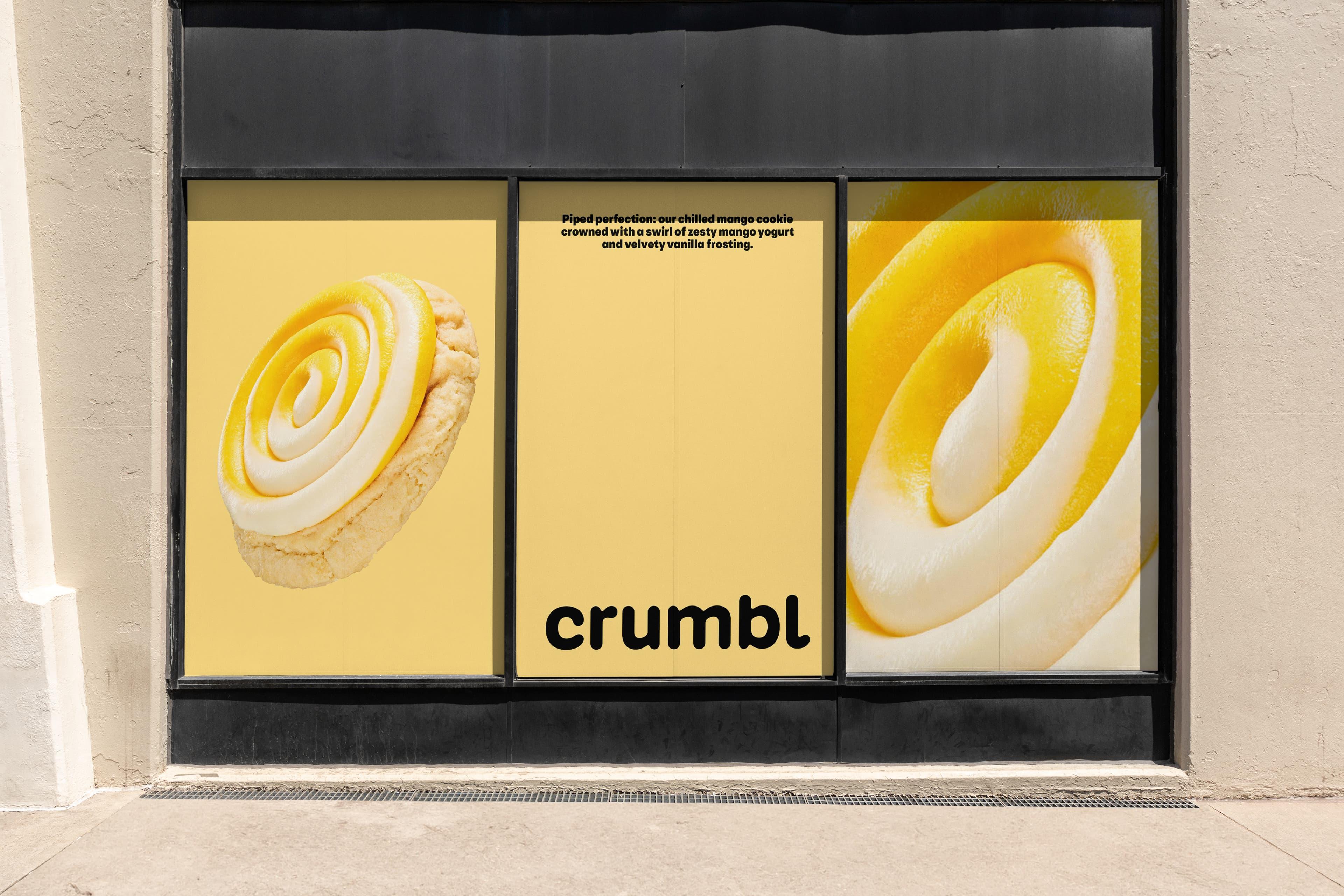
We approached photography with baker's precision, meticulously crafting graphic compositions that invite the imagination and tantalize the senses. A polished aesthetic that captures the spirit of Crumbl's mouthwatering, larger-than-life masterpieces, elevating imagery to a realm of pure, delectable delight.
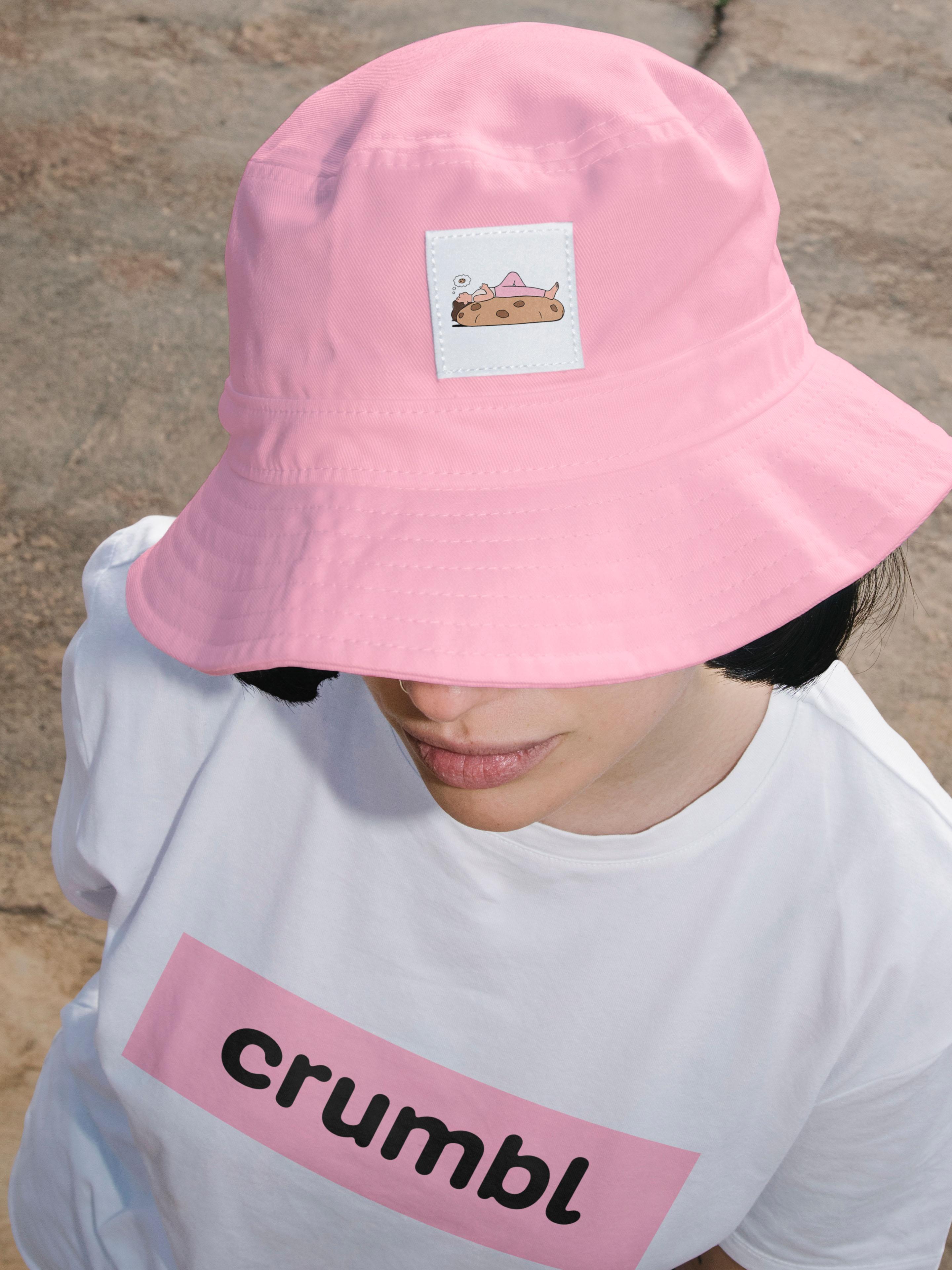
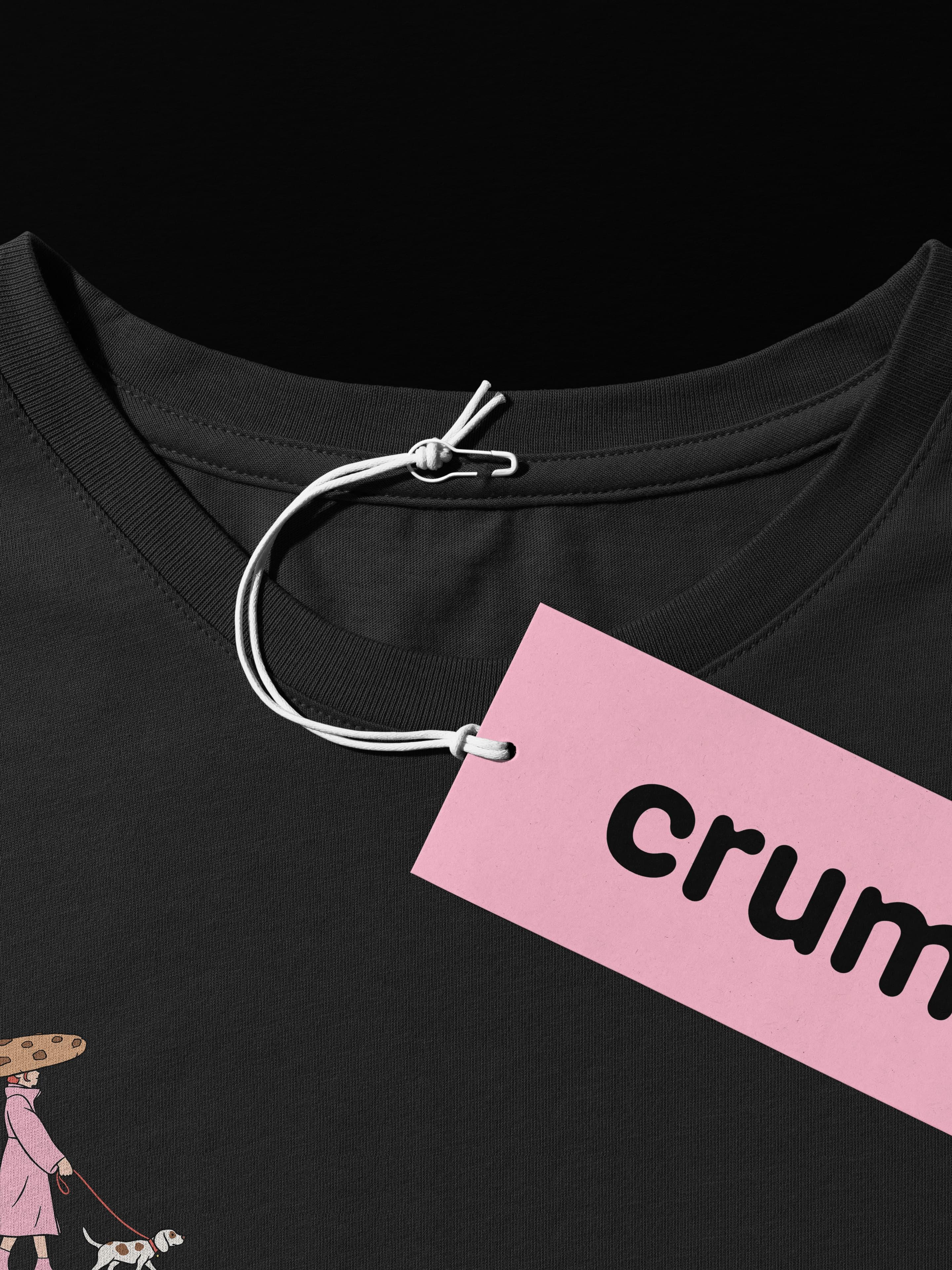
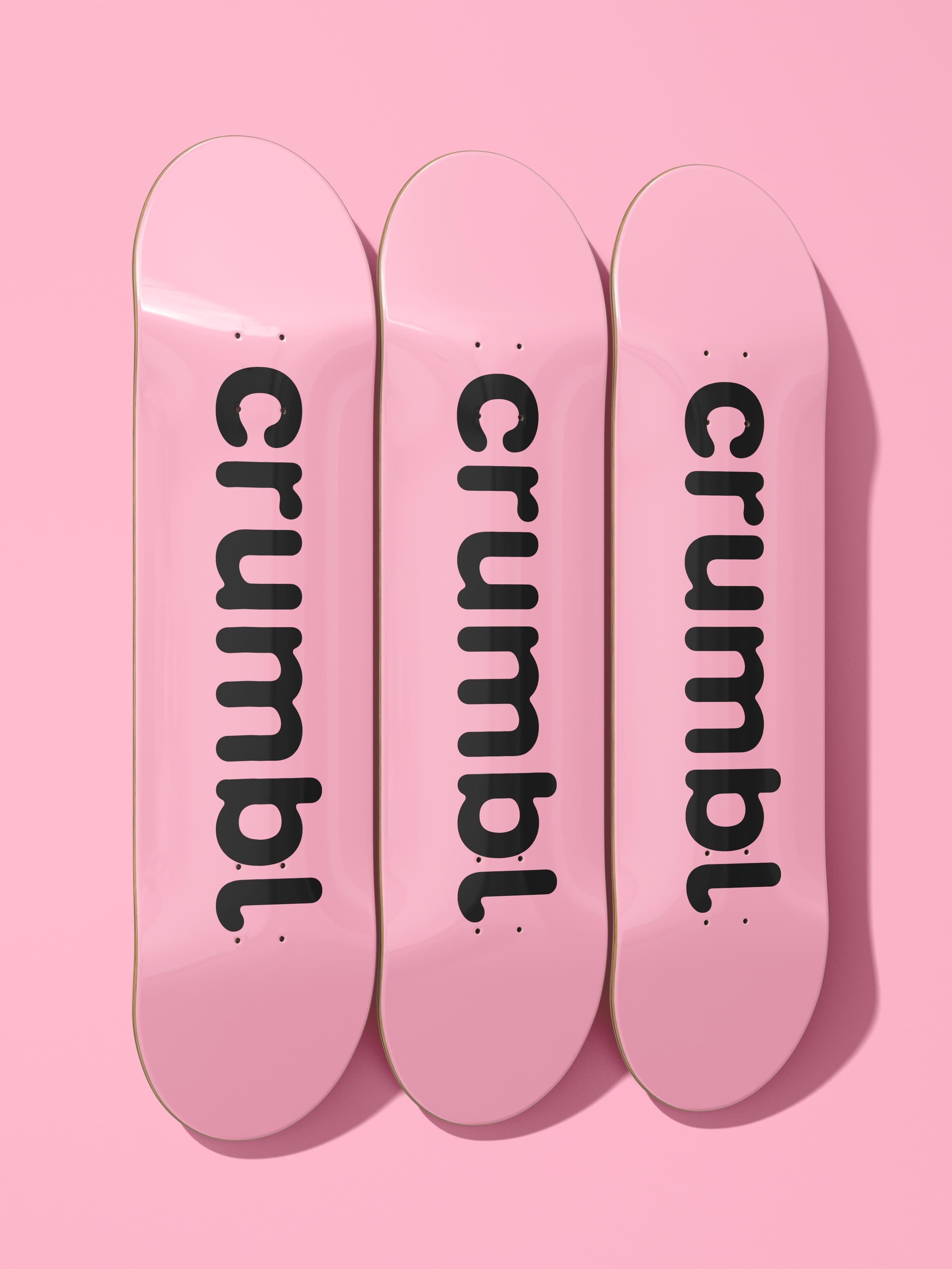
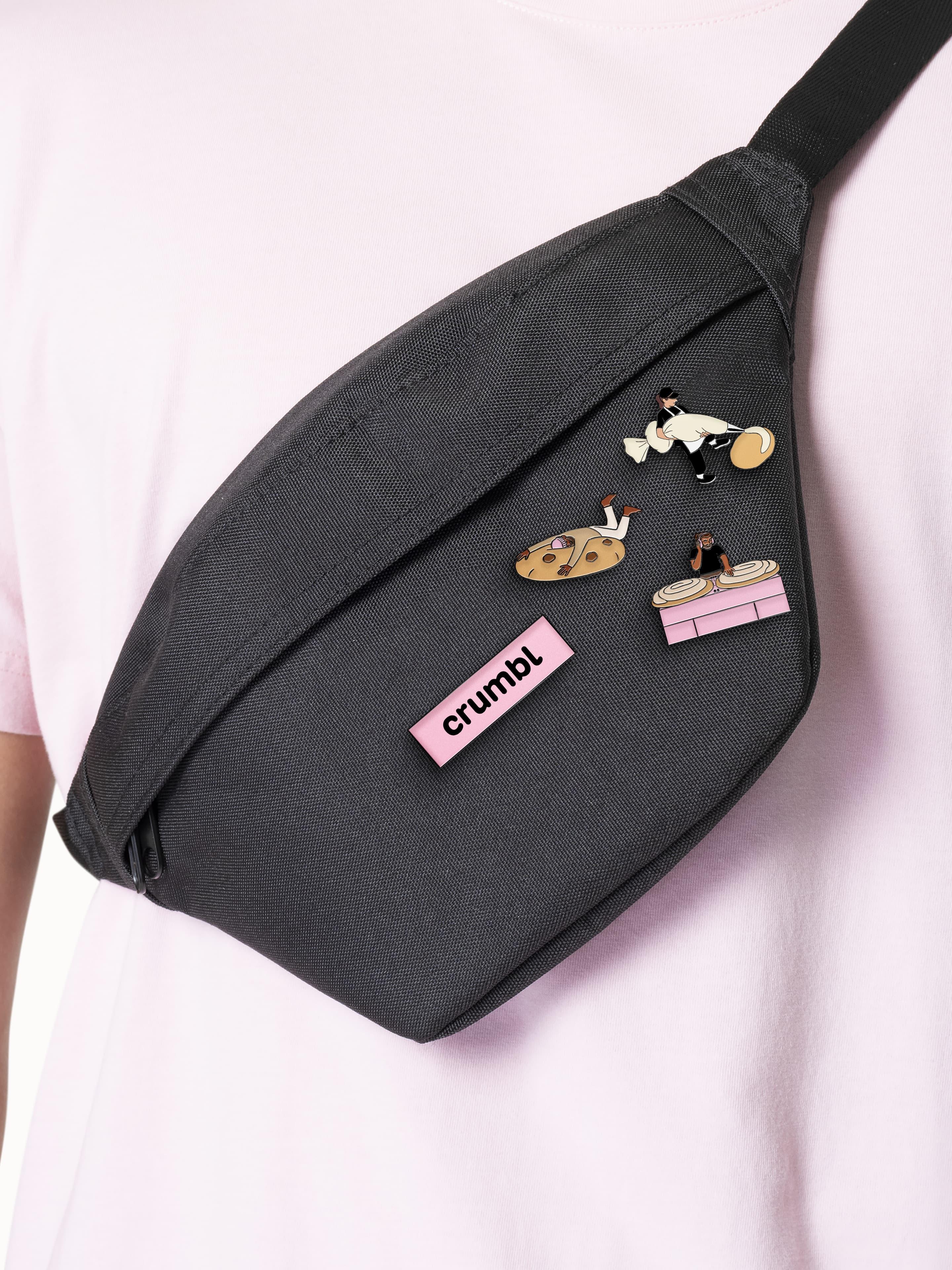
Crumbl's following of loyal customers and colleagues has long adorned the brand, so the identity was made to flex and create coveted merch, all about boosting the good times and uniting the community.
Logotype: Alec Tear
Crumbl Sans Typeface: Kilotype
Illustrations: BUCK
Product Photography + Video Photography: Ted Cavanaugh
Food Styling: Eugene Ho
