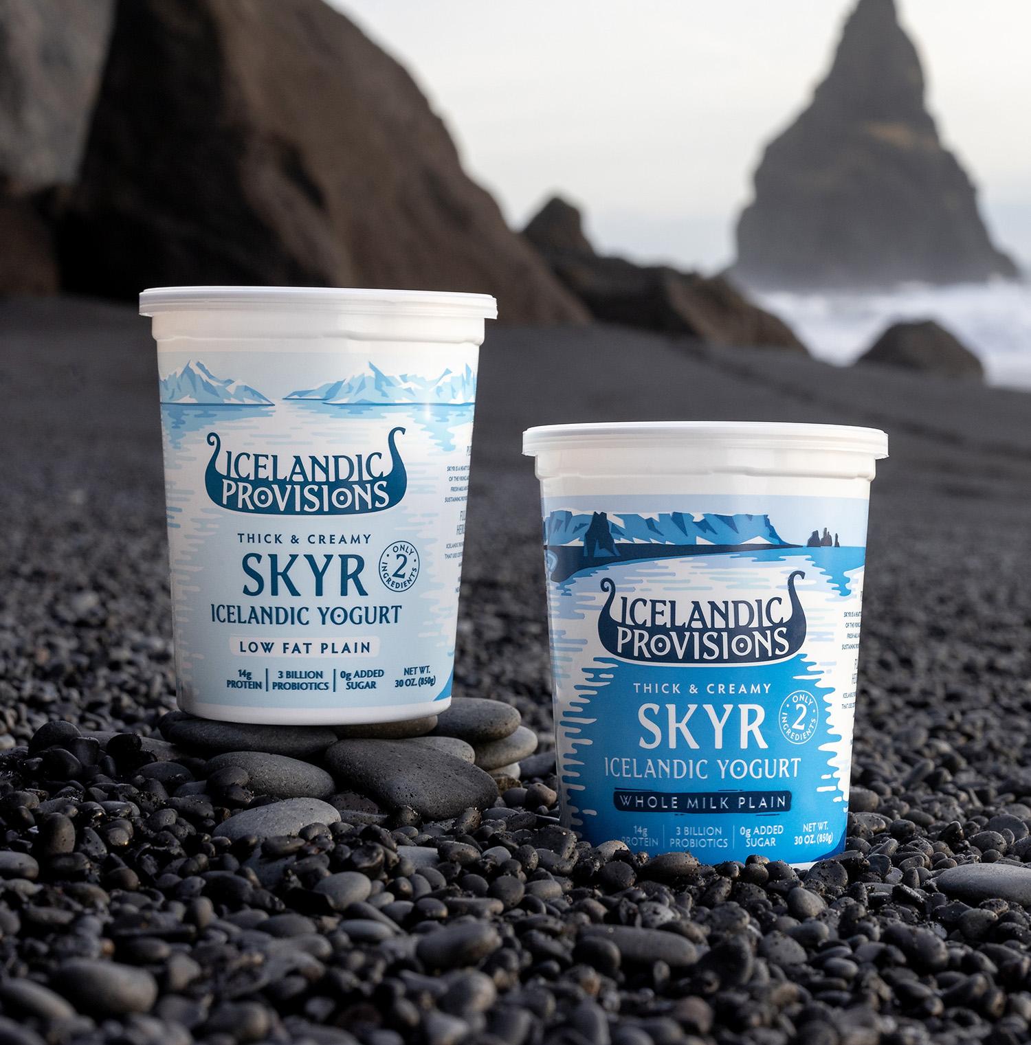
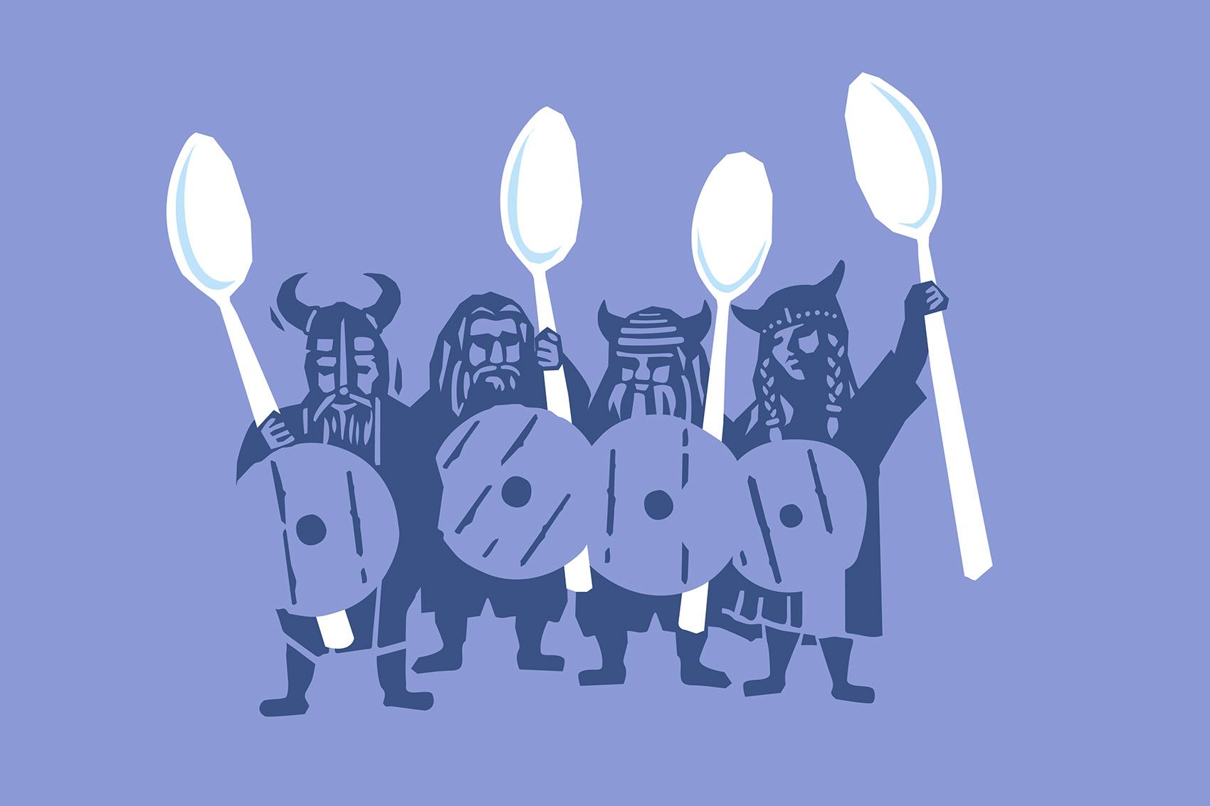
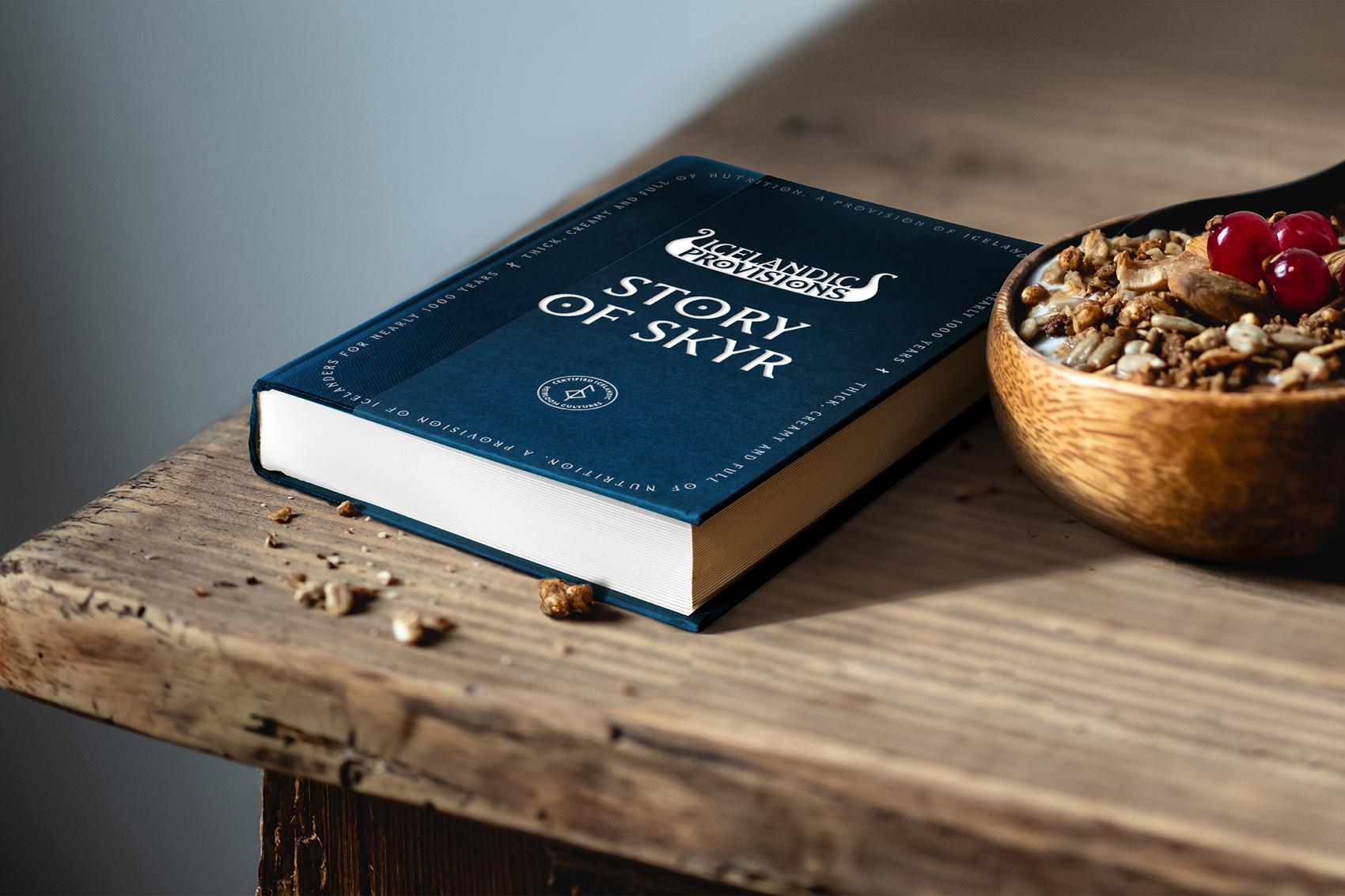
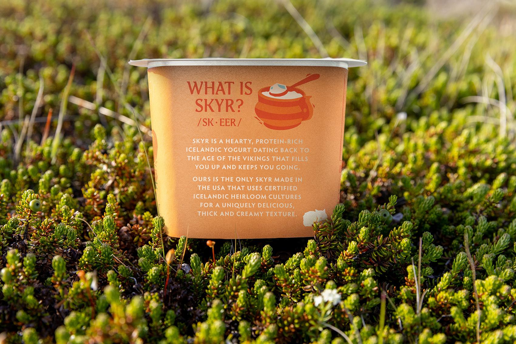
As vast as the oceans and as changing as the tides, few food categories have proven more variable and expanding than yogurt. To win in this space a brand needs to stand for something more. For Icelandic Provisions, purveyor of premium, thick, creamy Skyr that “more” turned out to be the brand’s authentic, Icelandic heritage as a food staple stretching back a 1000 years to the age of the Vikings!
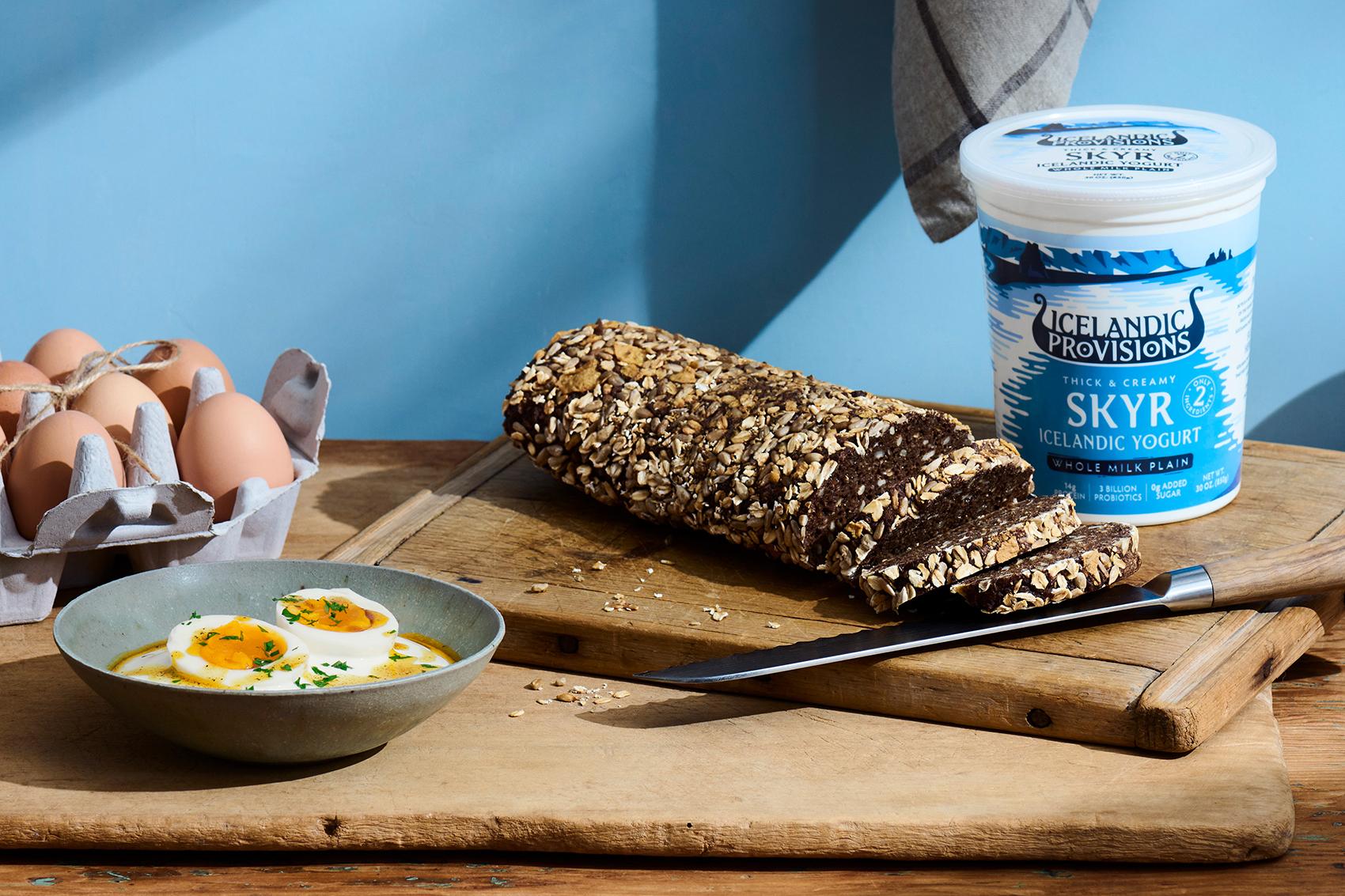
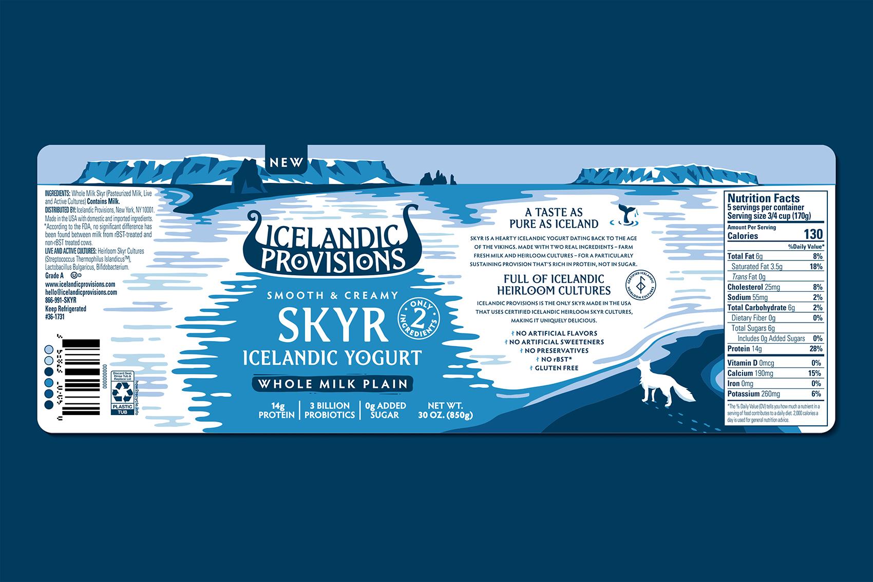
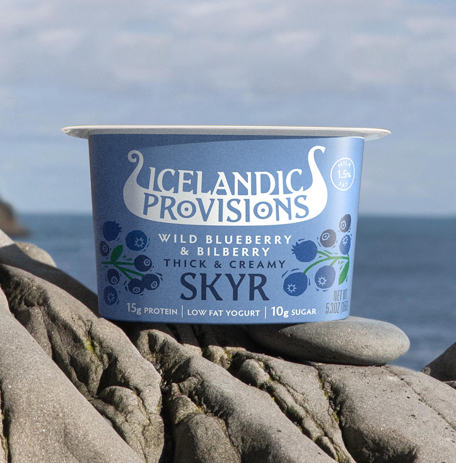
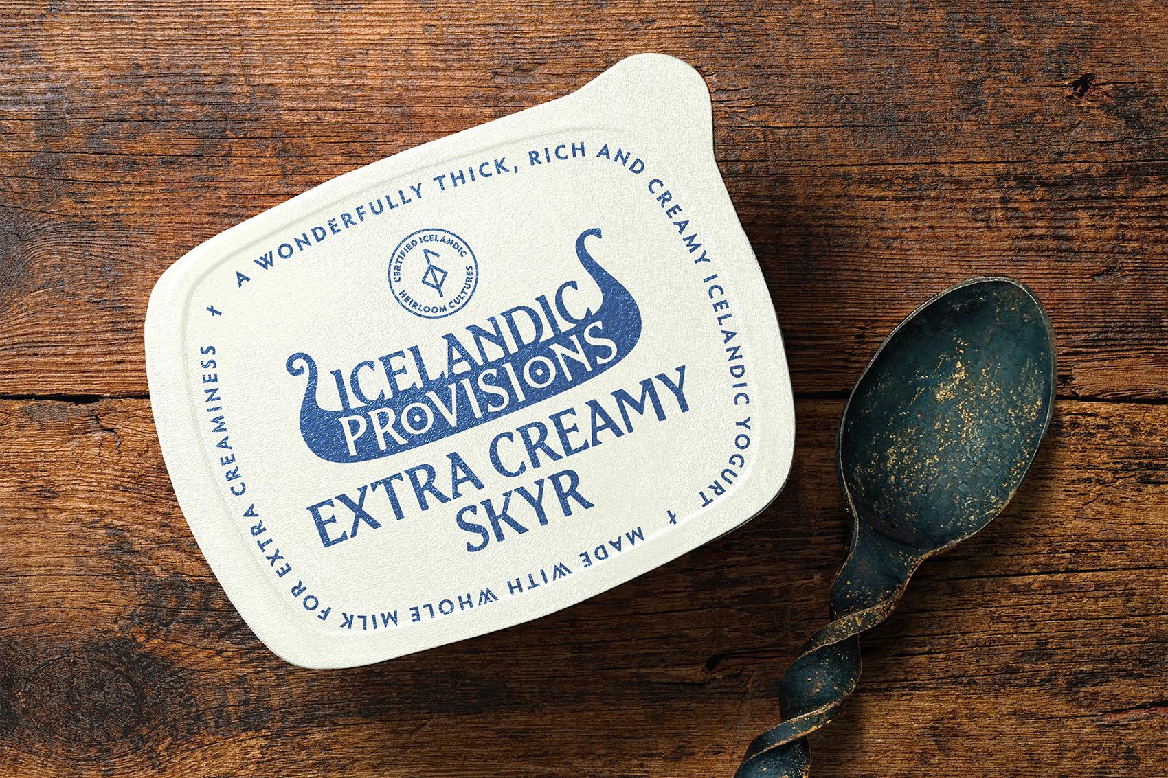
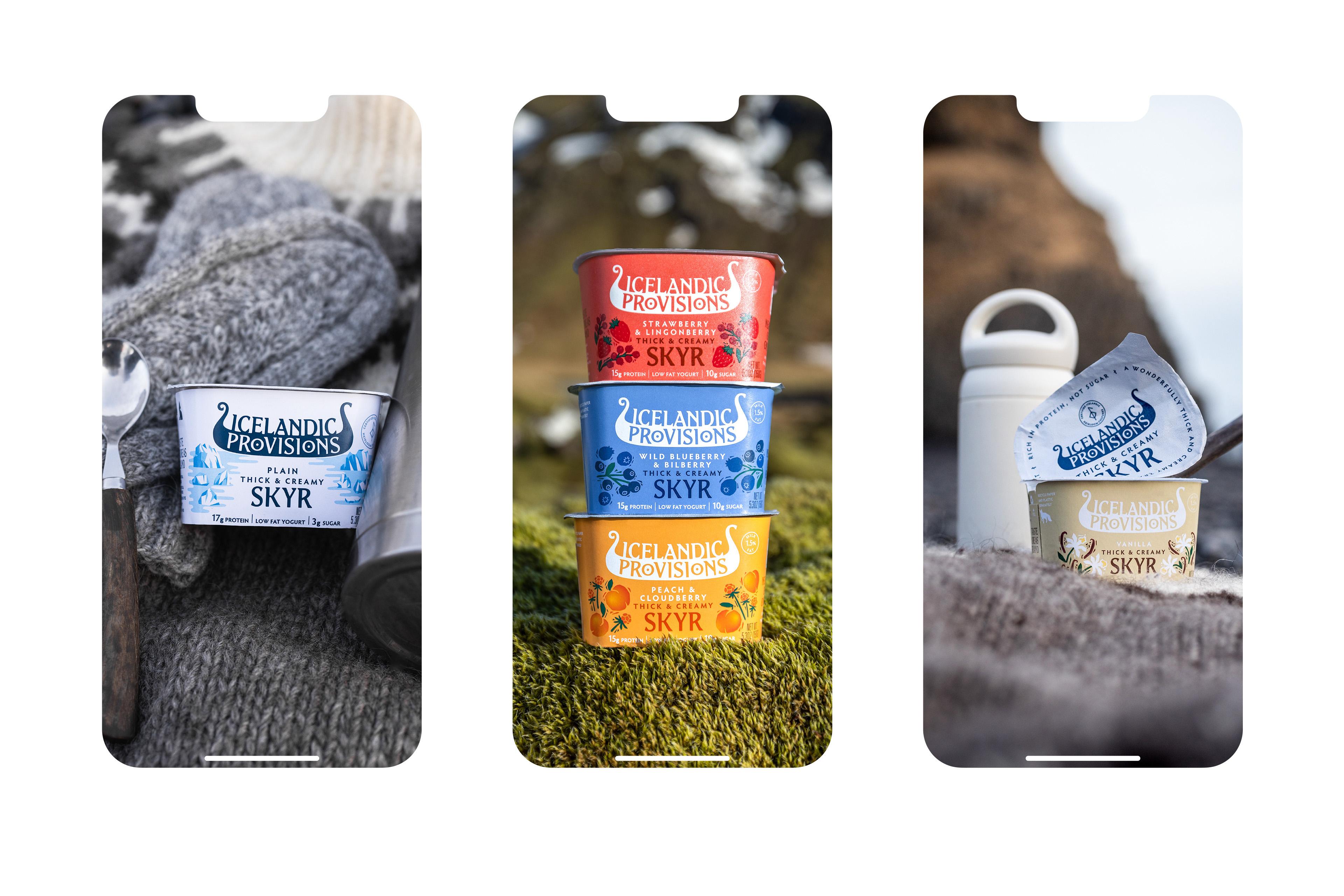
To bring this story to life we started by giving the brand a new logo; a Viking longship. A truly Icelandic symbol of strength and journeying. The new logo puts emphasis on “provisions”, which sits neatly in the hull, where provisions would be stored. The O’s create two shields hung from the sides, Viking-Style!
— Dan Hickle — Icelandic Provisions, Chief Marketing Officer“We want people to really feel the authenticity of our product. Skyr is made with genuine heirloom cultures that stretch back to the age of the vikings - it’s a fantastic story”
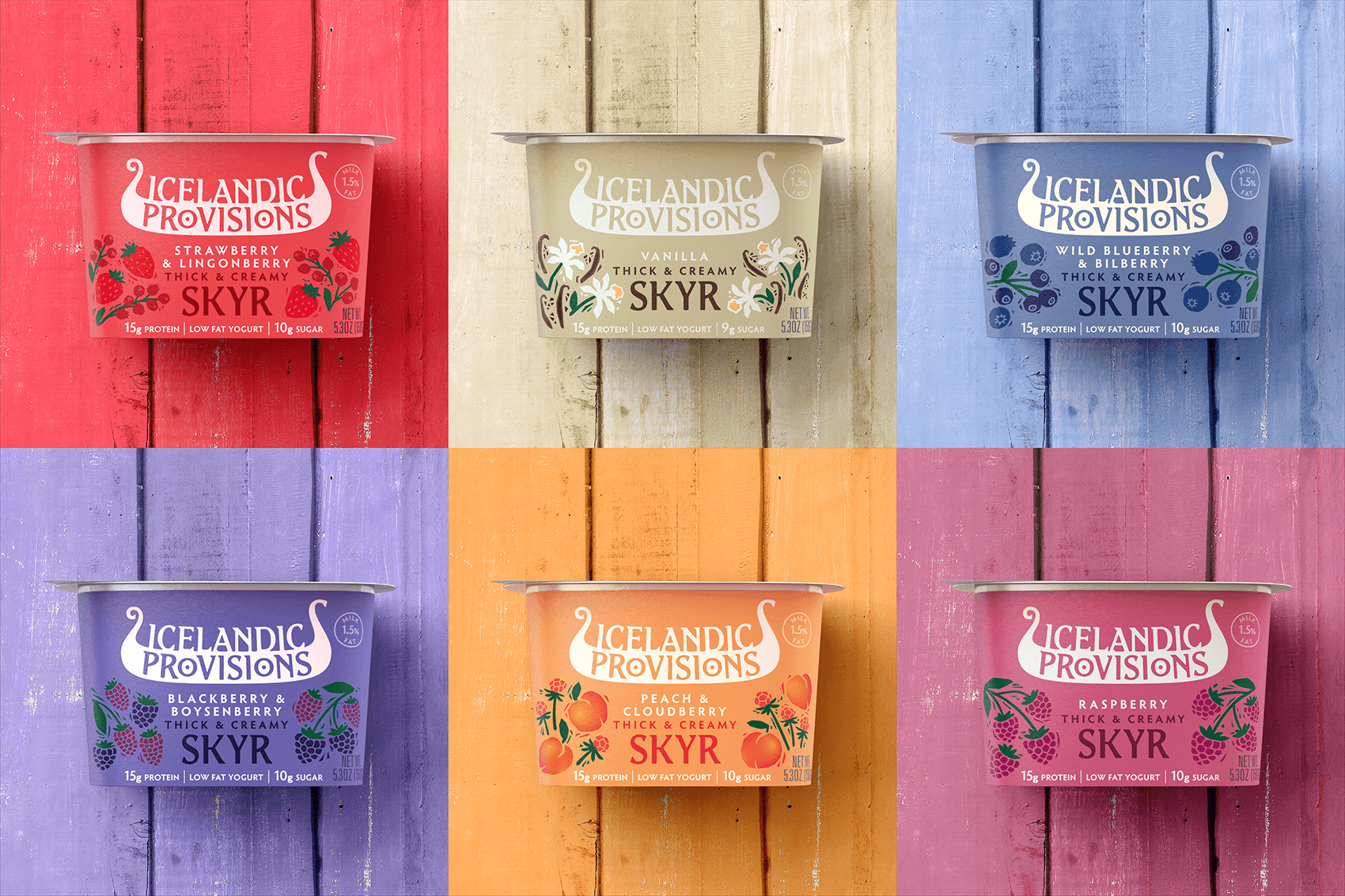
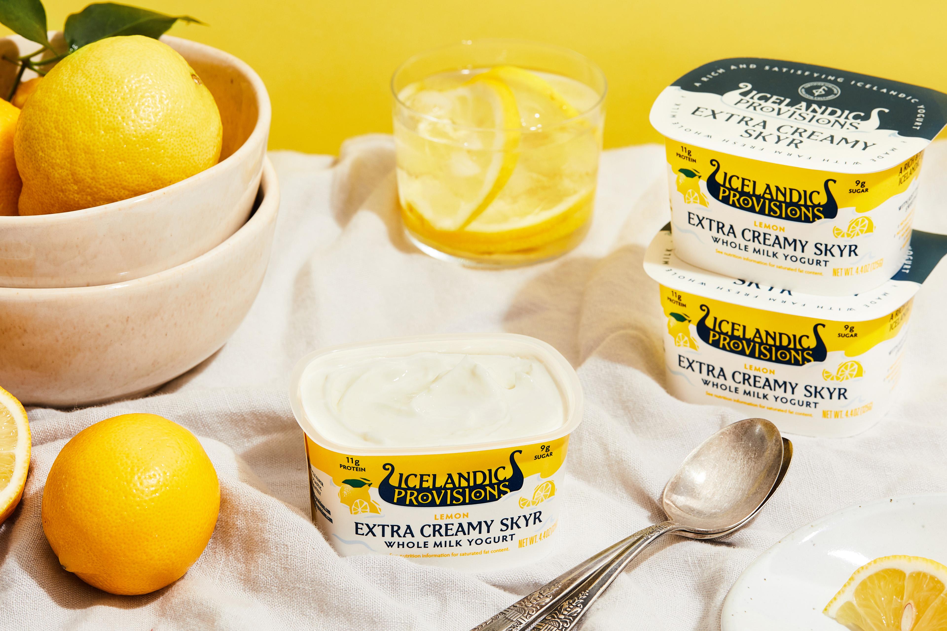
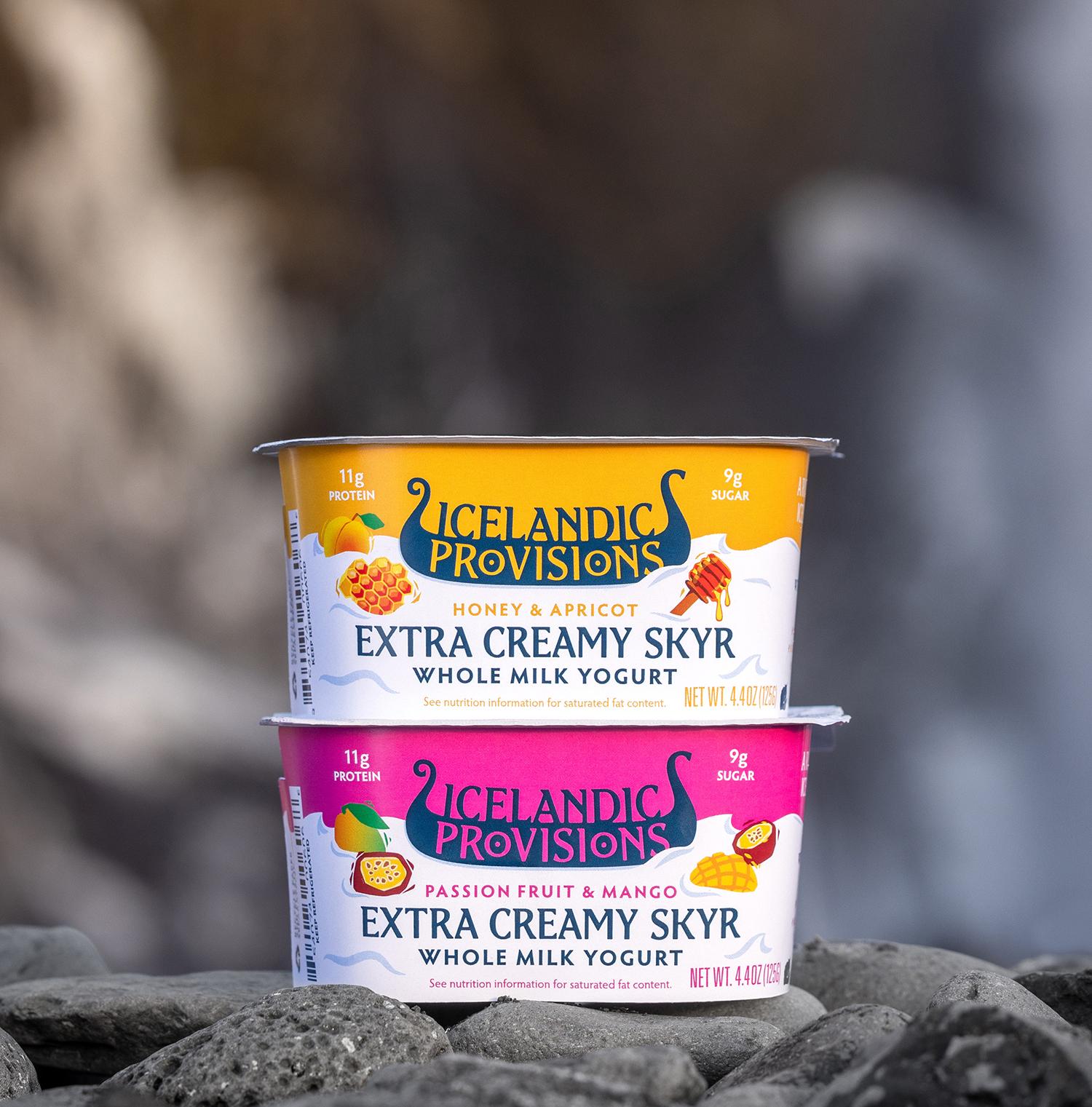
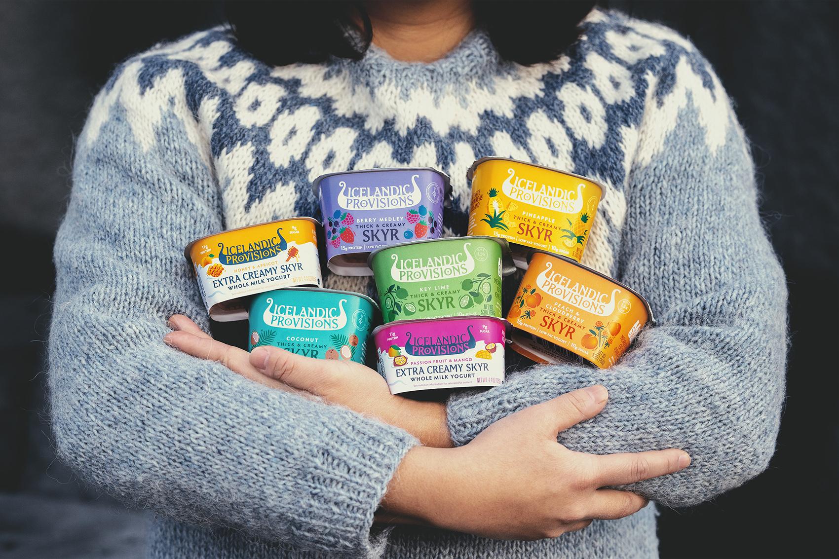
With such a distinctive mark to cue the brand, the packs were able to embrace color. Which true to the brand’s sense of optimism, were inspired by the brightly colored homes of native Icelanders. The result: a flavorful color riot of hues in a category where white reigns supreme and a range where color signals flavor: the same method humans have used to search for provisions for thousands of years.

New also to the brand’s cargo of assets was a bespoke typeface, “Edda”, inspired by traditional Icelandic Runic letterforms that ground the brand in its unique heritage. The distinctive trailing serifs of these letters echo the forward movement of a ship, fit for a brand on a journey.
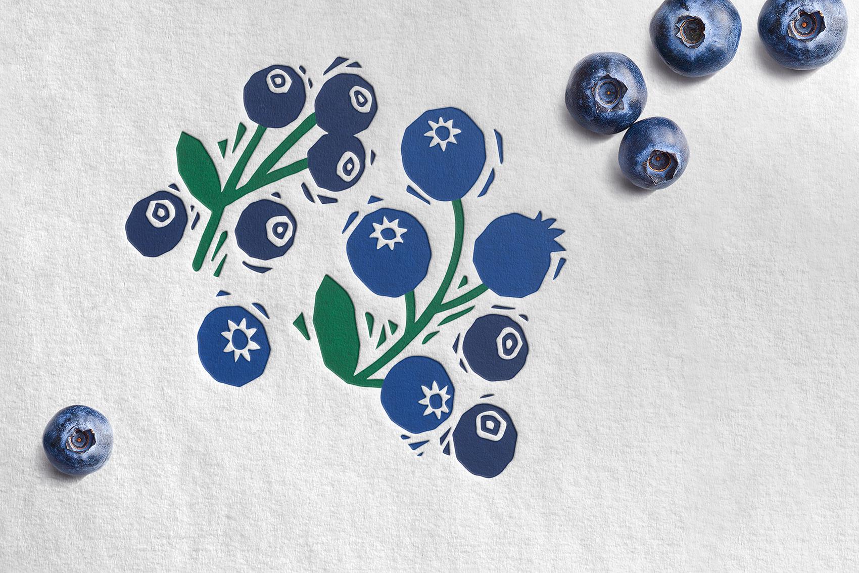
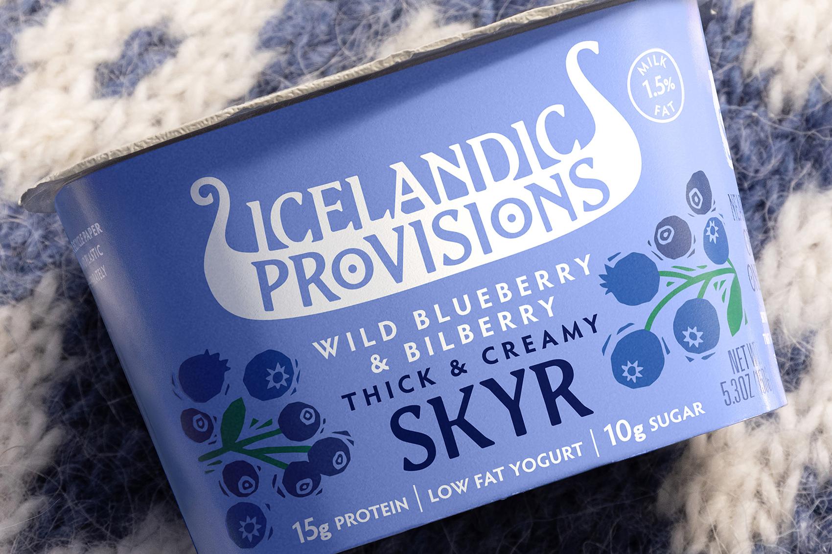
A hand-carved illustration style stirred up taste appeal by providing a distinctive and strength-giving quality to the way the brand shows its fruits, berries and nuts. A look befitting a sustaining and protein rich product.
— Dan Hickle, Icelandic Provisions, Chief Marketing Officer“Purchase intent grew 50% amongst consumers exposed to the new branding vs old.”
With the longship icon, the new typeface, and the way we depict ingredients, all the chapters of the story are now there, in design, to set the brand on a steady course to new worlds and beyond, allowing the brand to bring exciting new product lines to shelf!