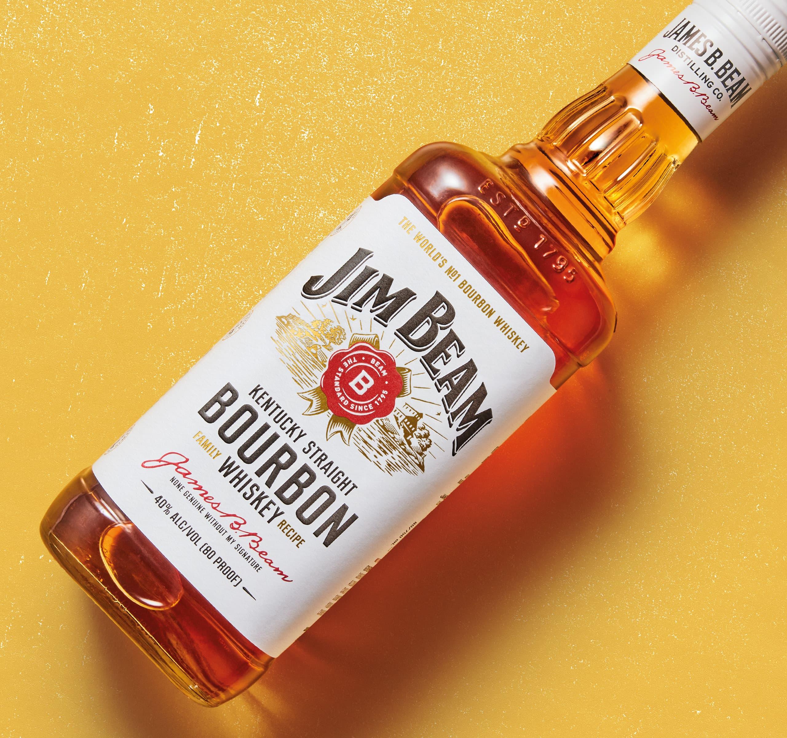
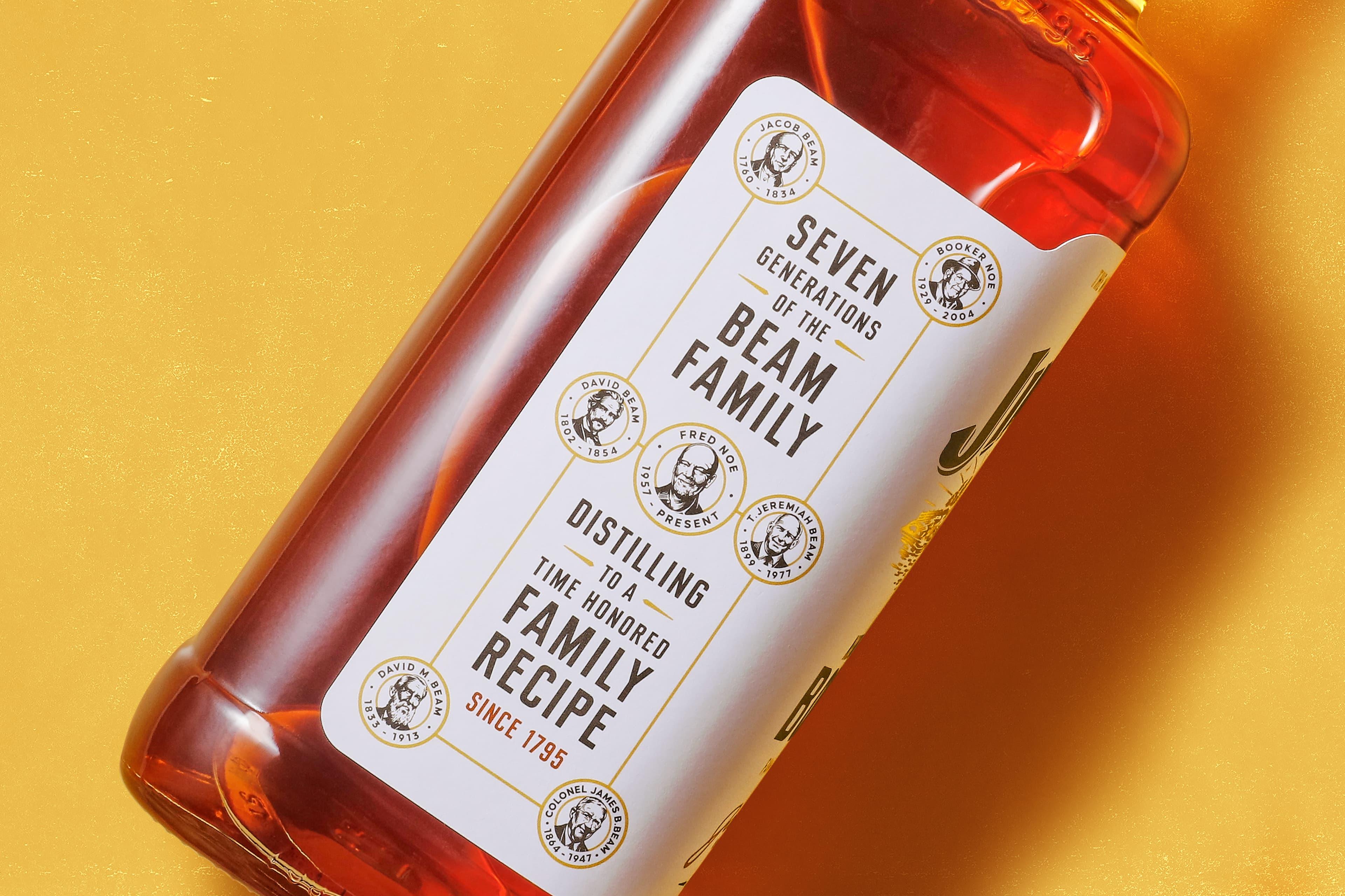
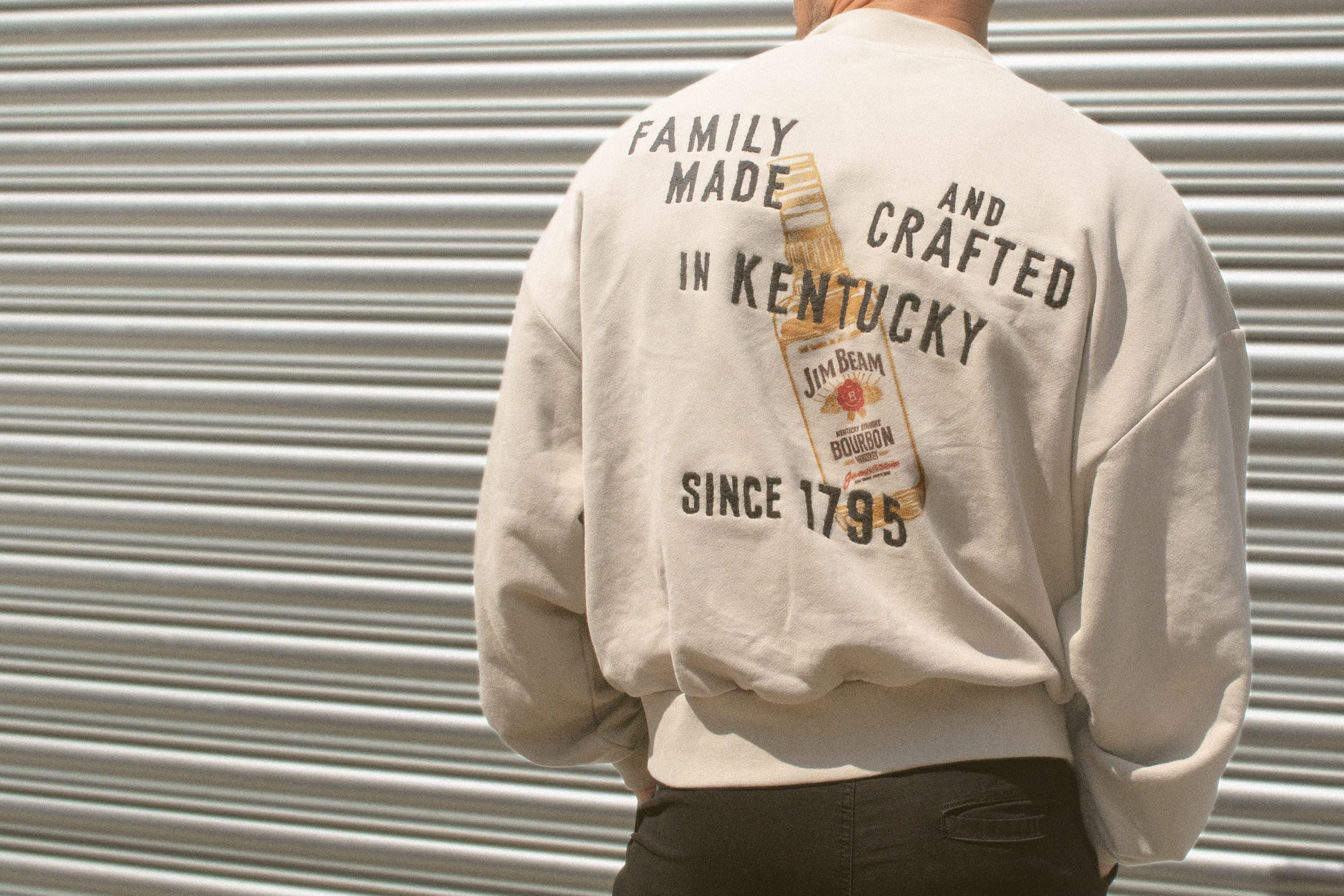
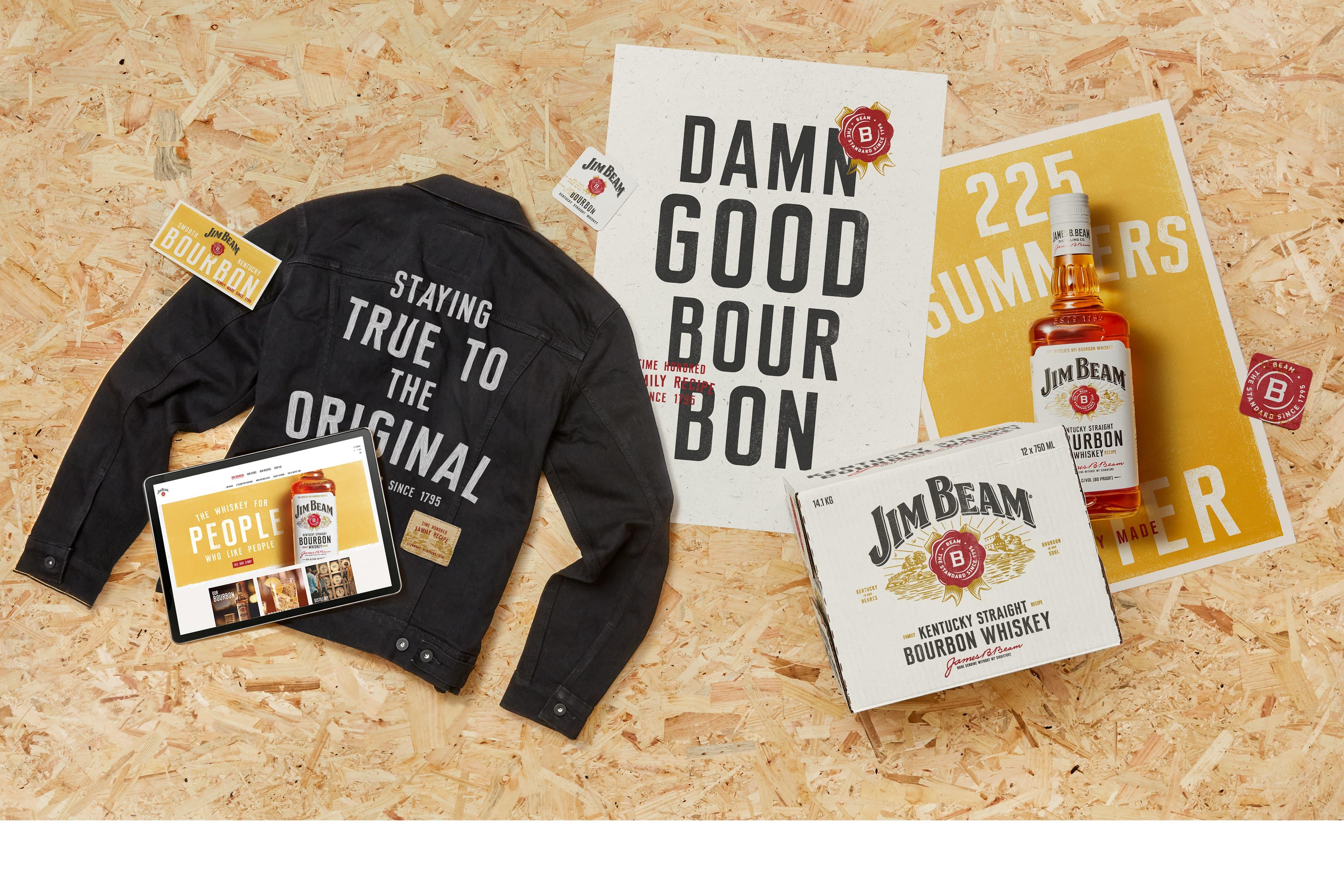
Jim Beam has a great story. A bourbon first bottled on the family porch in Clermont, Kentucky, still distilled where it was distilled on day one. A whiskey now in its eighth generation under a Beam family master distiller. It’s a brand that places a value on place, roots, family, and making great whiskey – a whiskey made "for the many not the few". But the story wasn’t coming through in the brand world. The bottle had drifted into a me-too of its biggest competitor, losing distinction and showing up in a world that lacked "soul".
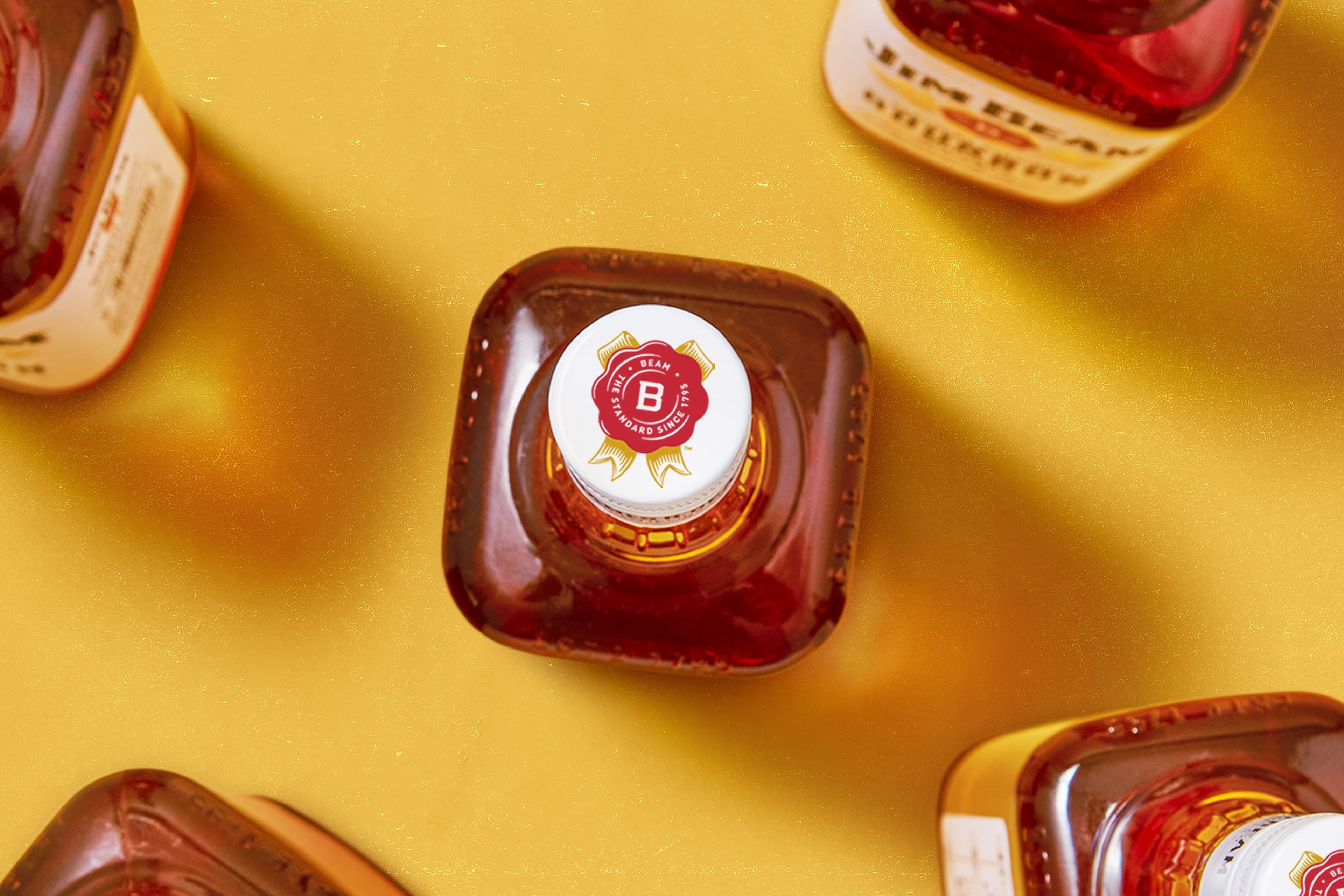
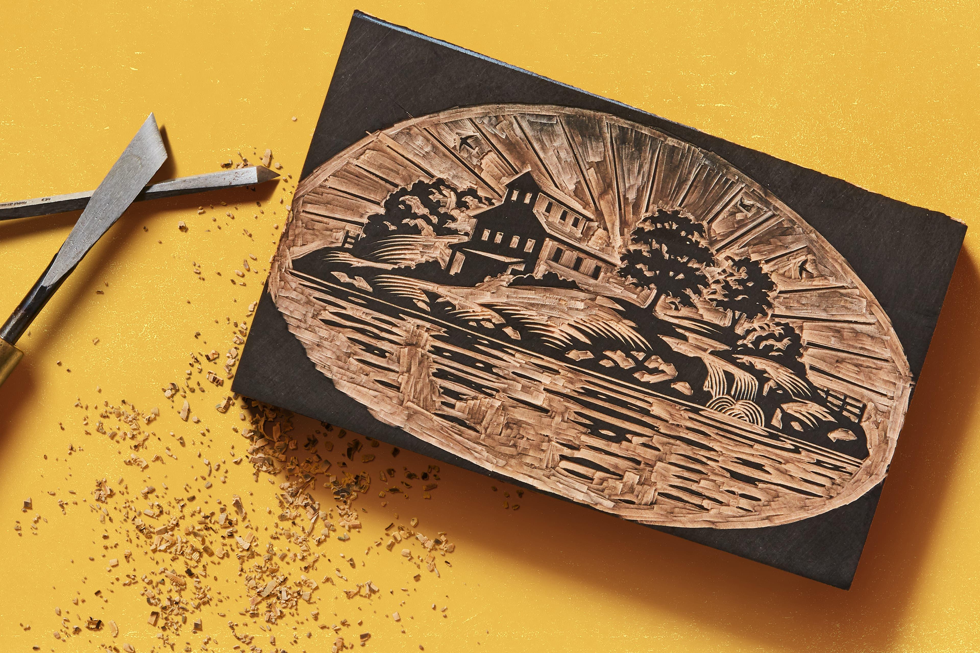
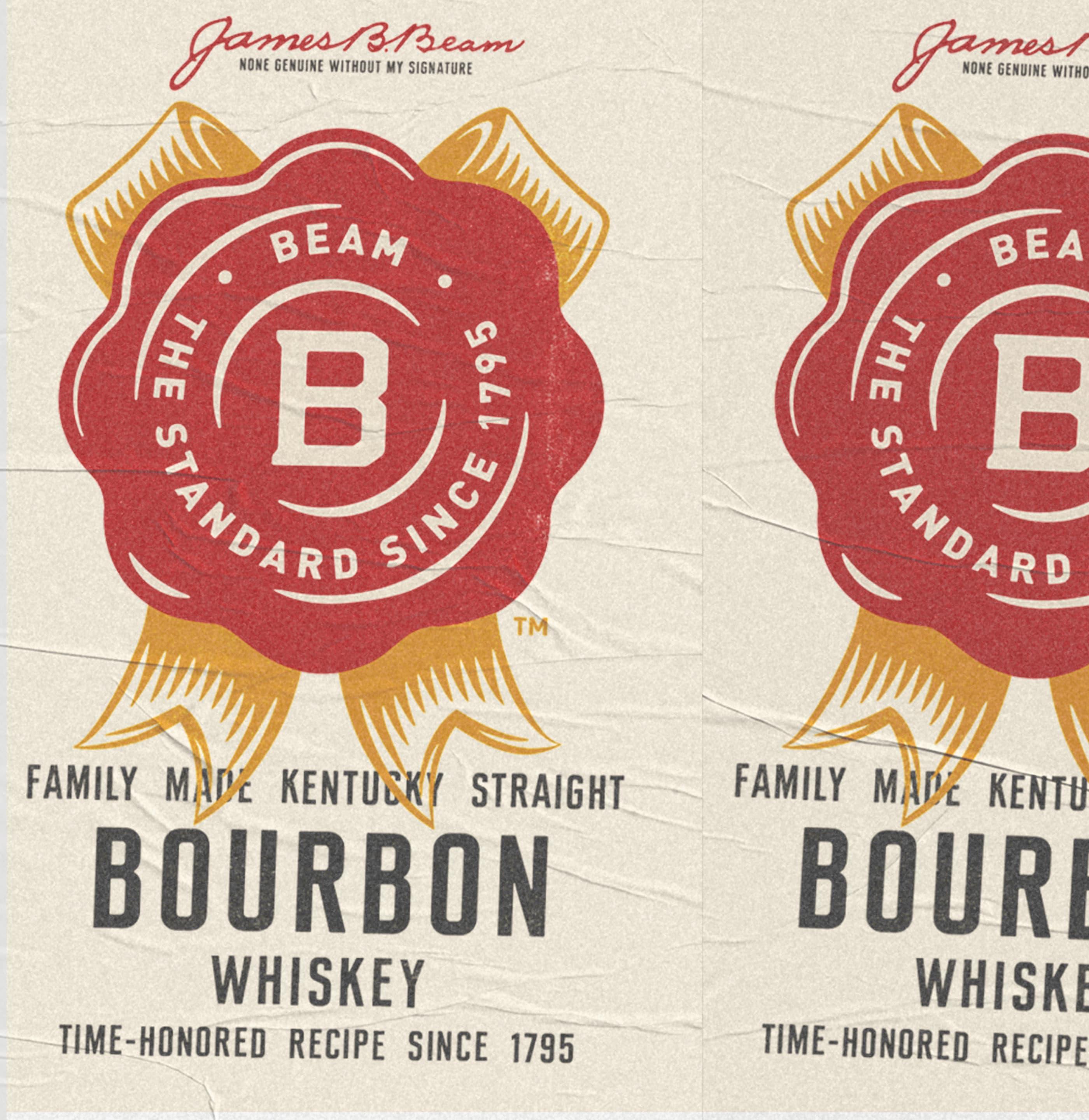
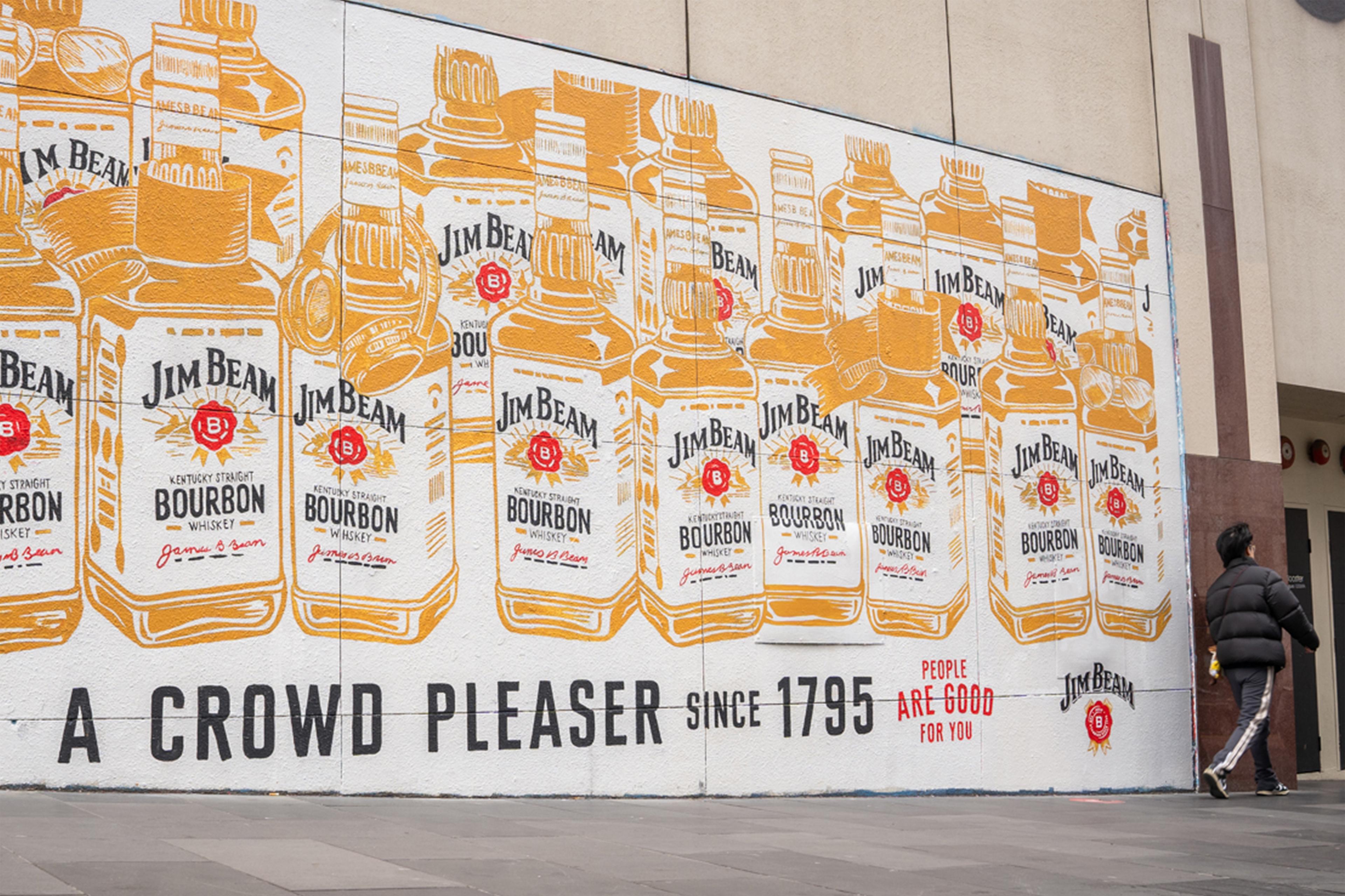
We took a long view of the brand, looking at the last century or so of Jim Beam bottles; all of which had the distinction and soul we were looking for. Then, using methods true to its local, grounded story – woodcut and letterpress – we recrafted the brand’s marks. Starting with its famous “swung” logo and warm red rosette.
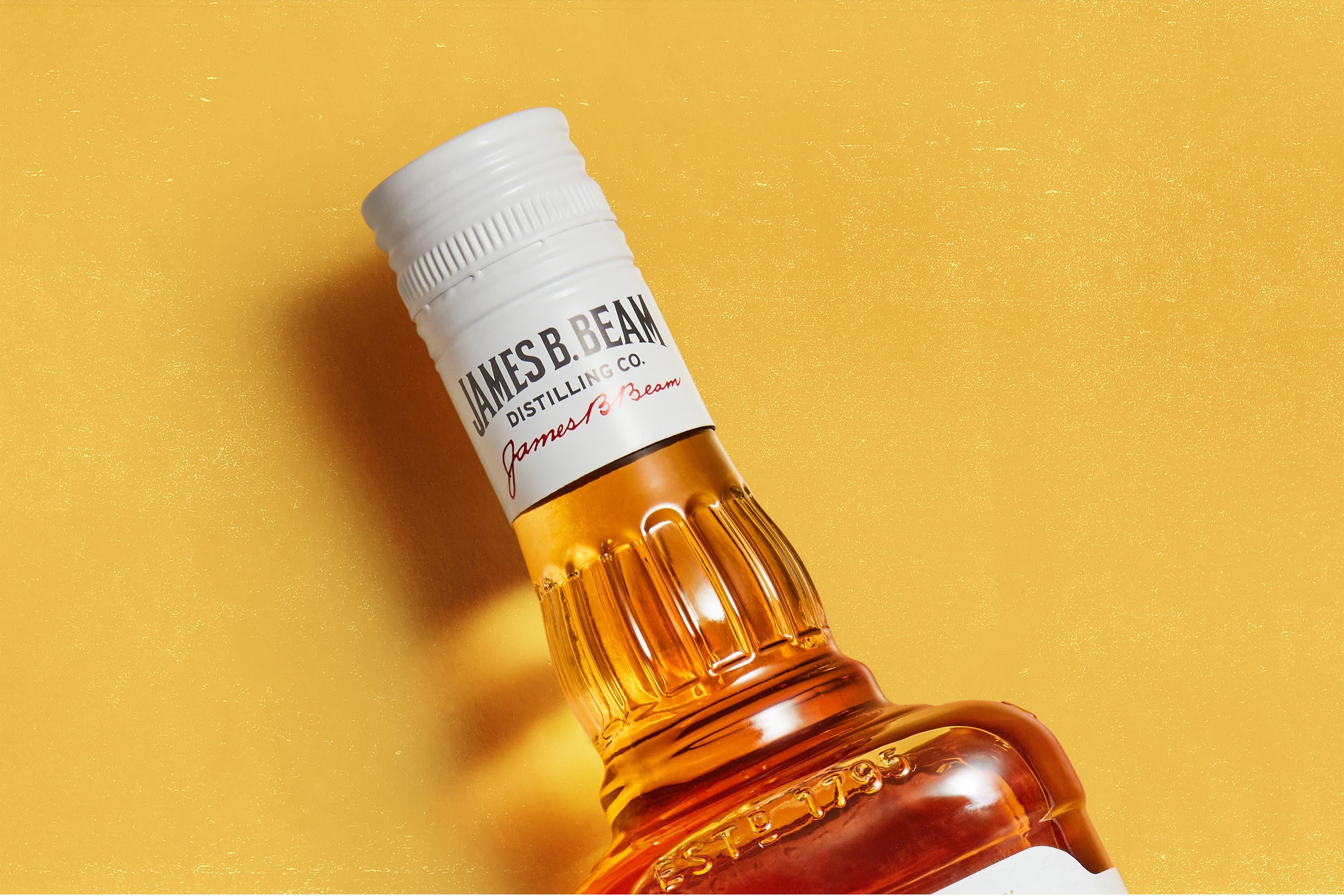
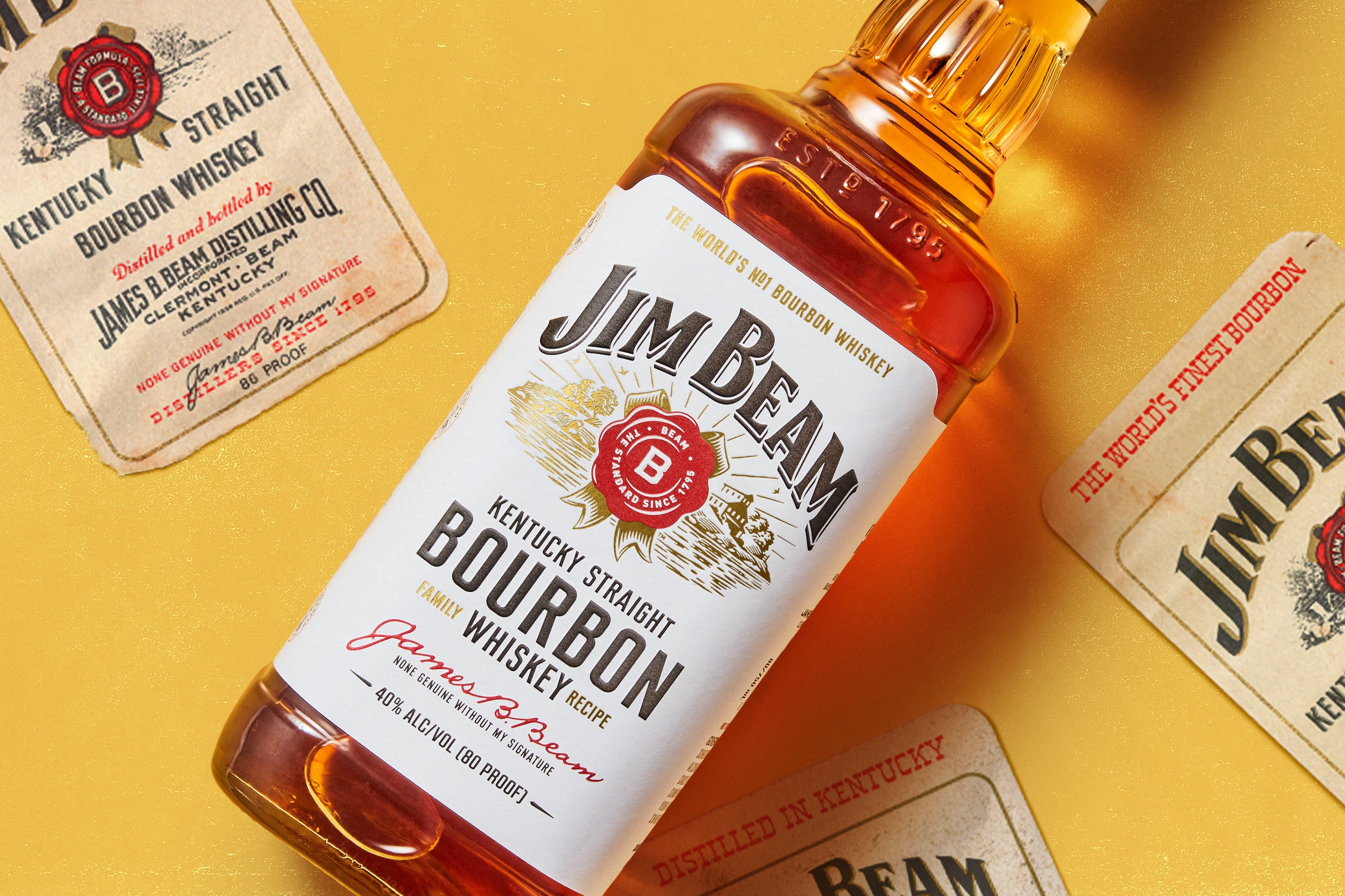
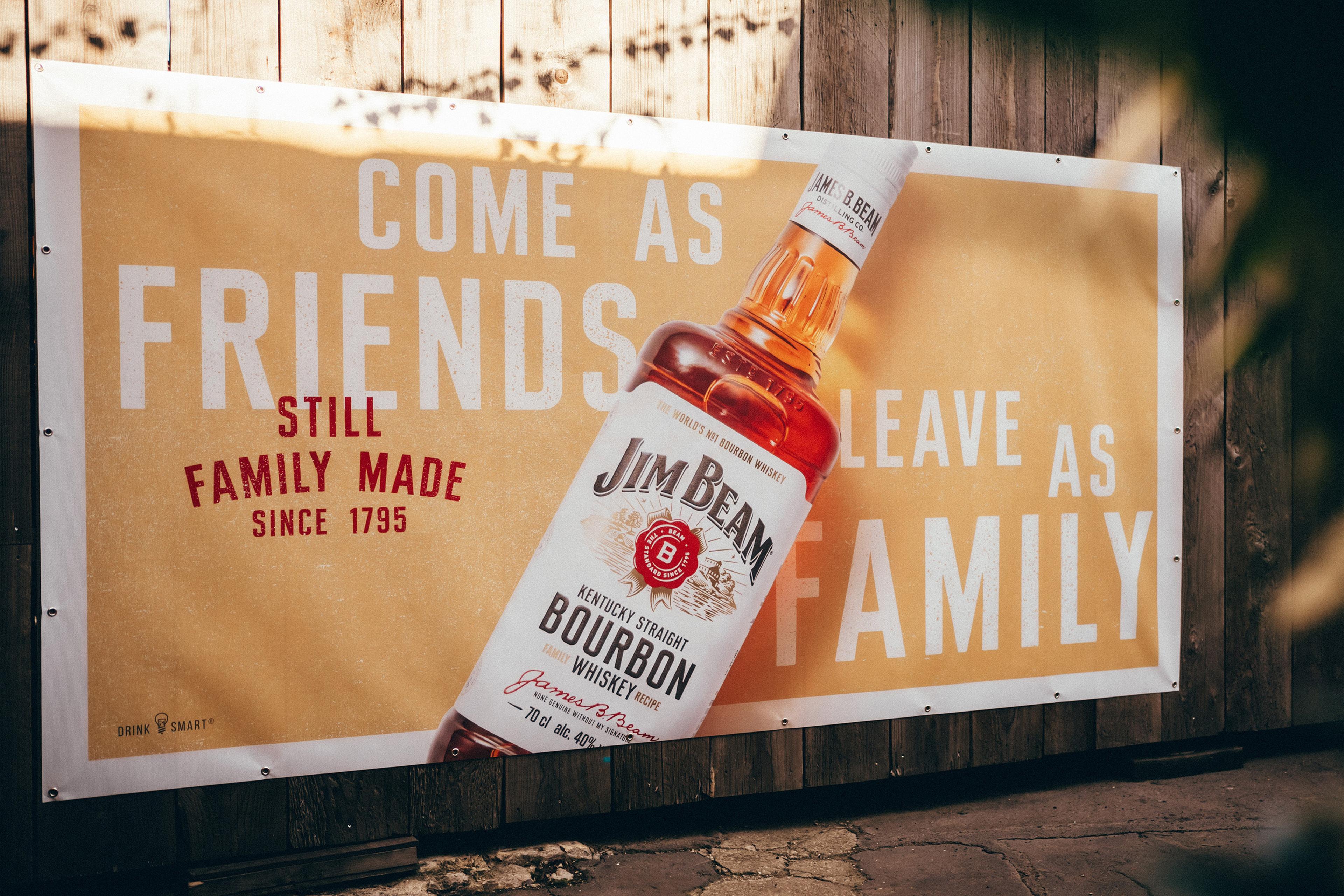
The bottle label went back to its original warm white (losing its black borders). We re-cut the lettering, in a nod to the brand’s archives, as “Kentucky Straight” – a signature face in which to tell the brand’s many stories (complete with idiosyncratic double-hit spacing). Then set those stories in an easy, conversational, way.
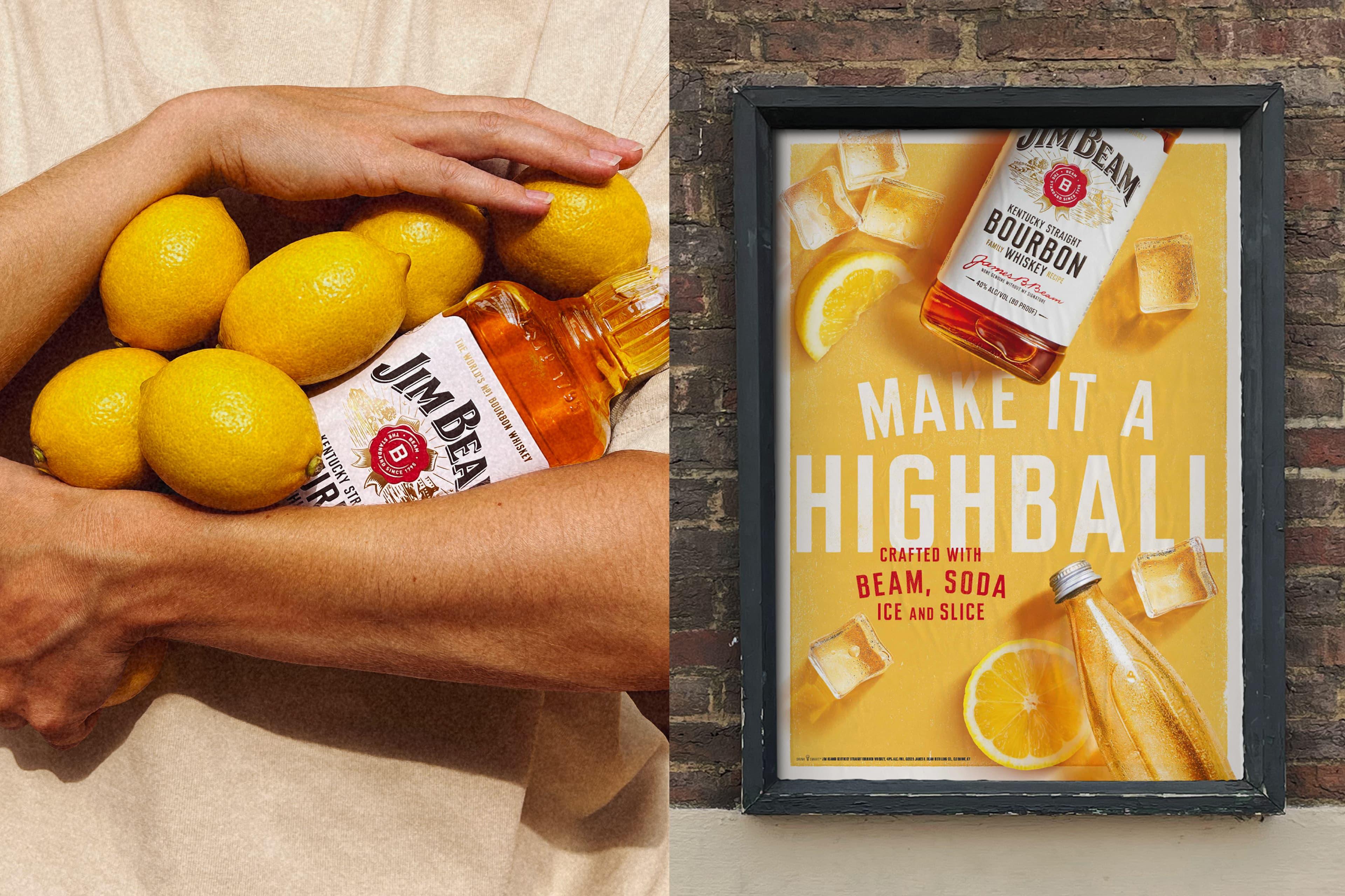
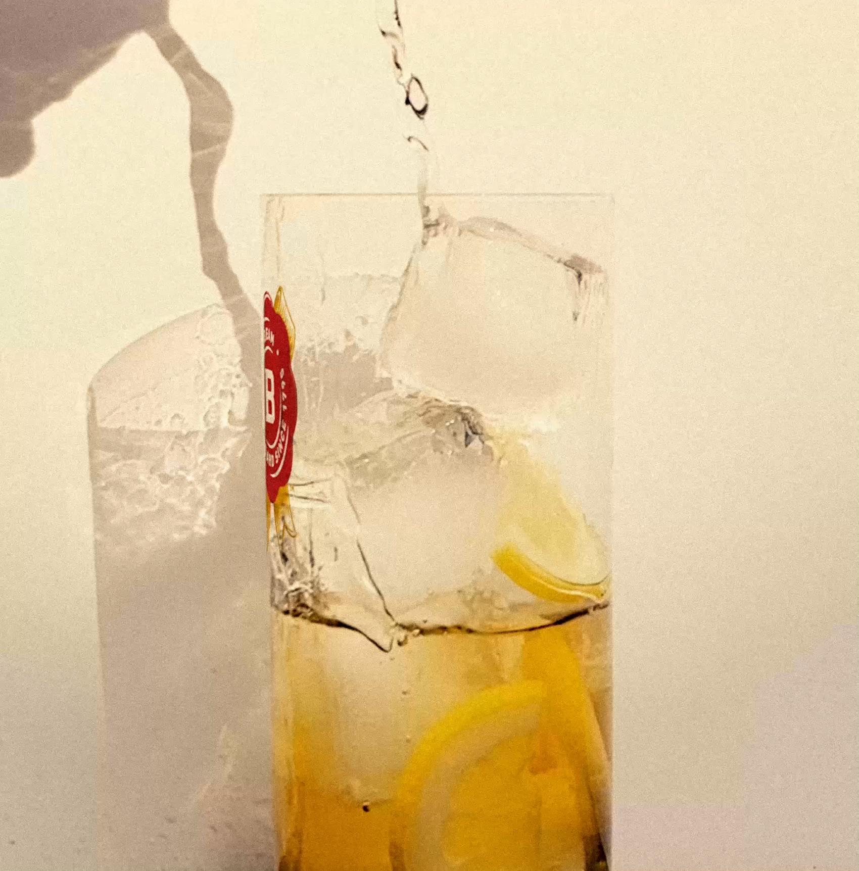
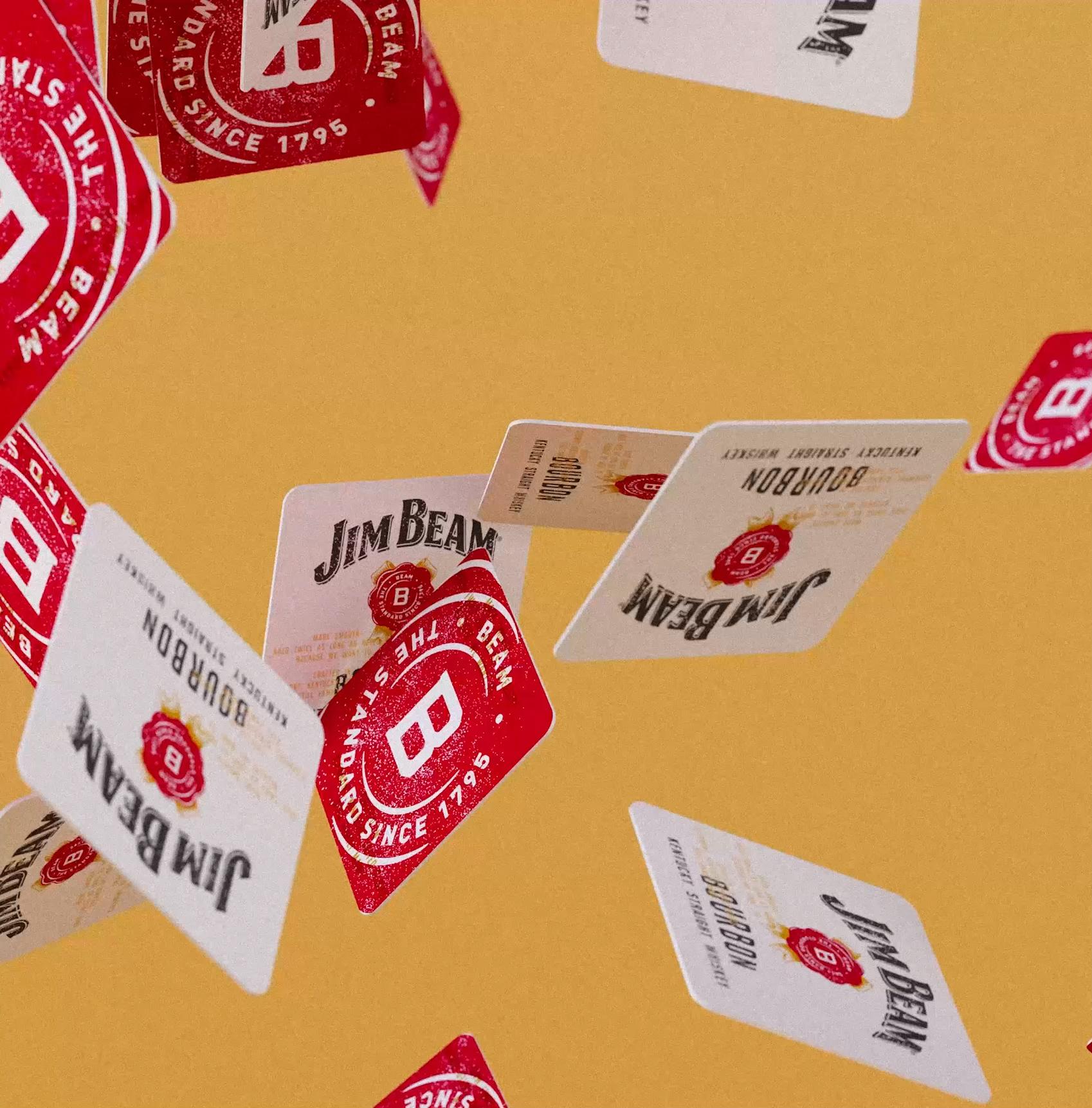
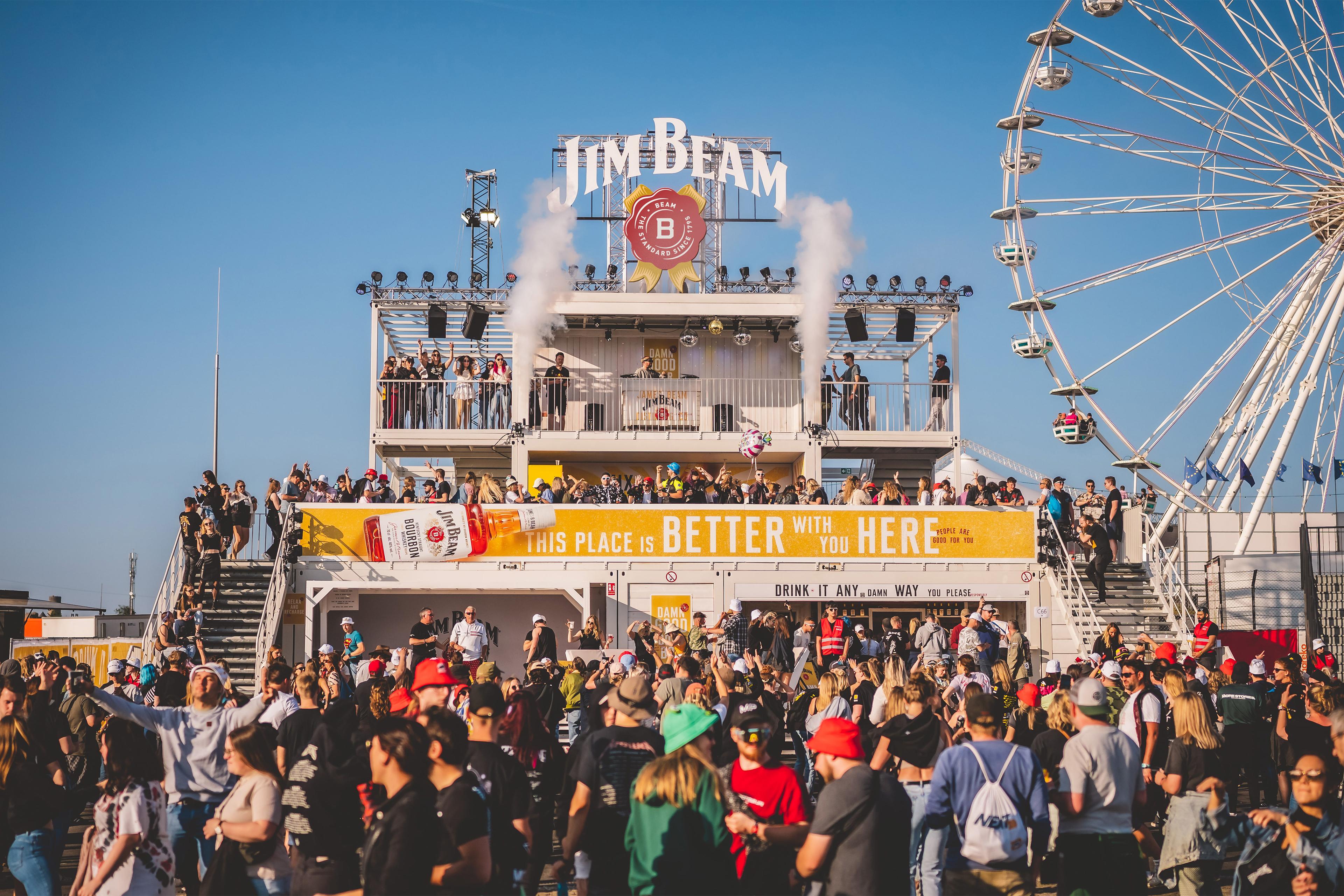
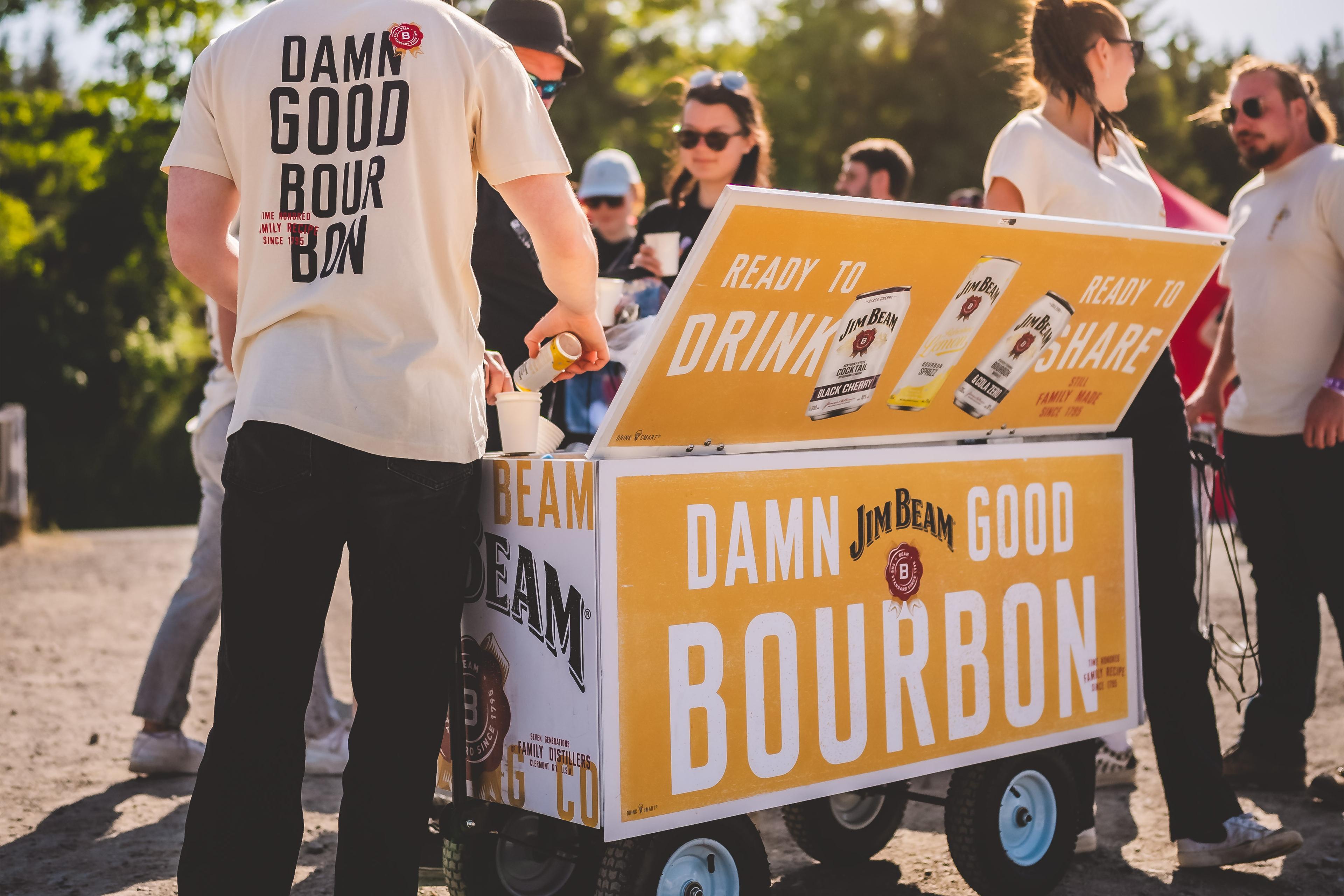
From a handful of assets and colors, anchored in the iconic and timeless bottle, we created a world inspired by the "spirit of the porch", with a well-loved, worn-in feel, a sense of easy confidence, an inviting quality, and a sun-dappled warmth – fitting a brand called Beam.
— Michelle Gannon — Jim Beam, Global Brand Director“Telling the story of the spirit of the porch alongside the unmistakable marks of Jim Beam enhanced all the brand’s familiarity - a generous, inviting soul true of Kentucky, true of the Family and true of the brand.”
Woodcut Illustrations: Andrew Davidson
Logo : Rob Clarke
Photography : Josh Caudwell
Tyeface: Mika Melvas
Rosette : Garry Redford