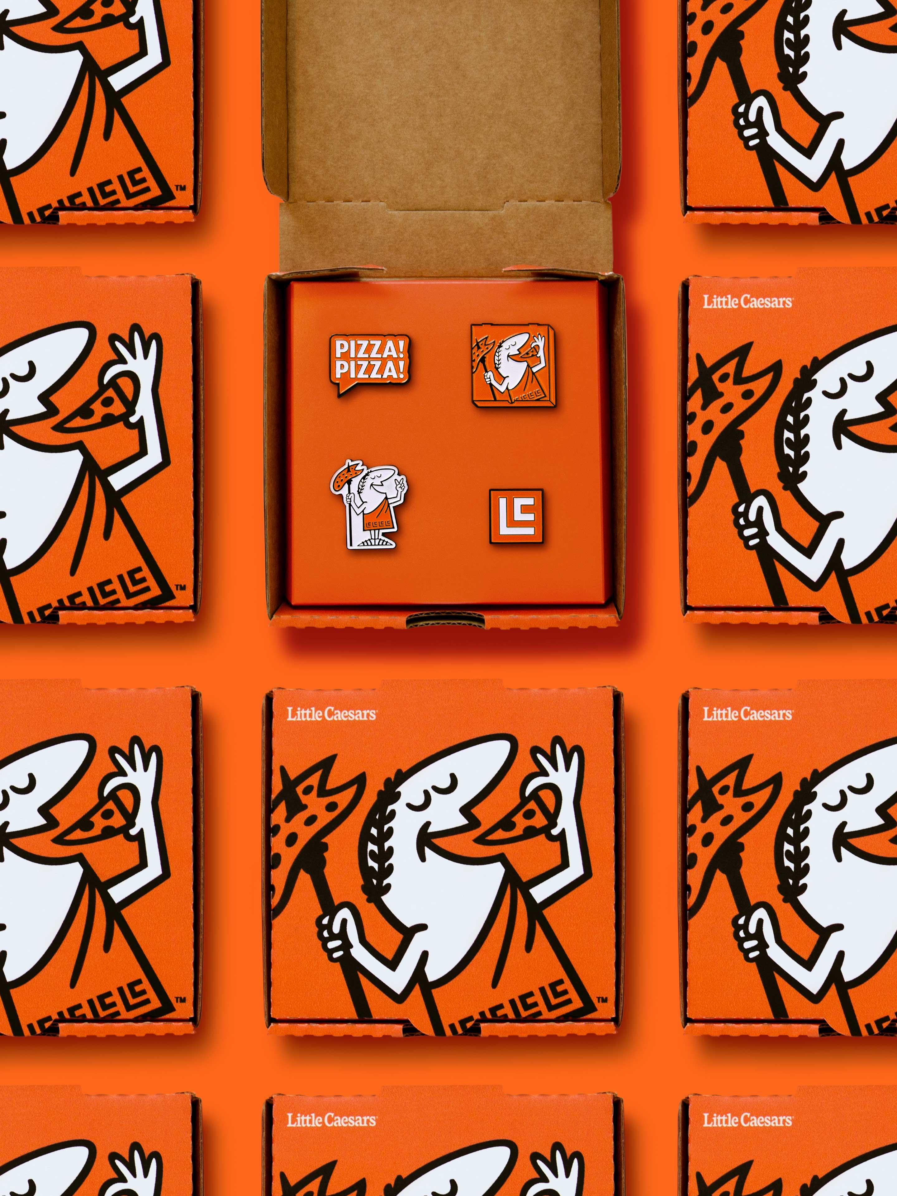
Being named “Best Value in America” for 10 years in a row, was a blessing and a curse. A great honour for the business but to the consumer, the perception was that low prices meant low quality—when, in fact, a simple set of fresh ingredients and smart distribution methods helped keep the prices down. So we set about elevating perceptions and contemporizing the brand for customers all across the world.
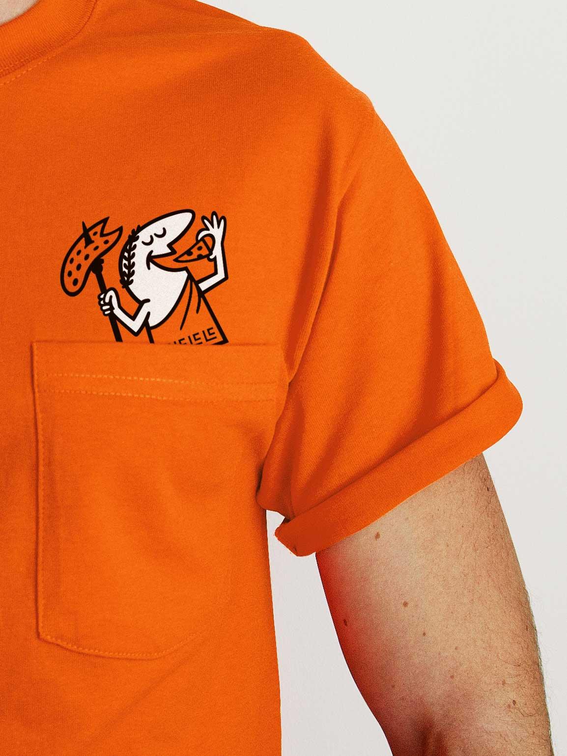
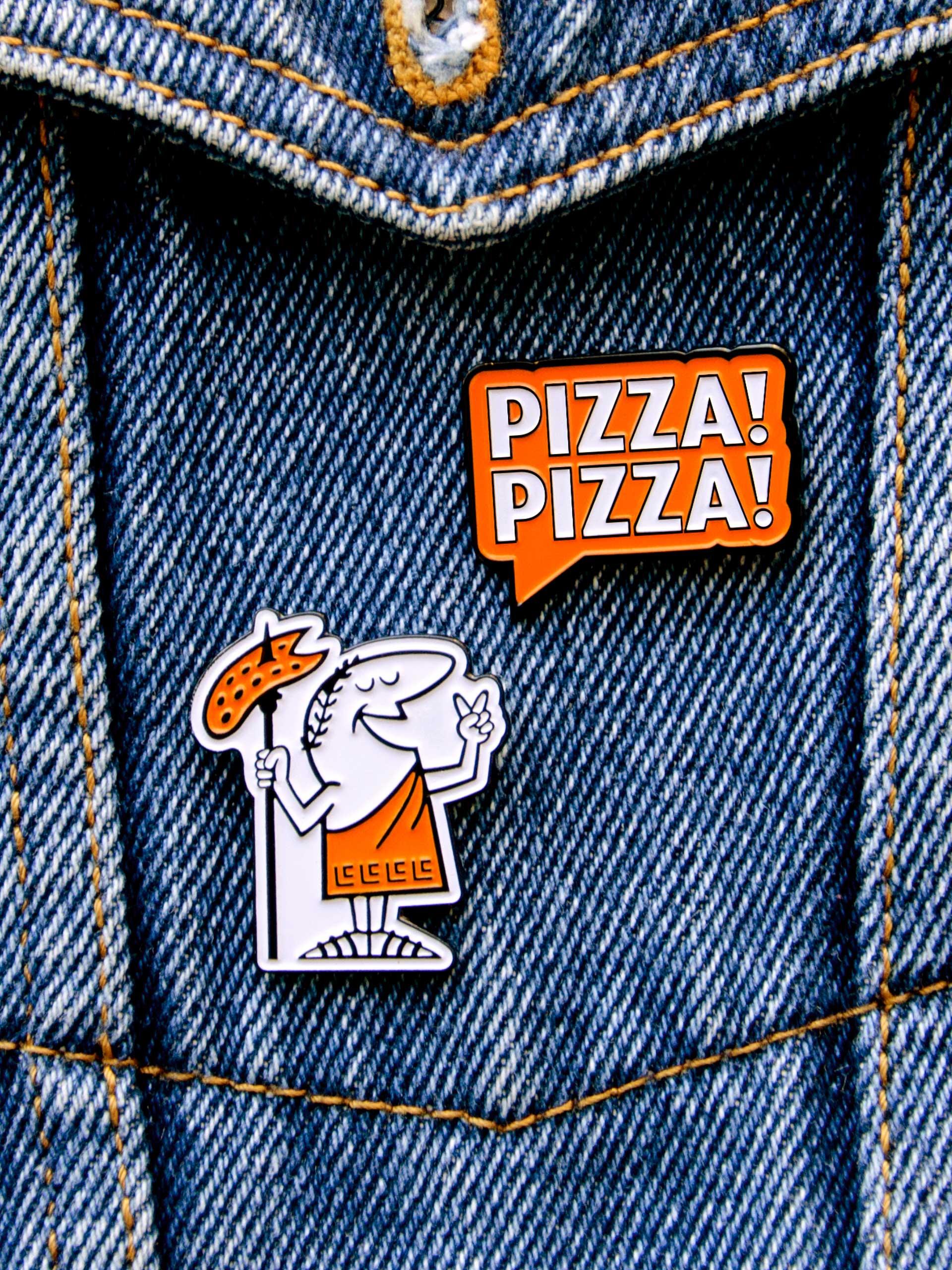
Little Caesar was lovingly restored (and manscaped) with a respectful nod to his original 1950’s cartoon heritage—creating a singularly consistent image. The Little Caesars wordmark was optimised, developing versions for various global markets alongside a custom typeface and unique typographic style. Design decisions were inspired by the products themselves—simple, bold, and handcrafted.
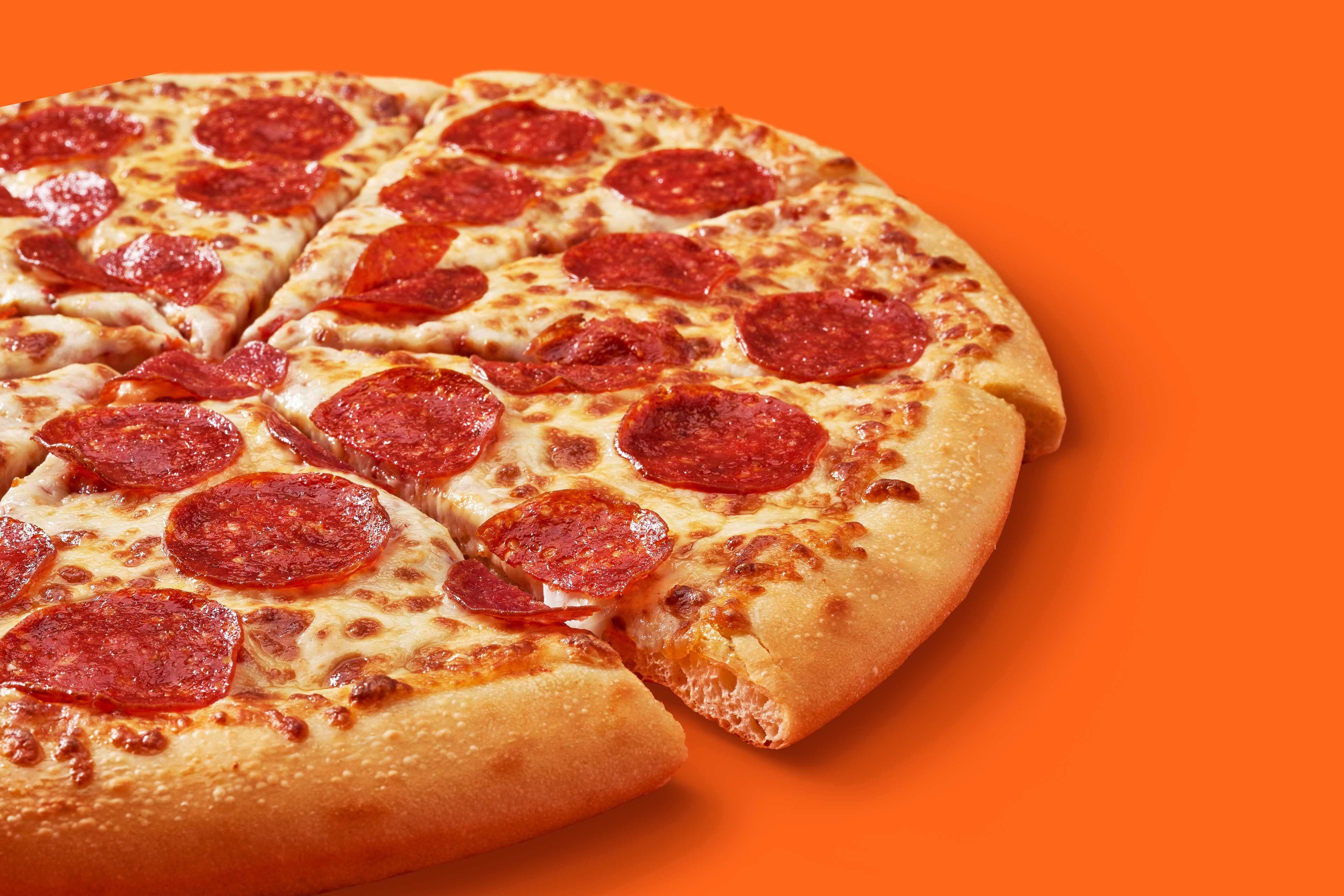
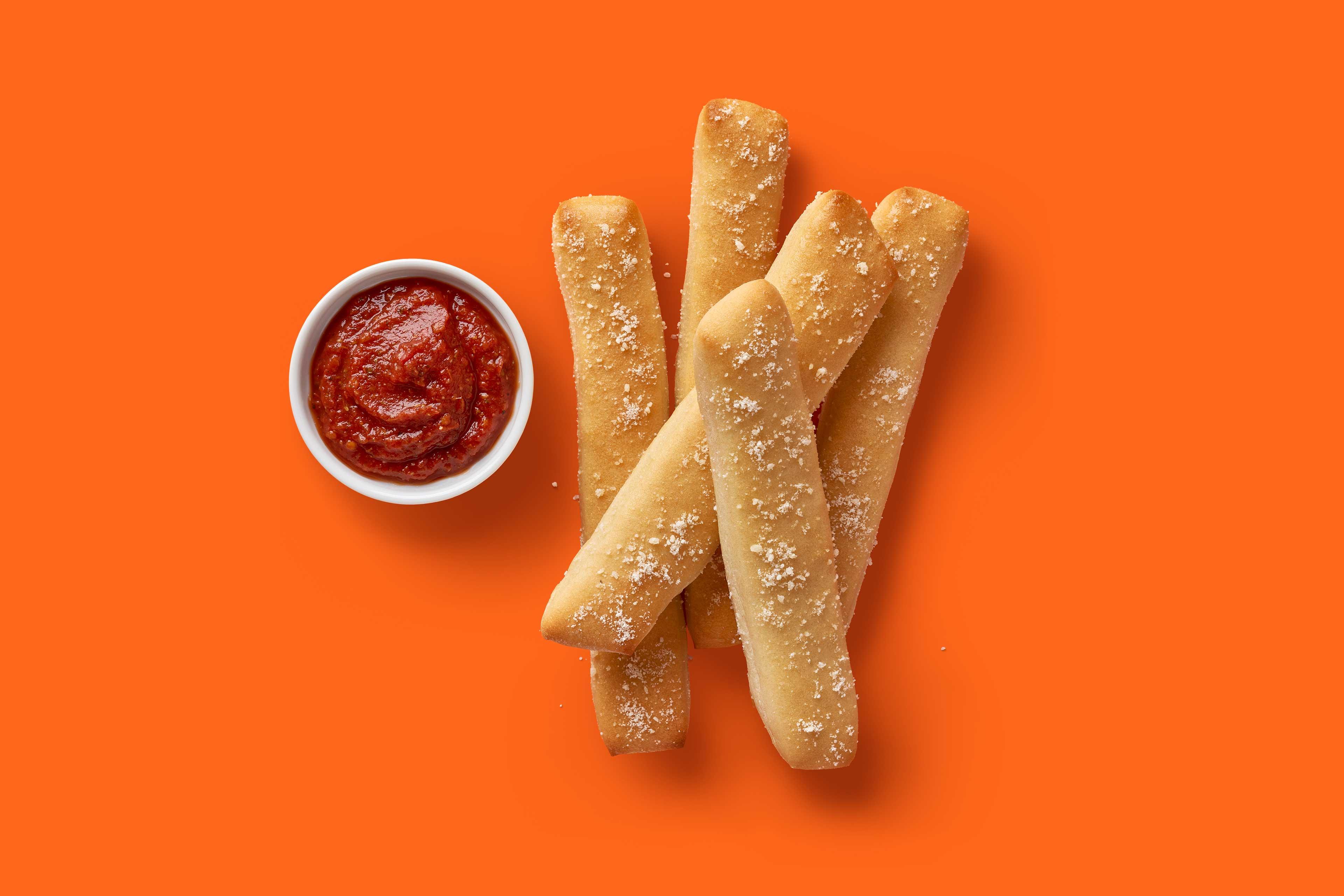
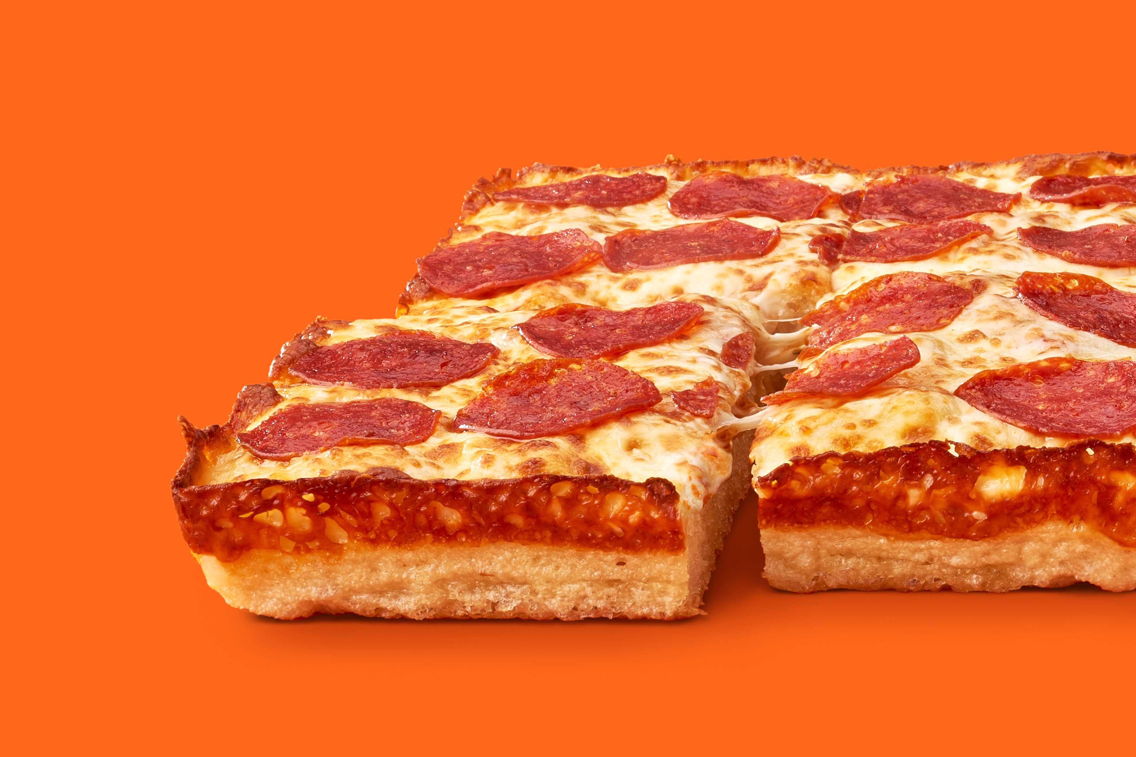
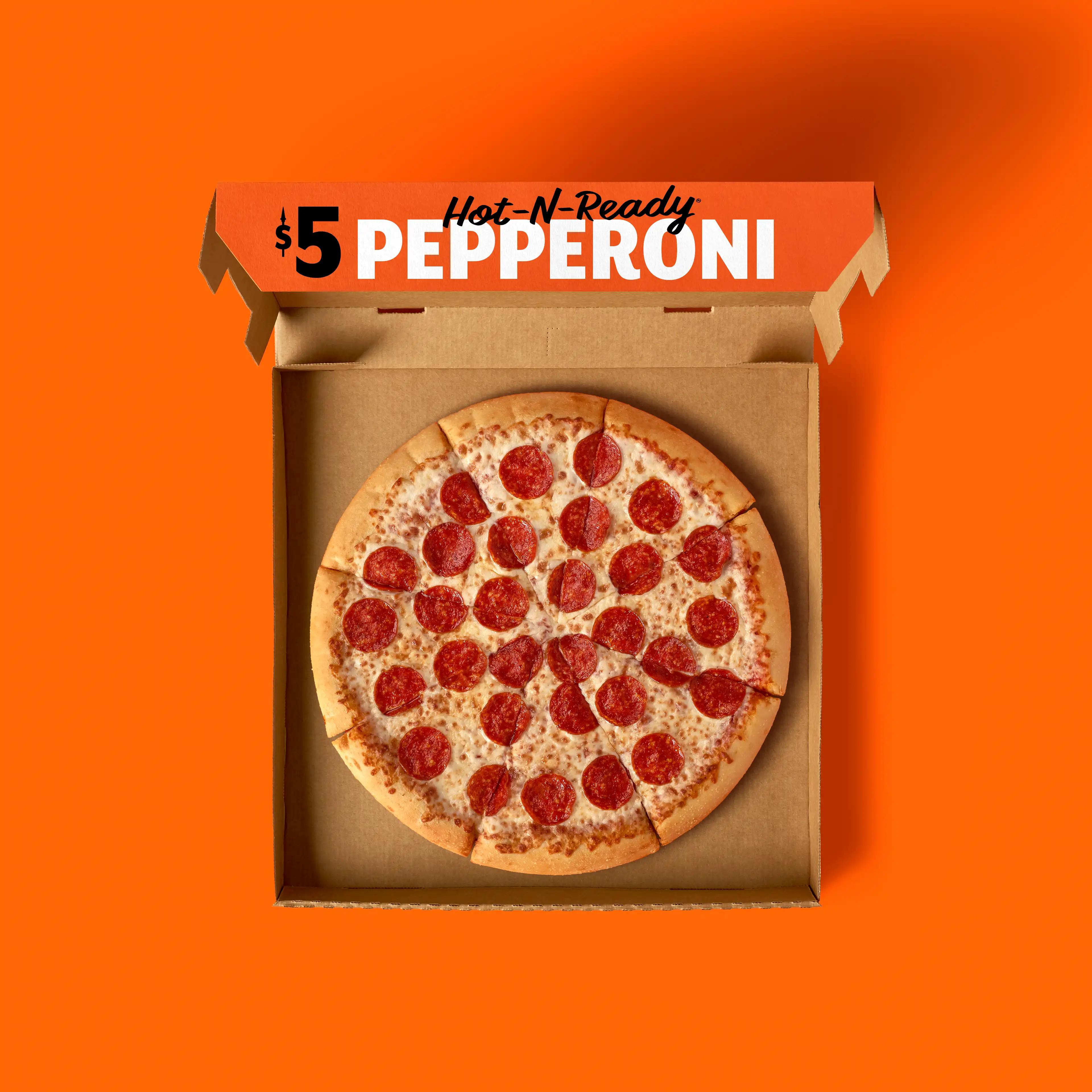
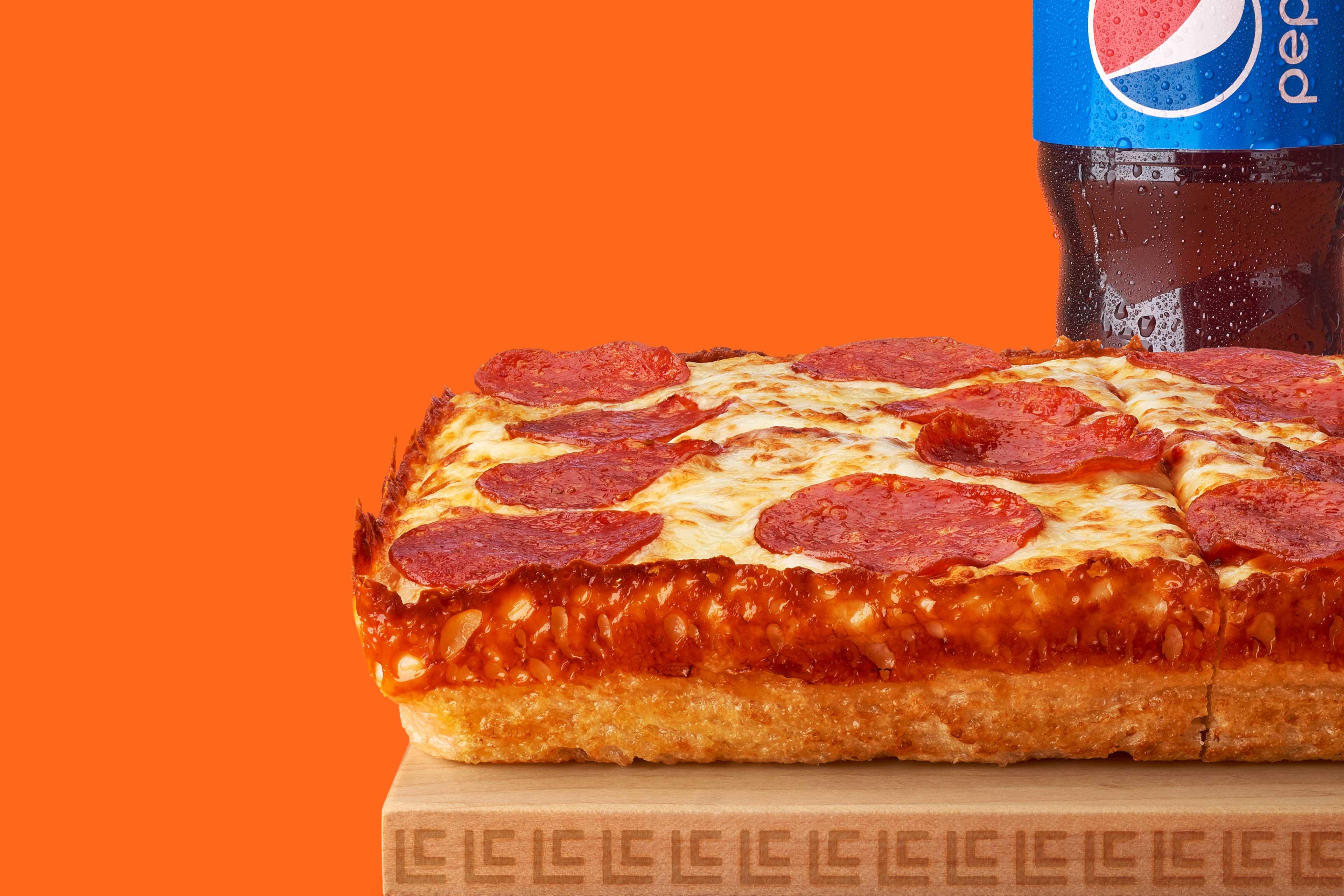
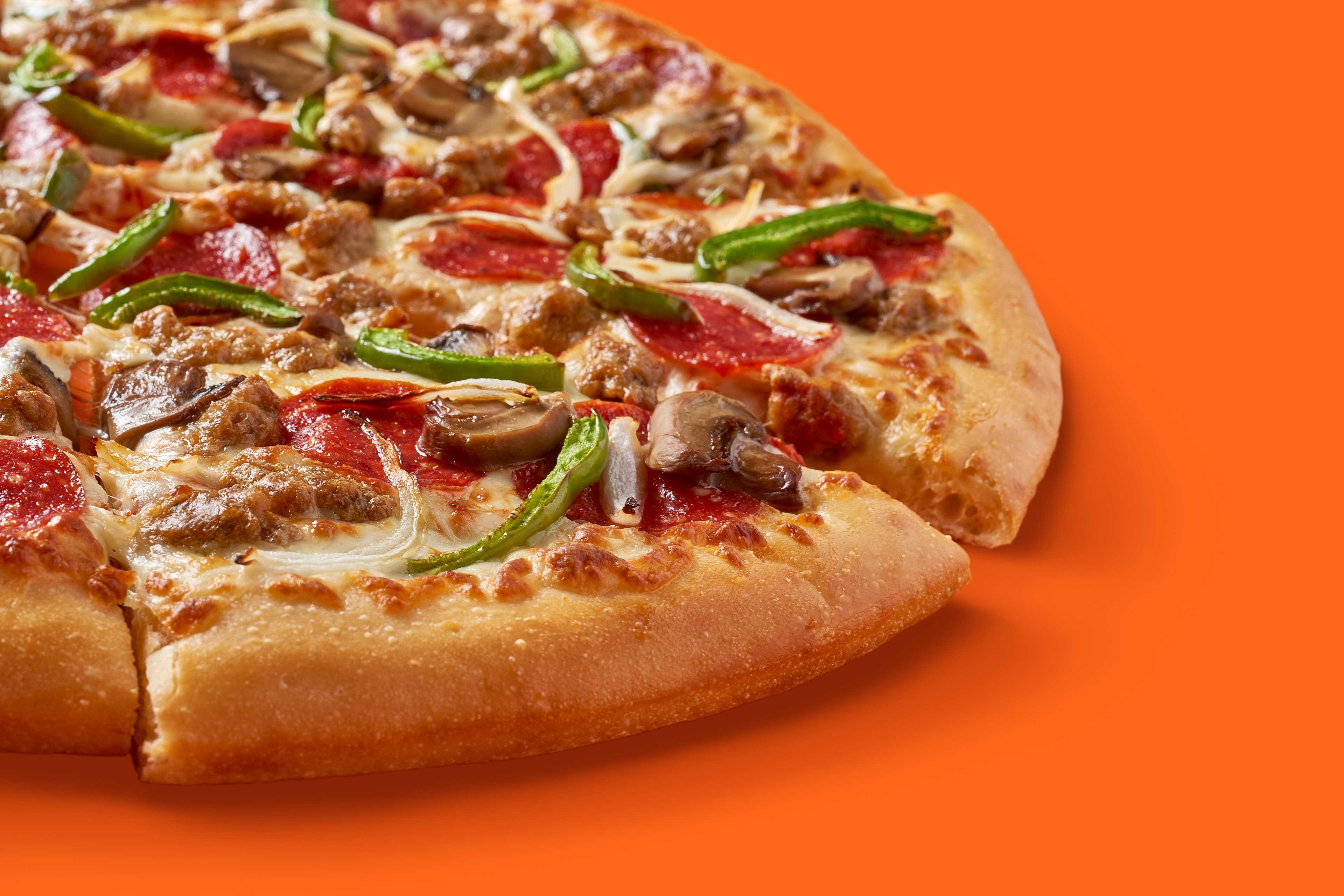
Through motion, Little Caesar was able to resume duties across his empire; social posts, ads, TV end cards, the ordering app, and even at the Little Caesars Arena. The animations gave depth to the character, melting hearts as well as cheese. We focused the colour palette and dialed up the deliciousness of the food photography. From products to promos, we unapologetically heroed orange all across the brand.
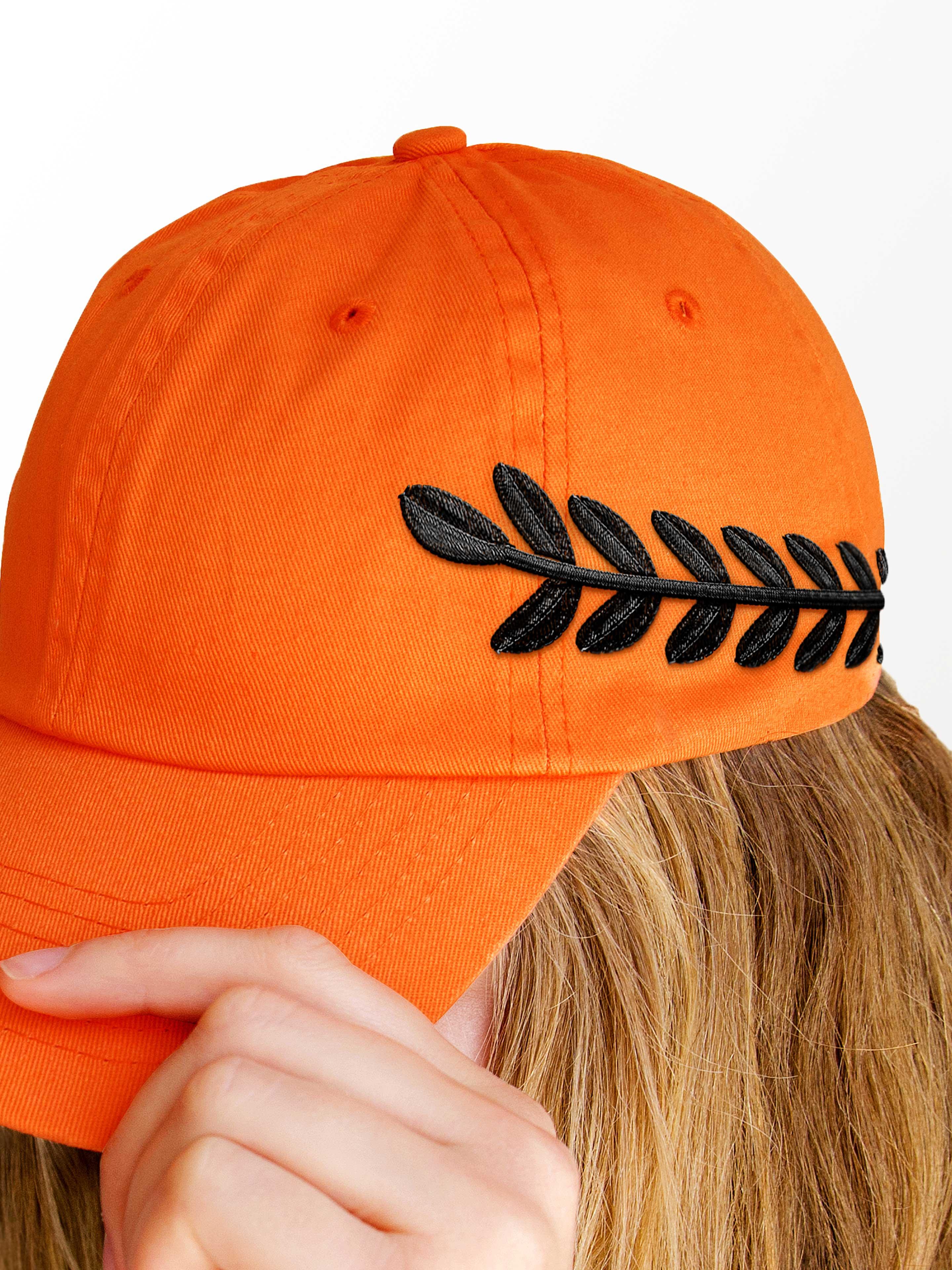
In addition to an array of new poses, props, and animations, we highlighted iconic aspects of Caesar’s ensemble. His spear, laurel crown, and toga monogram are now celebrated symbols for the brand. Customers had many “aha” moments when noticing the new details peppered throughout the brand experience. Some wondered if the details had been there all along…
