Rise has a simple ambition; to lead the movement to democratize cannabis. So that everyone, everywhere is free to access the benefits of this remarkable plant. To be a leader, it needed to look like a leader, which is why they came to us for a new identity.
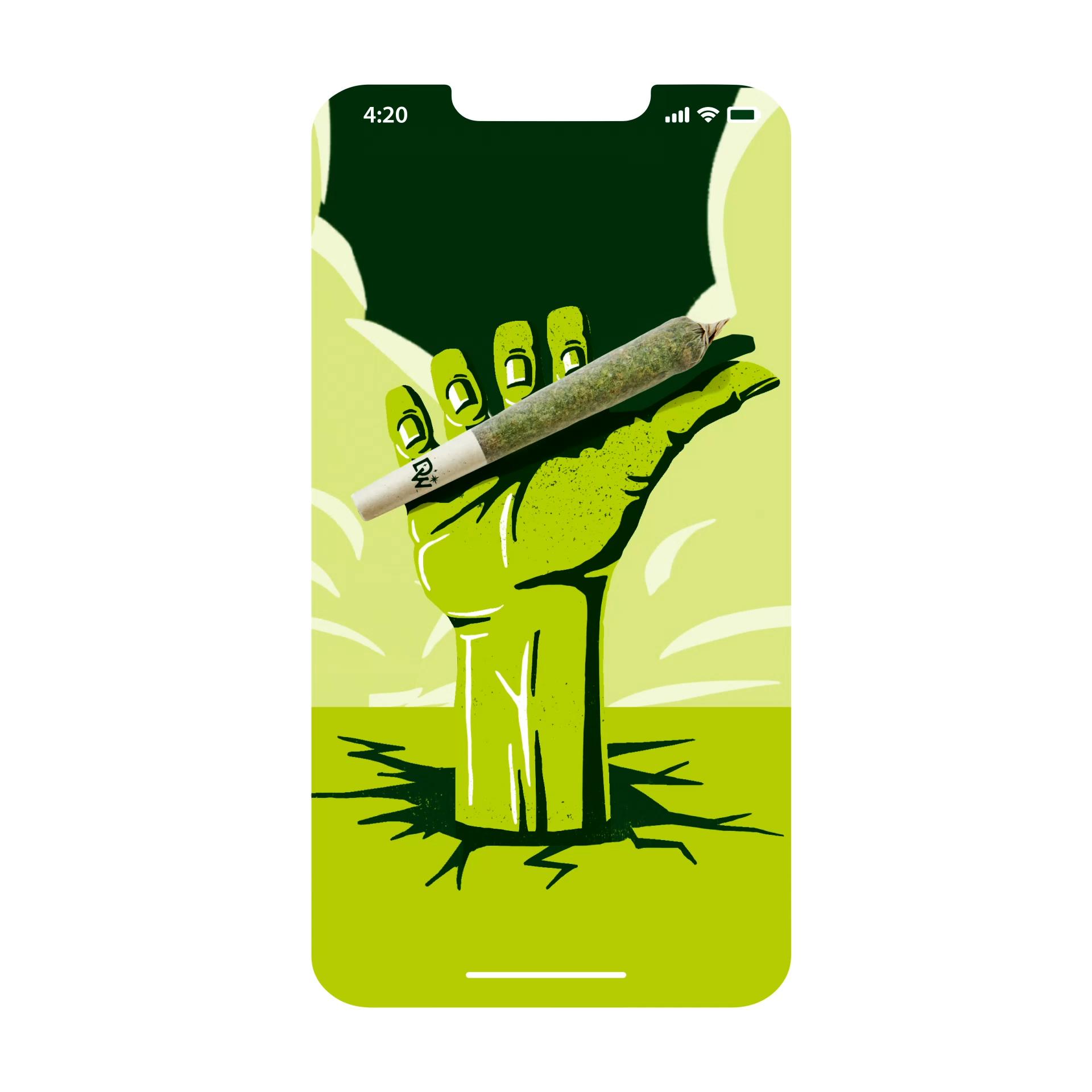
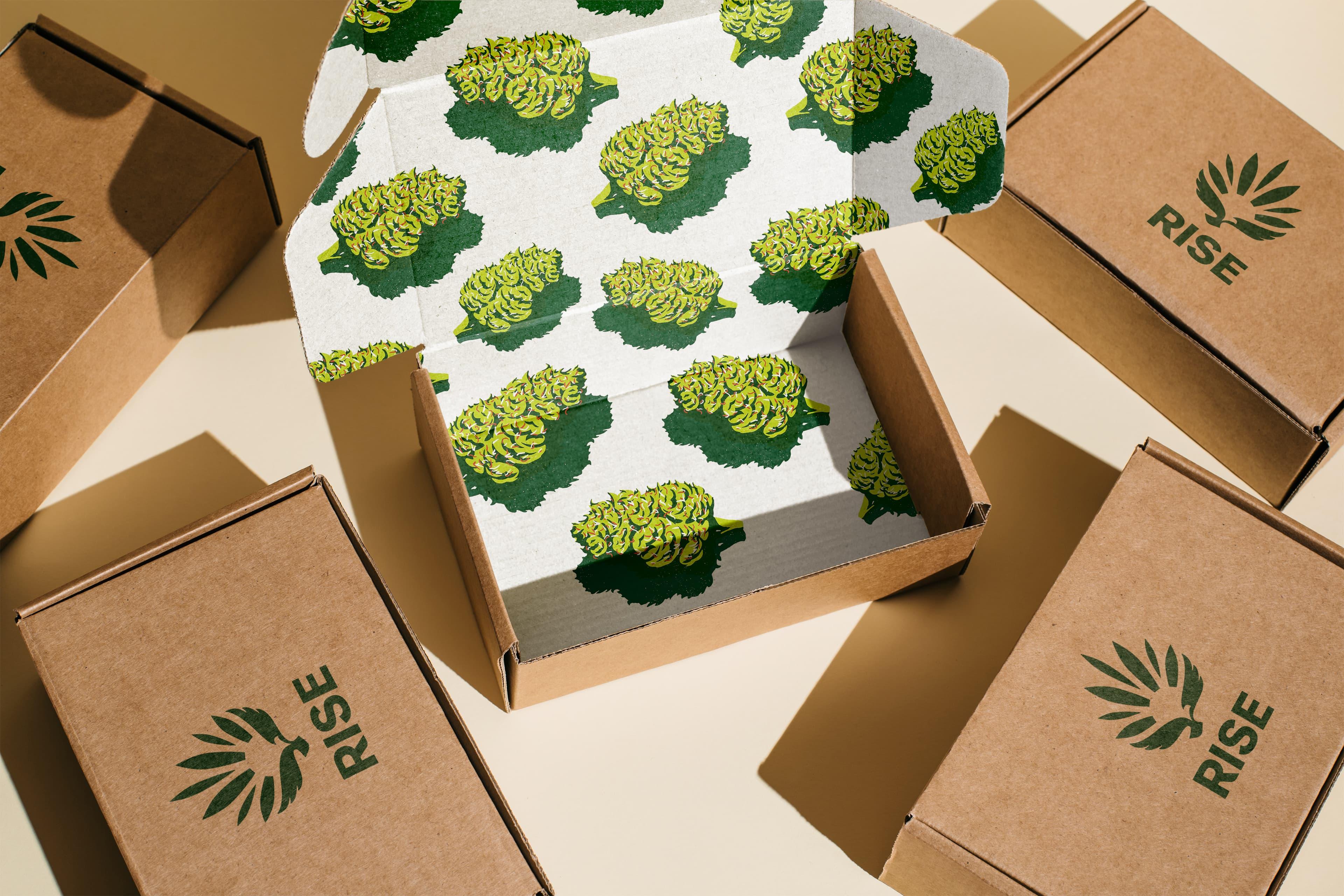
To capture the brand’s beliefs and values, we created a strong, distinctive brand mark that people could get behind and proudly wear. A bird of freedom, movement, and positivity was crafted, rising upwards with wings proudly open and head looking forwards, while still being grounded in the plant and nature. It both empowers and enlightens, capturing the healing and transformative qualities of cannabis.

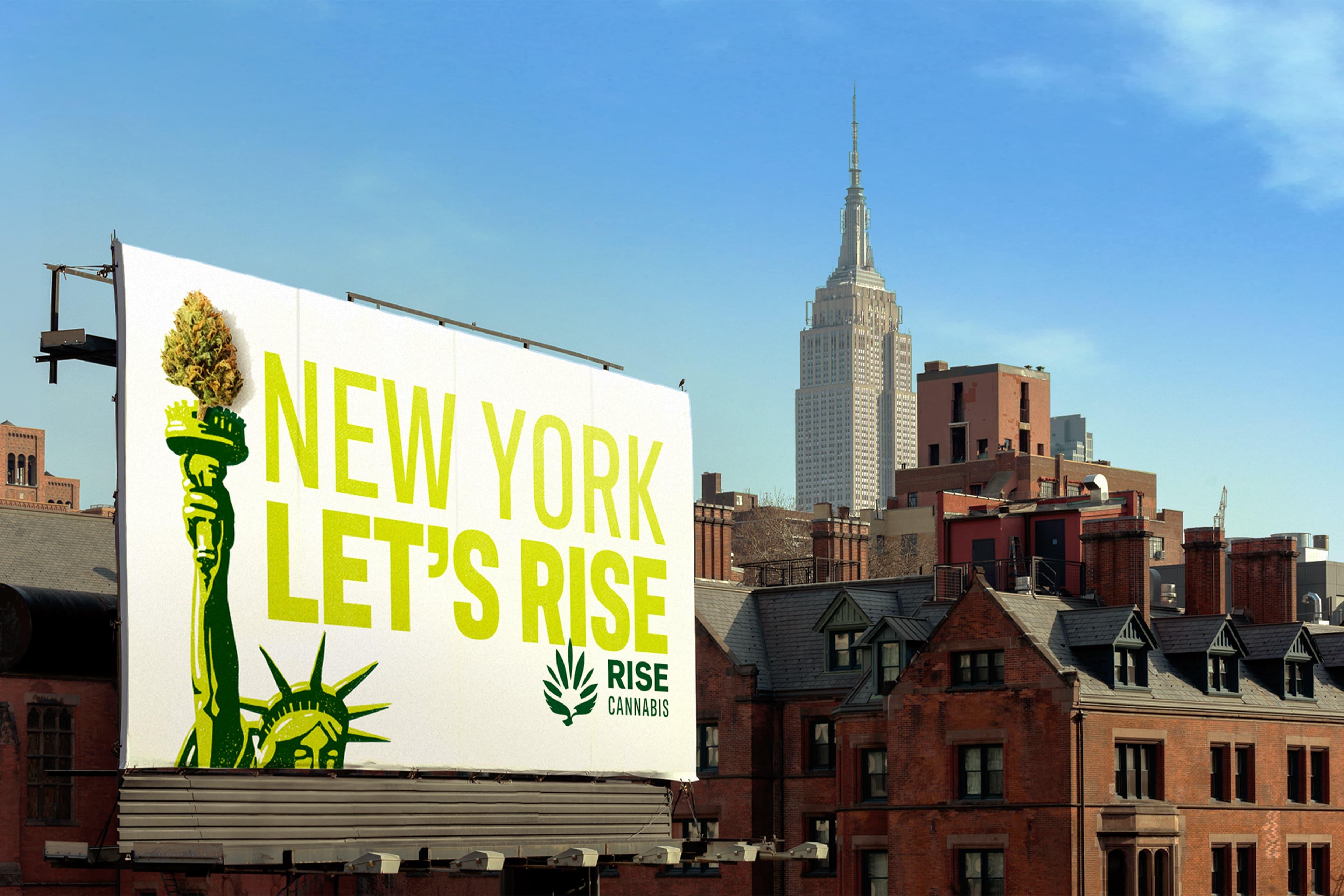
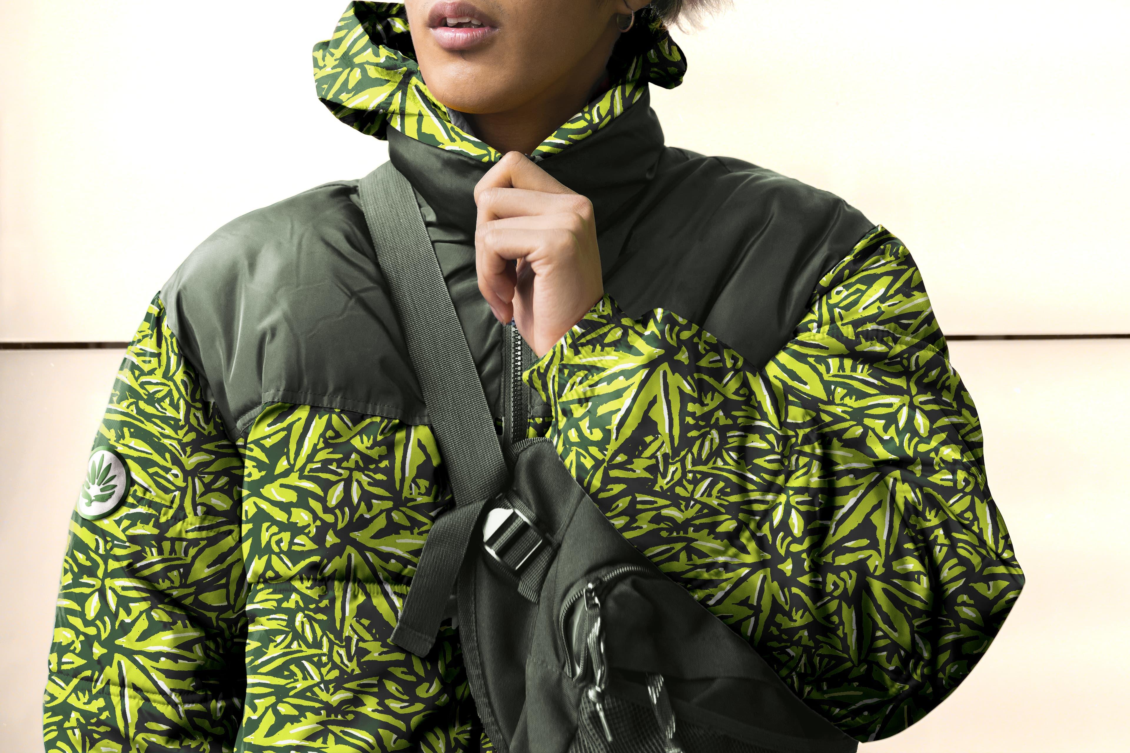
The brand mark and identity were designed to be flexible and adaptable, allowing RISE to appeal to a broad range of adults, from medical to adult-use patients and customers, while also overcoming challenges related to various state regulations.
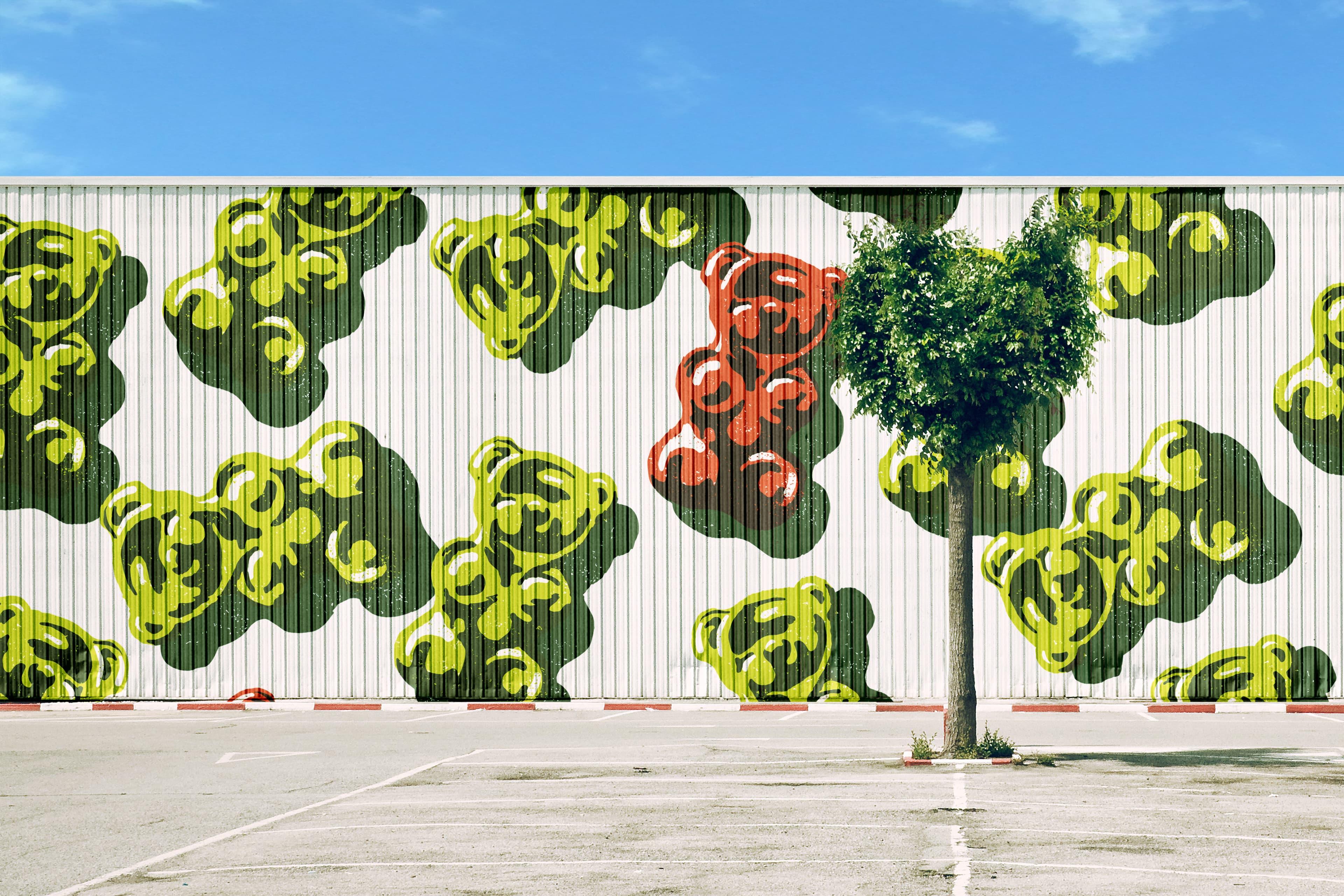
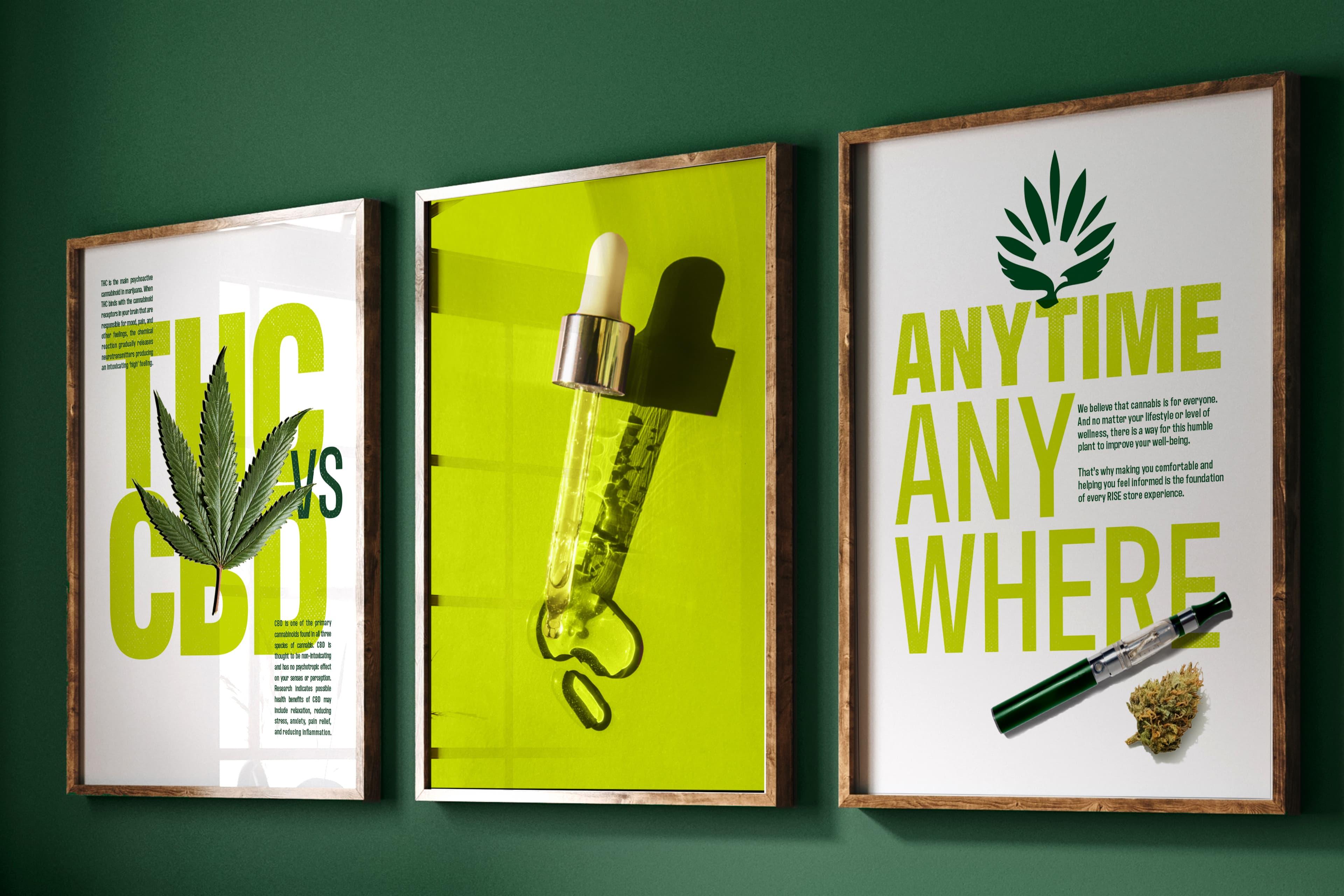
Both the illustrative and photographic style is inspired by the rays in the RISE icon, resulting in a bright, optimistic, and empowering aesthetic that incorporates natural sunlight casting long shadows.
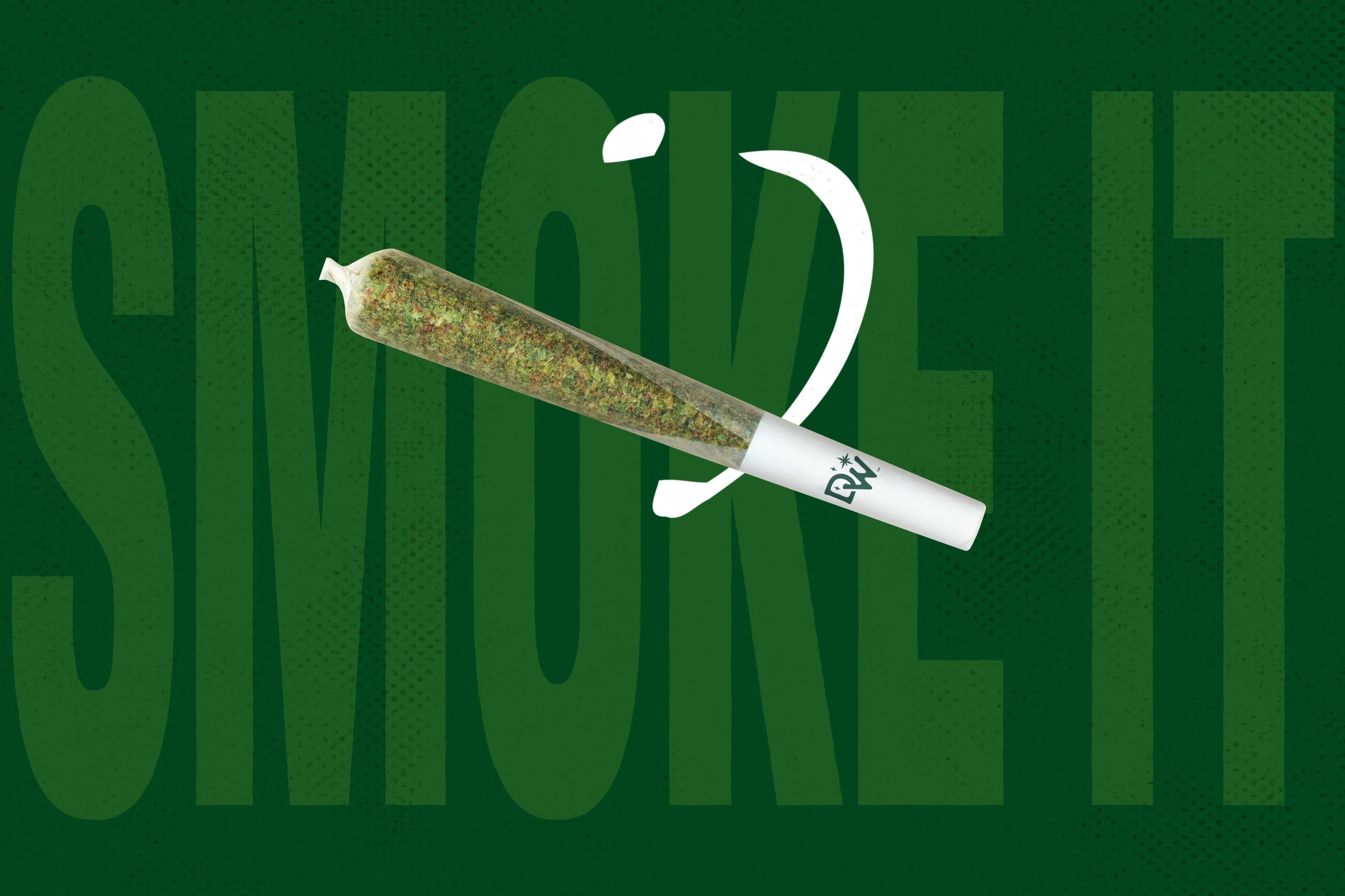
The brand mark is accompanied by a bold, vibrant color palette inspired by the cannabis plant and its products, as well as a raw, textural, and imperfect aesthetic that is disruptive and irreverent.
RISE is a brand that embodies freedom, progress, and healing. It's unapologetic, disruptive, and empowering, and we believe its identity now fully captures this spirit.