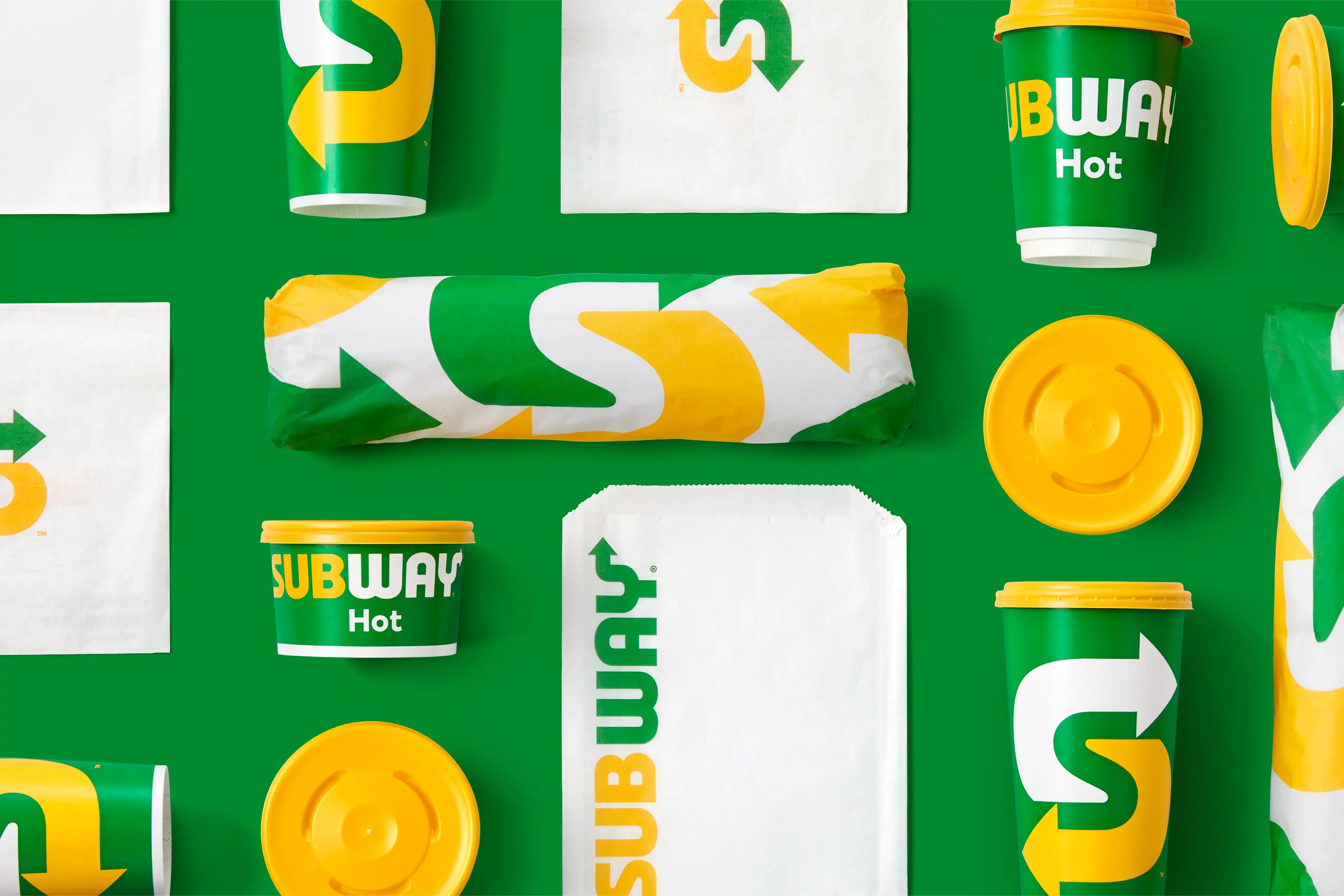
With 44,000 locations globally and an almost infinite combination of fresh tasty options, Subway was at the top of its game. The same could not be said of the identity. It had grown stale and lacked the substance to satisfy the expectations of a more savvy consumer who hungered for a more relevant and inspiring experience.
The identity was centered around a timeless new logotype, inspired by the original Pete’s Subway signage from way back in 1965. The logotype inspired everything from a freshened and updated colour palette, to new custom typography, and ultimately a much-needed shorthand symbol. The “Choice Mark” was designed to work functionally on social media, and also reminded consumers that substitutions are highly encouraged when ordering at the store or from one’s couch.
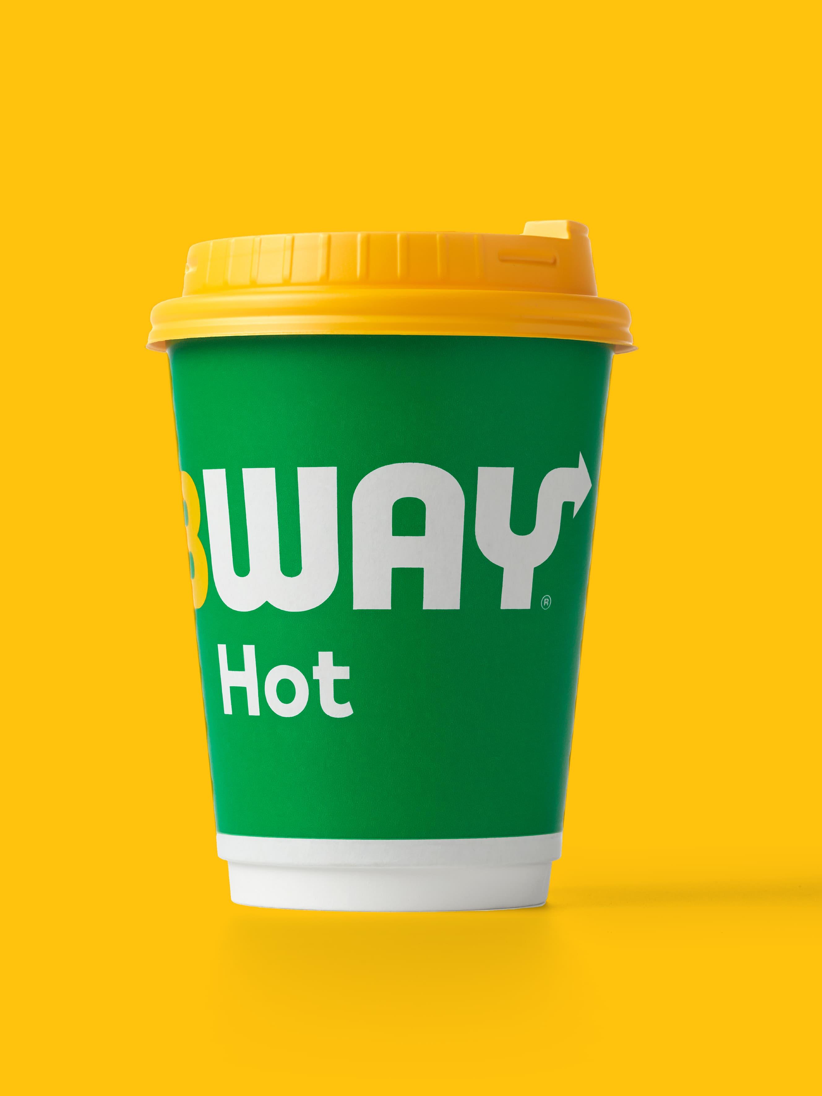
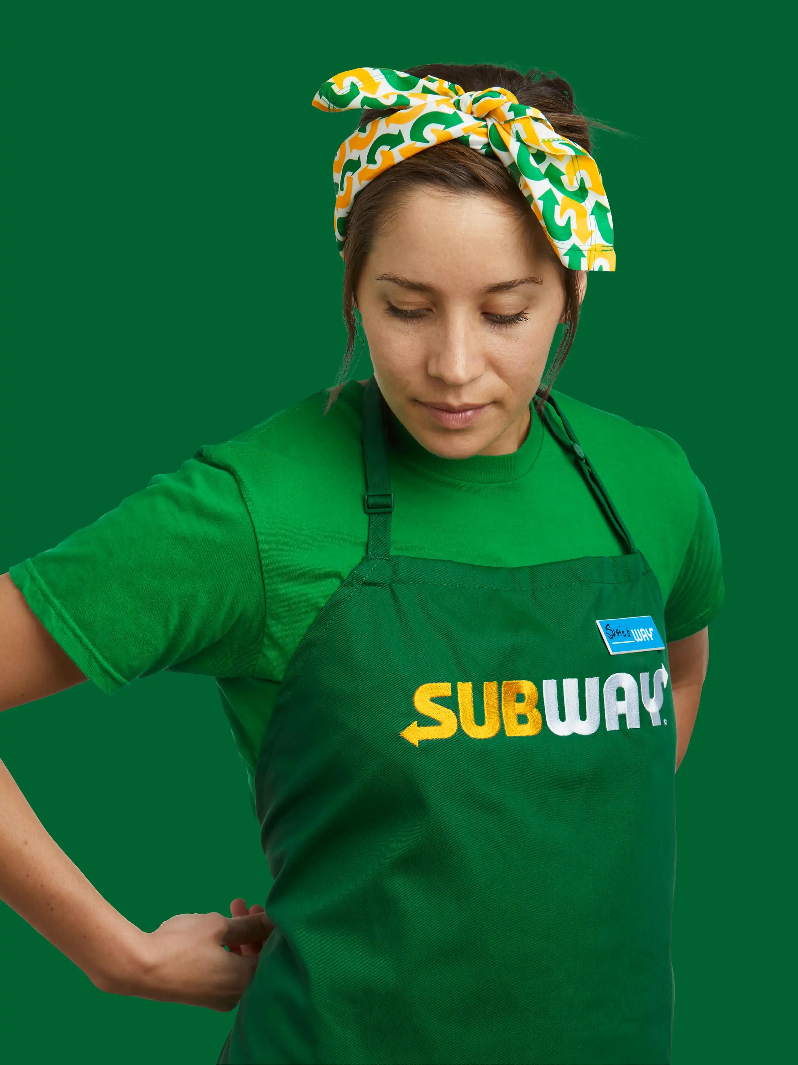
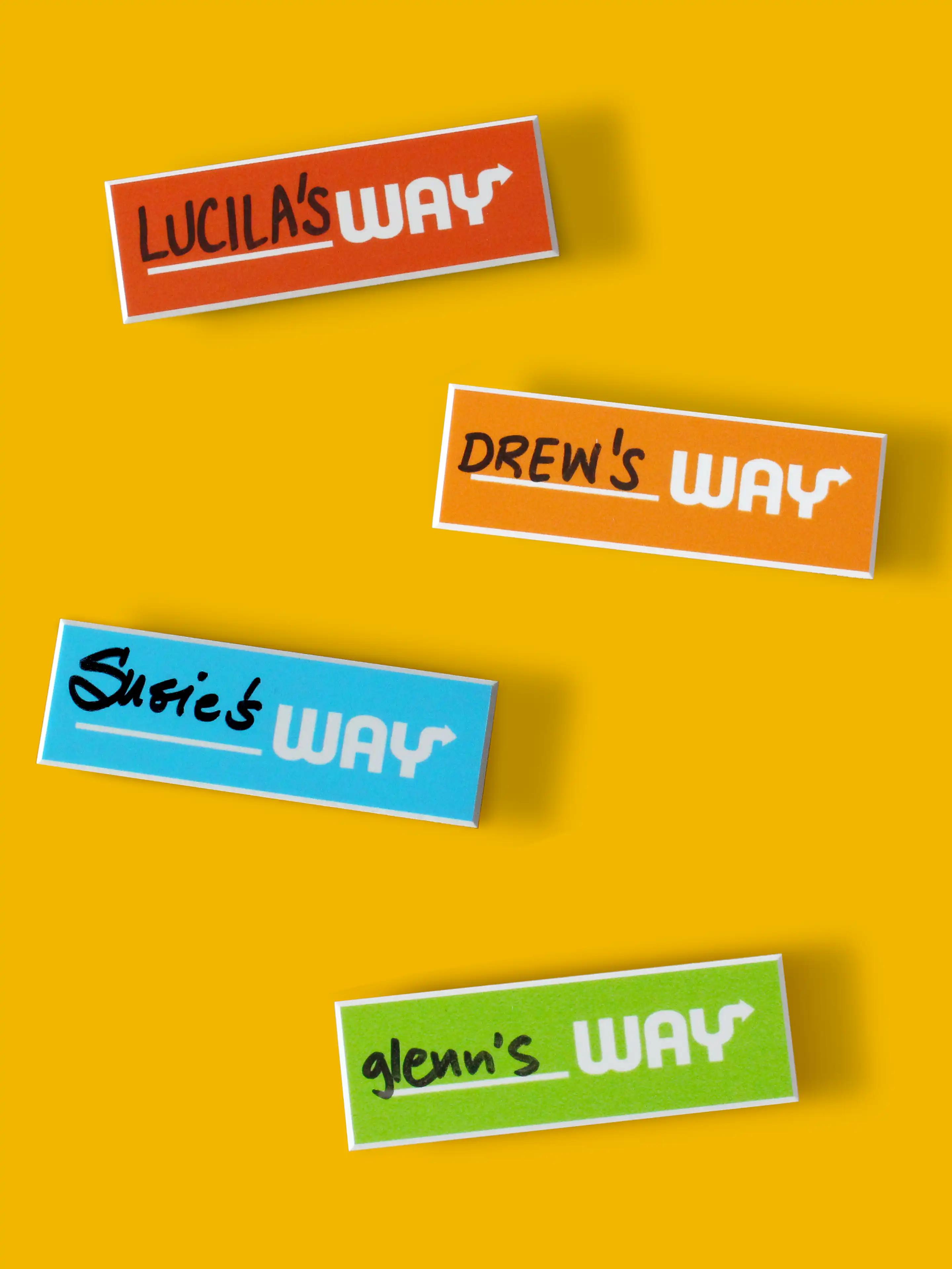
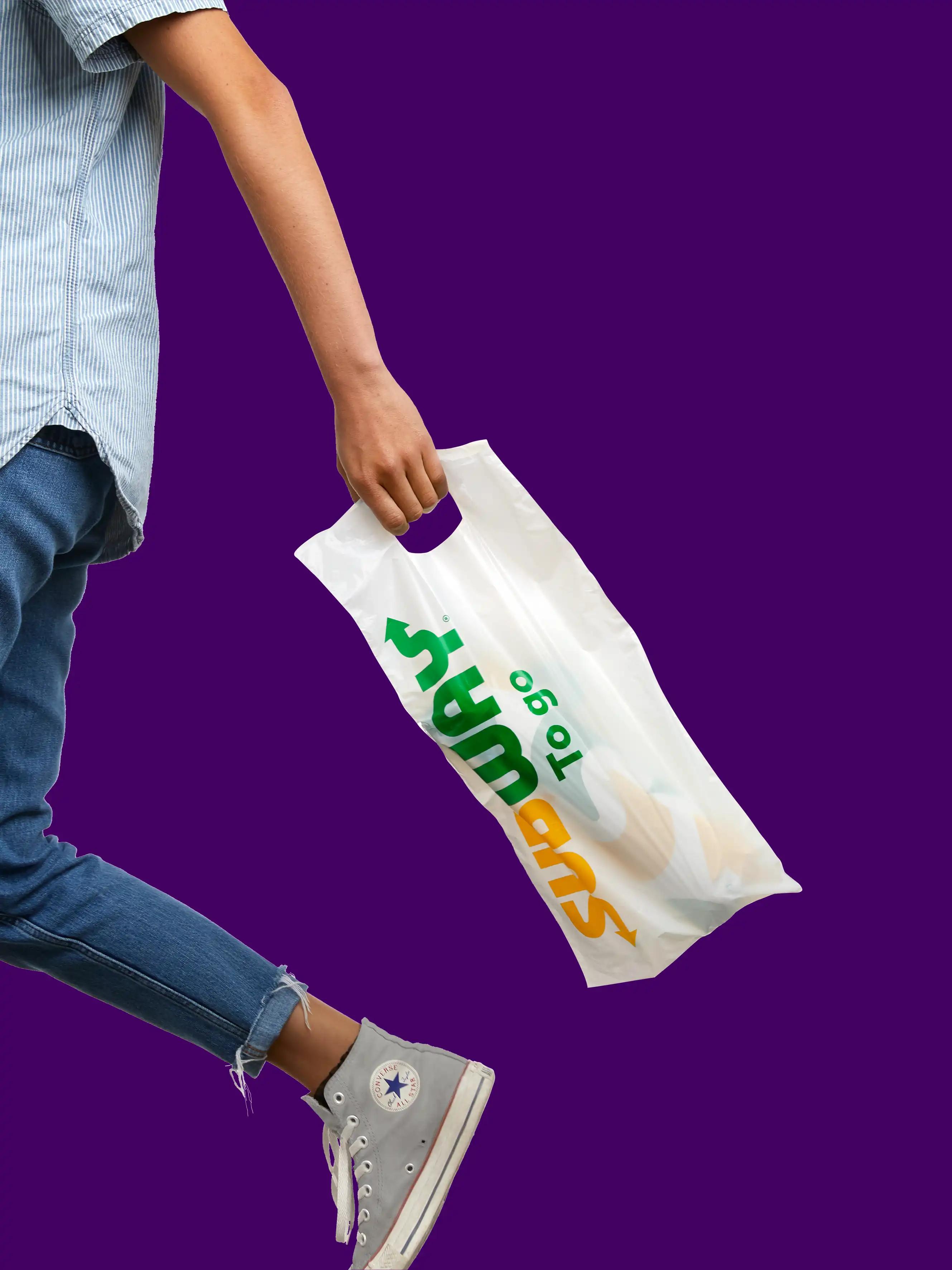
The experience was brought to life across packaging, uniforms, and signage, and inspired new designs for menus, the website, app, social media, digital ordering, and environmental design of the restaurants. The brand finally had the tools and assets to behave in a fresh way, instead of just saying it.
The previous visual identity revolved around a library of many disparate off-the-shelf fonts. A simplified expression was created with custom typography in two weights: Footlong and Six-Inch, both designed to complement the structure and forms in the logotype and the square proportions of the Choice Mark. While many brands in the category use type styles that cue indulgence with extreme boldness, these new fonts intentionally set a lighter and crisper tone and made the brand more distinct.
In the spirit of freshness, the tasty ingredients were presented in a new and unexpected way. Photographer Marion Luttenberger collaborated on a shoot to both highlight the quality of the produce, and to create narrative vignettes on every topic from breakfast to fitness. A similar vibrant and graphic approach was applied to the sandwiches, all against a backdrop of colour inspired by the ingredients themselves.
