A Melt-In-Your-Mouth Makeover
We talk a lot about designing for iconic brands. More often than not, the things that help make a brand iconic are the things that have endured - visual assets that, over time, become synonymous with a brand.

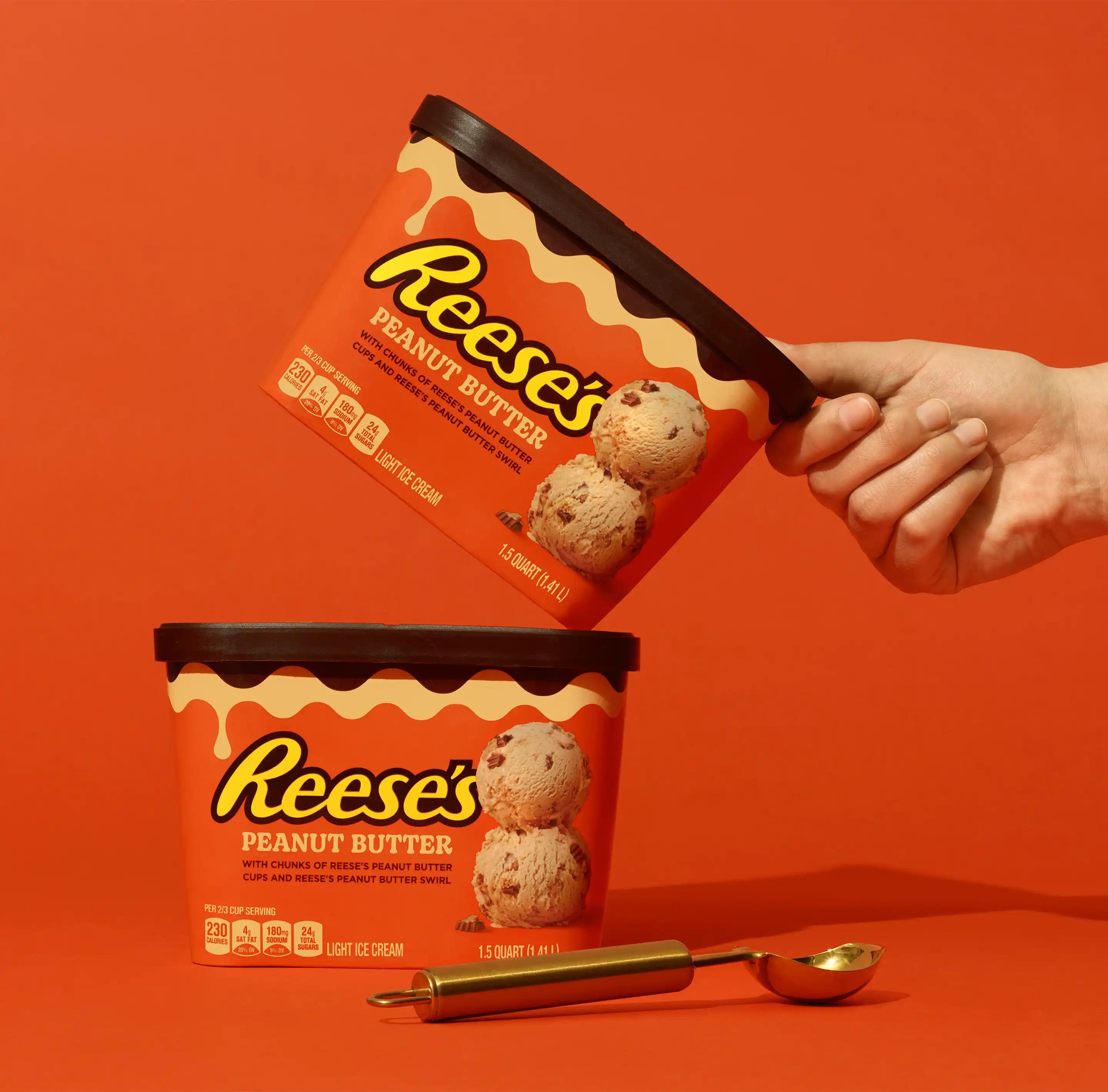
No surprise then that our recent redesign of Reese's Ice Cream didn't start with a blank canvas, but with the re-framing of an existing asset, the Reese’s 'riffle’ - a pattern inspired by the distinctive fluted edge of a Reese's Peanut Butter Cup.


From as early as the first concept stage, the riffle took centre stage; acting not only as a shortcut to the Reese’s brand, but a device that focuses on the melting, drippiness of Reese's Ice Cream.

— Gavin Hurrell — Creative Director - Turner Duckworth"We're always looking for a way to lean in to what a brand already owns. Respecting existing assets, rather than rejecting them. The Reese’s Riffle is a great example. It's become a sensory cue that rings true for both product and brand."

Of course, the team developed new elements too. There’s playful photography, gooey typography and the introduction of a delicious new ‘peanut butter’ colour alongside Reese’s unmistakable orange. Across the range, a stripped-back design reflects Reese’s confident simplicity, whilst making space amongst the hustle of the frozen aisle.


Lifestyle Photography : Andy Grimshaw
Ice Cream Photography : Sarah Anne Ward
Ice Cream Food Styling: Eugene Ho